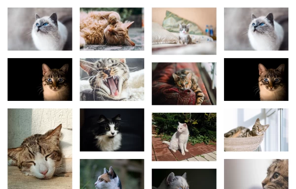
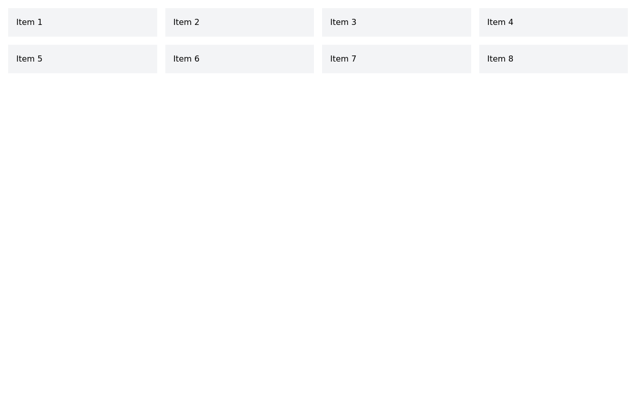
Tailwind image gallery
Responsive grid with evenly spaced image cards. Each card has a title label at the bottom, and there's a subtle hover effect for interactive engagement.
This tailwind example is contributed by Alok, on 08-Jan-2023. Component is made with Tailwind CSS v3. It is responsive. It supports dark mode. similar terms for this example are Masonry, Image grid

Author Alok
Related Examples
-
 Masonry Grid
Auto-adjusting masonry grid
3 years ago32.3k -
 Images grid
Responsive image grid with tailwindcss.
3 years ago19.3k -
 image gallery
image gallery [lightbox]
2 years ago20.4k -
 Image gallery using grid
basic image gallery that displays images in a responsive grid, with an overlay and a "View" button that appears on hover. You can further customize and enhance it to fit your design and functionality requirements.
2 years ago10.6k -
 Responsive products grid
Responsive product card grid using tailwind CSS.
3 years ago45k -
 2 years ago22k
 -
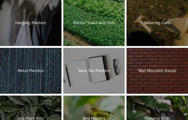 Image Grid
The layout is designed to showcase various categories or items using images and descriptive text. Each grid item features a high-quality image and a centered text overlay with a semi-transparent background
2 years ago14.7k -
 3 years ago23k
 -
 Tailwind image grid
tailwind picture grid
2 years ago10.7k -
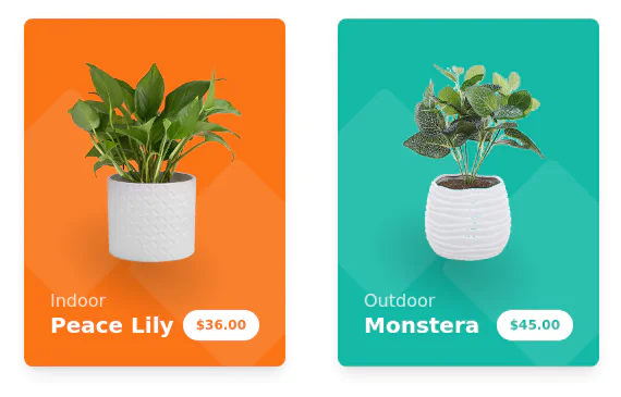
 Products card grid
Example of product card grid with product image and pricing
3 years ago24.2k -
 3 years ago27.2k
 -
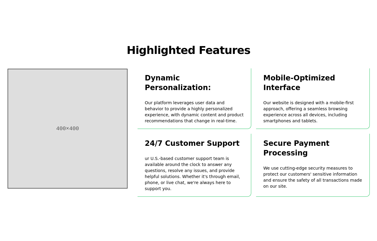
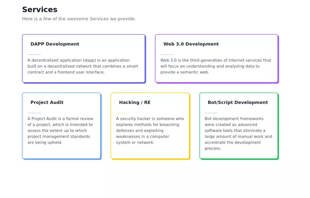 Feature Showcase
The feature showcase's responsive grid can also be used as testimonial cards.
3 years ago25.8k -
 3 years ago20.1k
 -
 Verticle card grid
Best suited for news websites
3 years ago13.8k -
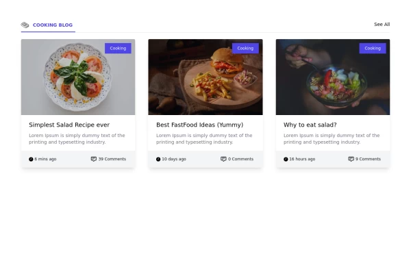 Card grid section
Display article/blog grid
3 years ago30k -
 3 years ago22.3k
 -
 Products cards w/ hover effect
Example of product card grid with product image, pricing and a hover effect FORKED FROM: https://tailwindflex.com/noob_dev/products-card-grid
2 years ago19.5k -
 3 years ago15.6k


Explore components by Tags
Didn't find component you were looking for?
Search from 3000+ components