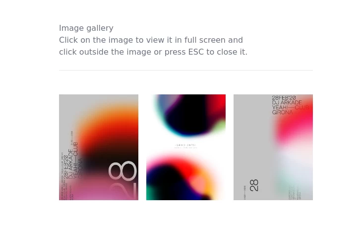
image gallery
image gallery [lightbox]
This tailwind example is contributed by Anonymous, on 31-Jul-2023. Component is made with Tailwind CSS v3. It is responsive. similar terms for this example are Masonry, Image grid

Author Anonymous
Related Examples
-
 Tailwind image gallery
Responsive grid with evenly spaced image cards. Each card has a title label at the bottom, and there's a subtle hover effect for interactive engagement.
3 years ago61.1k -
 Image gallery using grid
basic image gallery that displays images in a responsive grid, with an overlay and a "View" button that appears on hover. You can further customize and enhance it to fit your design and functionality requirements.
2 years ago10.6k -
 Image Grid
The layout is designed to showcase various categories or items using images and descriptive text. Each grid item features a high-quality image and a centered text overlay with a semi-transparent background
2 years ago14.5k -
 2 years ago21.9k
 -
 Images grid
Responsive image grid with tailwindcss.
3 years ago19.2k -
 3 years ago10.4k
 -
 3D Animated Image Gallery
3D Animated Image Gallery
1 year ago8.9k -
 Company Logos Showcase
Client showcase with icons
3 years ago12.8k -
 1 year ago12.1k
 -
-
 slider /carousel
simple slider or carousel
10 months ago1.2k -
 gallery
gallery by css
10 months ago1.1k


Explore components by Tags
Didn't find component you were looking for?
Search from 3000+ components