30 Search results for tailwindcss.com/docs/installation/using-vite

Use this datatable component from Flowbite to power interactivity for table like pagination, search, sorting, and more: https://flowbite.com/docs/plugins/datatables/


source https://github.com/gary149/tailwindcss-landing-gradients/blob/master/index.html


A clean contact form with a supporting image, built using Tailwind CSS by ReadymadeUI. Browse more free UI components and templates at readymadeui.com.

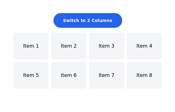
TailwindCss-flex/grid


This project is made of only html and even tailwind is using CDN to save storage space. Best for SPA and routing with other components .


A sleek and fully responsive contact form built with TailwindCSS. This form includes input fields for name, email, subject, and message, along with a stylish submit button. The design features a decorative background, smooth focus effects, and optimized mobile responsiveness.

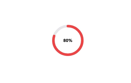
A sleek and customizable radial progress indicator built with SVG and styled using TailwindCSS. The progress bar is animated with smooth transitions, featuring a circular background, dynamic progress, and centered text or optional imagery. Perfect for showcasing percentages, stats, or any progress-related metrics in your projects.


A lightweight, responsive date picker built with TailwindCSS for styling and vanilla JavaScript for interactivity. It includes an input field with a calendar dropdown, month navigation, and a “Today” shortcut button. The component is designed to be mobile-friendly, easy to customize, and can be integrated into any project without dependencies like React or external UI libraries.


it is a navbar for practise purpose

source: https://dev.to/lazysock/make-a-typewriter-effect-with-tailwindcss-in-5-minutes-dc


responsive navbar built with TailwindCSS, perfect for mobile and desktop views

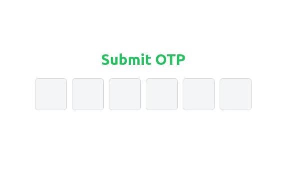
A clean and responsive OTP input field component built with TailwindCSS. This design features six single-character input fields with smooth transitions, light gray borders, and backgrounds. On focus, the borders turn blue, creating a visually appealing and user-friendly experience. Perfect for authentication and verification forms.

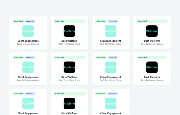
This product card is designed for e-commerce platforms using TailwindCSS. It features a discount badge, product image carousel, quick view and quick order buttons, ratings, product name, brand details, dynamic pricing with a strike-through original price, and a prominent add-to-cart button. The clean and professional layout is perfect for showcasing products on online stores.
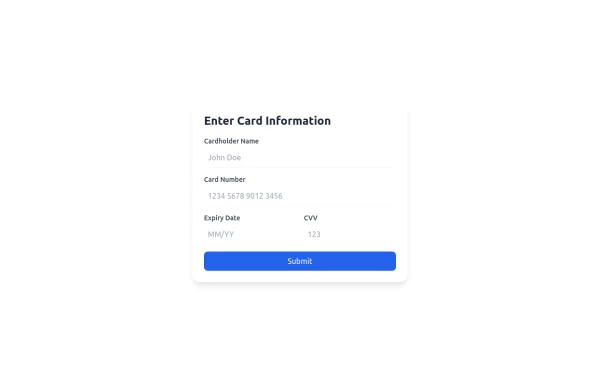
A sleek and modern bank card information form built with raw HTML and styled using TailwindCSS. This responsive form includes fields for cardholder name, card number, expiry date, and CVV, designed for clean aesthetics and ease of use.
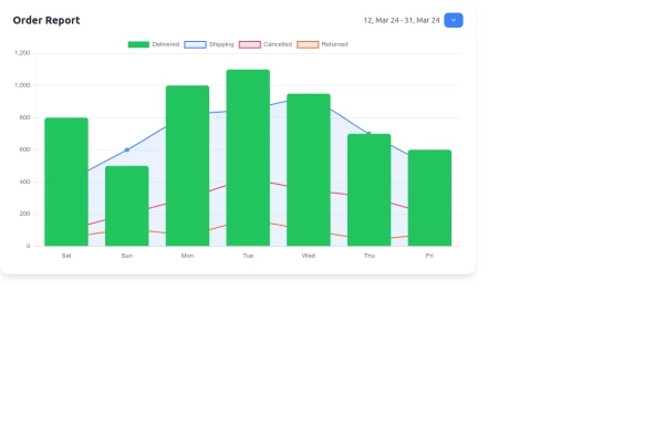
Create a stunning and interactive order report chart using HTML, TailwindCSS, and Chart.js. This chart combines bar and line graphs to visualize delivered, shipping, cancelled, and returned orders effectively. Perfect for dashboards and analytics pages with responsive design and clean aesthetics.
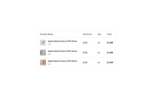
This is a clean and responsive product listing table built with HTML and TailwindCSS. The table displays product images, names, unit prices, quantities, and total costs in a structured format. It adapts to different screen sizes by enabling horizontal scrolling on smaller devices. The design is minimal yet functional, making it ideal for e-commerce websites, order summaries, and invoice pages. Let me know if you need any refinements!
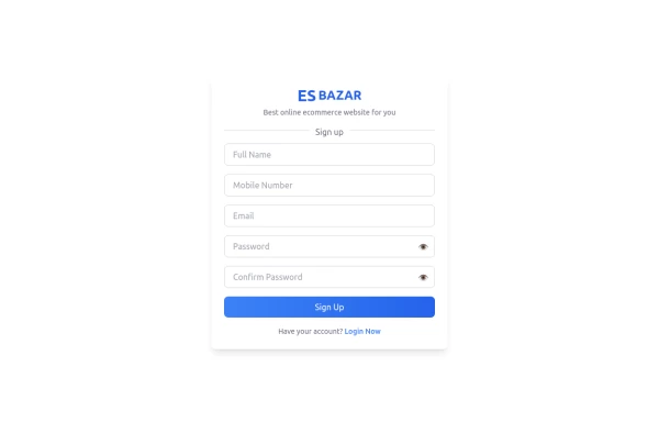
Create a visually appealing and fully responsive sign-up form using TailwindCSS. This form includes input fields for full name, mobile number, email, password, and confirm password, along with a gradient sign-up button. Designed with simplicity and flexibility, it is perfect for modern web applications and easy to integrate into any project.

Beautiful animated text rotation component with smooth fade transitions. Perfect for hero sections, showcasing features, and engaging website visitors with dynamic content.


Need a website, have a project idea, or just want to say hello? Feel free to reach out! My Contact Section is built with Tailwind CSS, ensuring a clean, responsive, and user-friendly experience. Drop me a message, and let's create something amazing together!

tailwindcss


Best New tailwindcss,help save the children


Responsive image grid with tailwindcss.


Aurora Spinner using tailwindcss

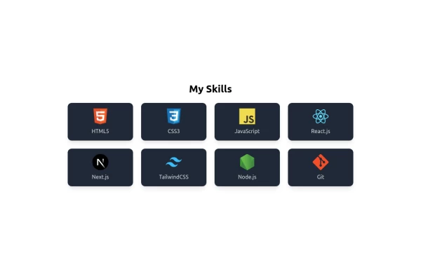
🚀 Showcasing My Skills with TailwindCSS & Flexbox! I’ve designed a responsive and interactive Skills Section using Tailwind CSS and Flexbox. With smooth hover effects and a clean layout, this section highlights my expertise in: 🔹 Frontend Technologies – HTML, CSS, JavaScript, React, Next.js 🔹 Styling Frameworks – TailwindCSS 🔹 Backend & Tools – Node.js, Git


I create a attractive responsive navbar using tailwindcss and custom css. also work on mobile devices.
