Donate Hero section
Best New tailwindcss,help save the children
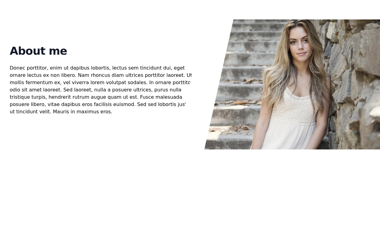
This tailwind example is contributed by ORGIN_DREAMS, on 21-May-2025. Component is made with Tailwind CSS v3. It is responsive. similar terms for this example are popup,dialog,about me

Author ORGIN_DREAMS
Related Examples
-
 Flour mill website landing page template
flour mill and services template website which comprise of many sections like about us, featured products, why us, visit us
1 year ago14.4k -
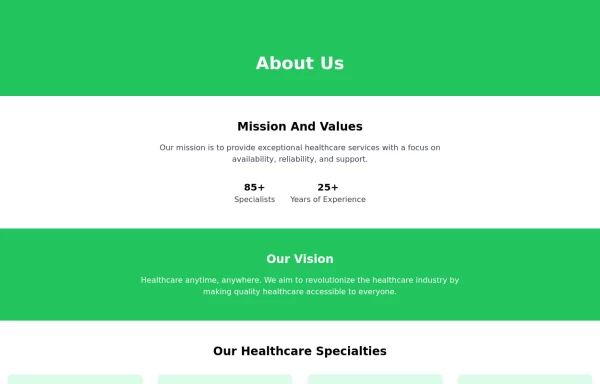 About Us
This The About Us Component with the tailwind class and some animation by tailwind and best about us page you can modify it and content is for now only clinic but you can ad your content
1 year ago4.8k -
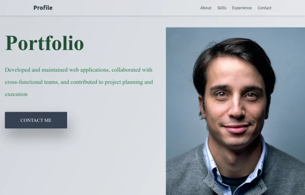 Responsive Portfolio Webpage with Tailwind CSS
This is a reusable and responsive portfolio webpage template created with HTML and Tailwind CSS. Designed for developers or creatives, the template includes essential sections like Header, Hero, About, Skills, Experience, Projects, Testimonials, Contact Form, and Footer. It features a clean, modern design and is fully customizable without requiring JavaScript. Perfect for showcasing personal or professional work on the web.
11 months ago2k -
 Modern Responsive Footer with Tailwind CSS
This sleek and modern responsive footer is built using HTML and Tailwind CSS. It features three sections: brand information, useful links, and social media icons. The footer includes smooth hover effects, subtle fade-in animations, and a fully responsive design that adapts seamlessly to different screen sizes. Perfect for websites looking for a professional and stylish footer section.
10 months ago1.8k -
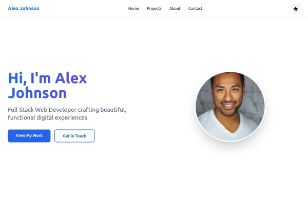 Simple web portfolio
The portfolio includes all required sections (Hero, Projects, About, Contact) with professional styling, and I've added some premium touches like social media icons, a sticky navigation, and beautiful gradient effects that make it feel cutting-edge and engaging.
6 months ago929 -
 6 months ago879
 -
 Innovative Rwanda-Canada Transport Services Website
Innovative Rwanda-Canada Transport Services Website
4 months ago394 -
 2 years ago24.7k
 -
 Stars: Sun and Moon Illustrations
I Created Sun and Moon Illustrations with Tailwind CSS, Embracing Light and Dark Modes
1 year ago4.2k -
 3 years ago12k
 -
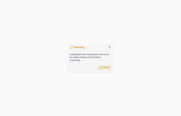 Confirmation Modal for Critical Actions
A clean and responsive warning dialog component built with Tailwind CSS. Includes a title, descriptive text, and action buttons for confirmation or cancellation of critical actions.
3 months ago529 -
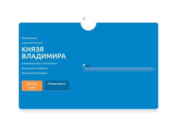 Home page 2
Отзывчивый логотип по центру. Интерактивные кнопки призыва к действию.
10 months ago832


Explore components by Tags
Didn't find component you were looking for?
Search from 3000+ components