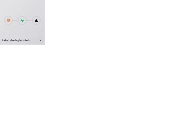
Skills Showcase, My Tech Stack and Expertise & Skills
🚀 Showcasing My Skills with TailwindCSS & Flexbox!
I’ve designed a responsive and interactive Skills Section using Tailwind CSS and Flexbox. With smooth hover effects and a clean layout, this section highlights my expertise in:
🔹 Frontend Technologies – HTML, CSS, JavaScript, React, Next.js
🔹 Styling Frameworks – TailwindCSS
🔹 Backend & Tools – Node.js, Git
This tailwind example is contributed by Muhammad Umair Arshad, on 25-Mar-2025. Component is made with Tailwind CSS v3. It is responsive.

Author Muhammad Umair Arshad
Related Examples
-
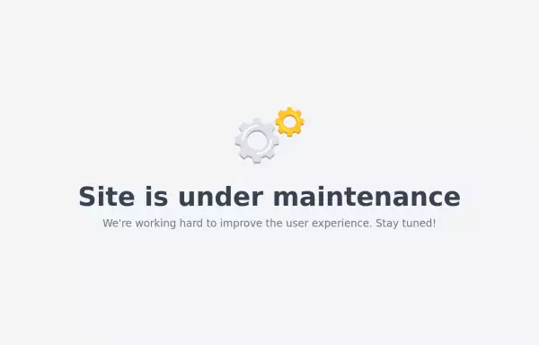 Maintenance page template
The site is under maintenance placeholder page
2 years ago10.5k -
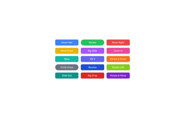 button animation
button animation big
8 months ago866 -
 1 month ago40
 -
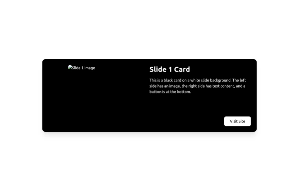 Sticky fullpage pages / slides
Sticky full page
3 months ago332 -
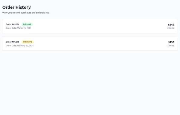 Order History
Order History
10 months ago1.1k -
 Animated bento box.
A Coastal UI component (coastalui.com). This can be used as part of a bento box, great for showing connectivity between context, could be used beyond just showing tech stacks.
10 months ago1.4k -
 8 months ago508
 -
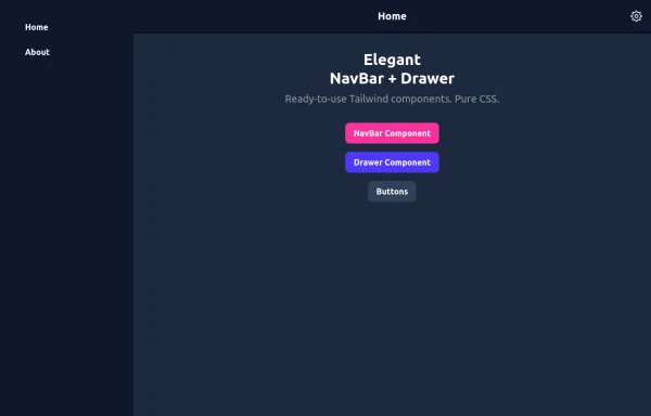 Elegant NavBar + Drawer
A NavBar, a responsive drawer/sidebar, and other useful Tailwind components to get started creating an app. Pure CSS, no JavaScript needed (although this example uses a bit of JS).
9 months ago1.3k -
 Forgot Password
Forgot Password
1 month ago103 -
 1 year ago3k
 -
 responsive home page
the best home page
8 months ago1.1k -
 Clean AI Chat UI with Tailwind CSS – ChatGPT-Style Interface
A polished and responsive AI chat interface built using modern Web Components and Tailwind CSS. This UI replicates the smooth, minimal experience of ChatGPT with a clean layout, floating input bar, animated scrollable message feed, and mock AI responses. Ideal for SaaS dashboards, AI assistants, or frontend prototypes. Designed with professional spacing, accessible colors, and reusable components. Key features: Responsive layout with mobile support Floating input bar with auto-expanding textarea Tailwind-powered message bubbles with clear sender roles Modern dark theme with subtle gradients and shadows Easily extendable to real AI APIs (e.g., OpenAI)
8 months ago1.8k


Explore components by Tags
Didn't find component you were looking for?
Search from 3000+ components