Elegant OTP Input Fields with TailwindCSS
A clean and responsive OTP input field component built with TailwindCSS. This design features six single-character input fields with smooth transitions, light gray borders, and backgrounds. On focus, the borders turn blue, creating a visually appealing and user-friendly experience. Perfect for authentication and verification forms.
This tailwind example is contributed by SHARIFUL ISLAM, on 06-Feb-2025. Component is made with Tailwind v3.4. It is responsive.

Related Examples
-
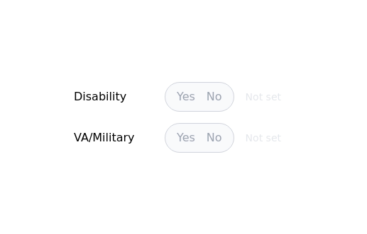
 Radio Buttons
Users can click anywhere on the input field to select the radio option
17.1k -
-
 15.1k
15.1k -
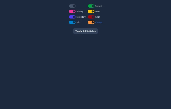 Elegant Switches
Useful Tailwind classes for creating several types of basic switches.
986 -
 Image input with preview
Show you a preview of the selected image.
27.9k -

-
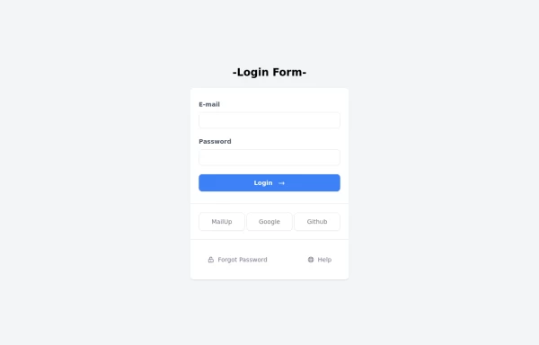 Login Form
Login Form
2.7k -
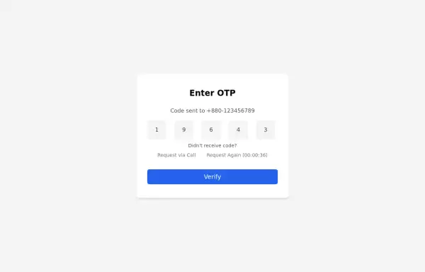 Simple OTP box Form
A Simple OTP form with full responsiveness && dark mode supported
4.1k -
 11.5k
11.5k -
 Login
LoginLogin form, responsive, no dark-mode for white backgrounds, elegant for any platform
5.2k -
-
 Multi Range Slider
Adjust the sliders to set your preferred price range. The left slider sets the minimum price, and the right slider sets the maximum price. The selected range is displayed below the sliders in real-time, allowing you to easily filter products within your budget.
2.5k


Browse by topic
Explore components by Tags
Jump straight to the UI pattern you need.
Can't find it?
Didn't find the component you were looking for?
Search across 3,000+ community-built components and grab the code in seconds.