Typewriter effect in tailwindcss with this simple trick
source: https://dev.to/lazysock/make-a-typewriter-effect-with-tailwindcss-in-5-minutes-dc
This tailwind example is contributed by Anonymous, on 04-Sep-2023. Component is made with Tailwind CSS v3. It is responsive.

Author Anonymous
Related Examples
-
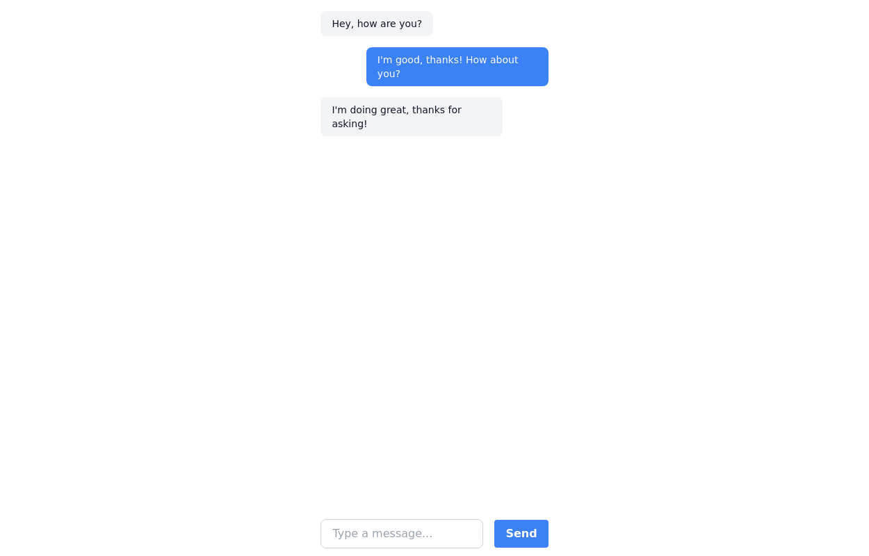
Typewriter effect
using javascript
3 years ago42.7k -
Typewriter animation effect
Build using only Tailwind CSS; no JavaScript is required. This is a continuous typing effect. If you want to stop it after the text is typed for the first time, then you can remove 'infinite' from [typing: 'typing 2s steps(20) infinite alternate, blink .7s infinite'] from the config file.
2 years ago21.3k -
background animation
background animation
2 years ago50.9k -
2 years ago15.8k
-
2 years ago21.7k
-
 3 years ago25.6k
 -
 3 years ago12.6k
 -
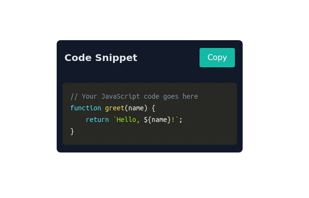 Code Snippet with Copy Button
Clipboard-Friendly Code Block Uses Prisma for code highlighting
2 years ago9.8k -
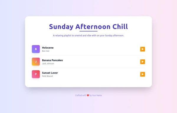 Soft Lights & Slow Beats
Sink into the tranquil rhythms of a Sunday afternoon. This playlist blends soft melodies and gentle beats to create a mysterious yet comforting atmosphere — perfect for relaxing, reflecting, or simply unwinding as the day fades away.
9 months ago511 -
 1 year ago3.4k
 -
 1 year ago2k
 -
 1 year ago2.2k


Explore components by Tags
Didn't find component you were looking for?
Search from 3000+ components