beautifull responsive navbar
I create a attractive responsive navbar using tailwindcss and custom css.
also work on mobile devices.
This tailwind example is contributed by Akram Khan, on 06-Jul-2024. Component is made with Tailwind CSS v3. It is responsive.

Author Akram Khan
Related Examples
-
 Responsive Gradient Navbar with Toggle
A modern, responsive navbar built with Tailwind CSS. Features a gradient background, flex layout, smooth hover effects, and a mobile toggle menu for optimal usability on all screen sizes.
8 months ago1.2k -
 Colourful NavBar by Itunu Ijila
Responsive Colorful Navbar with Tailwind CSS - Free HTML Template Modern, mobile-friendly navigation bar built with Tailwind CSS featuring vibrant gradient colors (purple, pink, red). Includes hamburger menu for mobile devices, smooth hover effects, and easy customization. Perfect for websites, landing pages, and web applications. Copy-paste ready HTML code with Tailwind CDN - no build process required. Fully responsive design that works on all screen sizes. Keywords: Tailwind CSS navbar, responsive navigation bar, colorful navbar template, HTML navbar component, mobile menu, gradient navbar, Tailwind navigation, free navbar template
3 weeks ago27 -
 Tailwind CSS Navbar
Logo on the left. Main menu with a mega menu under "Services". Responsive design with a hamburger menu for mobile devices. Mega menu appears on hover for desktop and toggles on click for mobile.
7 months ago1.1k -
 3 years ago61.8k
 -
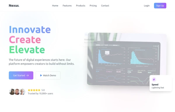 Modern page
hero page by salvator
8 months ago1.3k -
 11 months ago1.9k
 -
 11 months ago2.5k
 -
 Production-Ready Responsive Navigation
This is a sample content area. Scroll down to see the fixed header in action.
1 year ago3.5k -
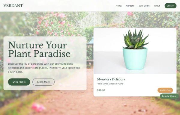 Garden
by salvator
8 months ago1.2k -
 hero modern
hero modern
1 month ago67 -
 Tailwind Sidebar Layout
Place edited for the search button
1 year ago5.4k -
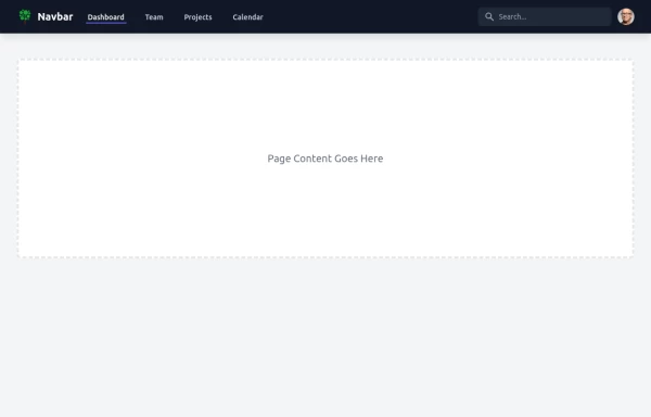
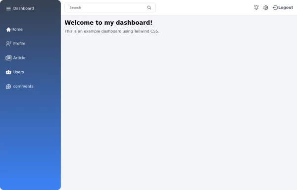
 Sidebar
This is the sidebar that I use in my projects, I use grid to be able to manage the space issue a little better, it seems like a clean and modern design, it is more than anything for the dashboards that you want to create
1 year ago4k


Explore components by Tags
Didn't find component you were looking for?
Search from 3000+ components