TailwindCss-flex/grid2
TailwindCss-flex/grid
This tailwind example is contributed by Ting Pan, on 17-Sep-2025. Component is made with Tailwind CSS v3. It is responsive.

Author Ting Pan
Related Examples
-
 2 years ago20.4k
 -
 11 months ago1.5k
 -
 Masonry Grid
Auto-adjusting masonry grid
3 years ago32.1k -
 4 months ago389
 -
 Card KPI
Targetas
3 months ago425 -
 1 year ago2.8k
 -
 4 months ago257
 -
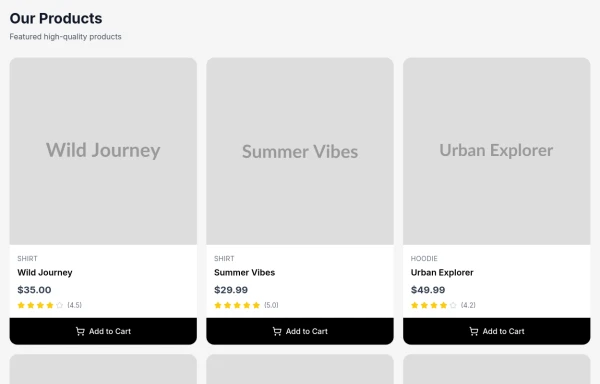
 Responsive products grid
Responsive product card grid using tailwind CSS.
3 years ago44.8k -
 Enhanced Student Testimonials Section
A modern, interactive testimonials section featuring glassmorphism design, floating animations, and social proof elements. Includes star ratings, course badges, user profiles with online status indicators, and a stats section. Built with Tailwind CSS and features gradient backgrounds, hover effects, and responsive design optimized for showcasing student success stories and building credibility.
6 months ago641 -
 1 year ago4.1k
 -
 3 years ago10.3k
 -
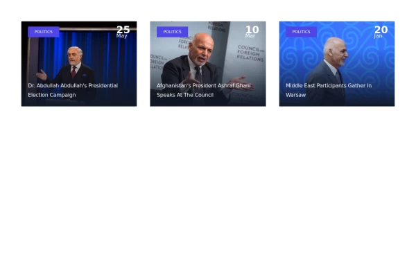 Short and simple card grid
Best suited for news websites
3 years ago11.6k


Explore components by Tags
Didn't find component you were looking for?
Search from 3000+ components