Layout switcher with tailwindcss and alpinejs
This tailwind example is contributed by Michael Andreuzza, on 01-May-2024. Component is made with Tailwind CSS v3. It is responsive. similar terms for this example are Services,Why choose us

Author Michael Andreuzza
Related Examples
-
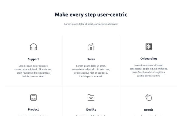
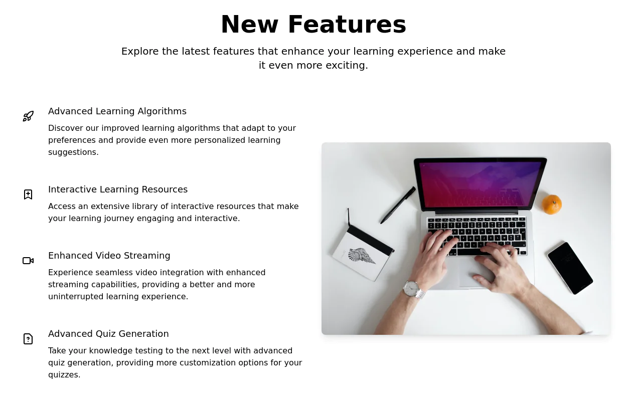 Product Feature Section
present multiple product features in a grid layout. Each feature is represented by an icon, title, and description.
2 years ago9.4k -
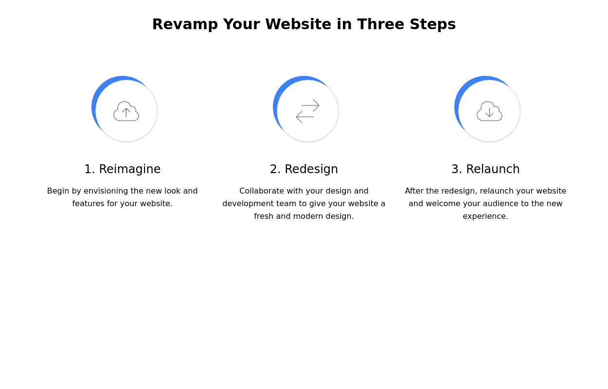 Steps section
Show features or steps of your website. Each step Includes Icons.
2 years ago9.7k -
 3 years ago13.8k
 -
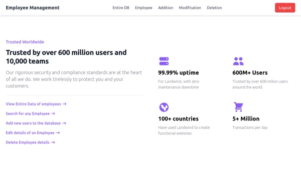 Employee Data Management System TailwindCSS,Html
This project is made of only html and even tailwind is using CDN to save storage space. Best for SPA and routing with other components .
1 year ago1.5k -
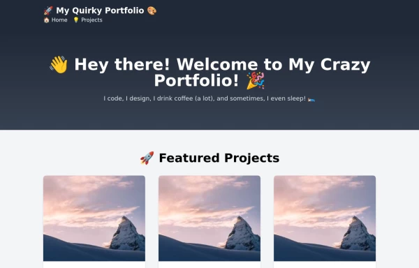 free tailwind personal portfolio template
free tailwind personal portfolio template
2 years ago5.5k -
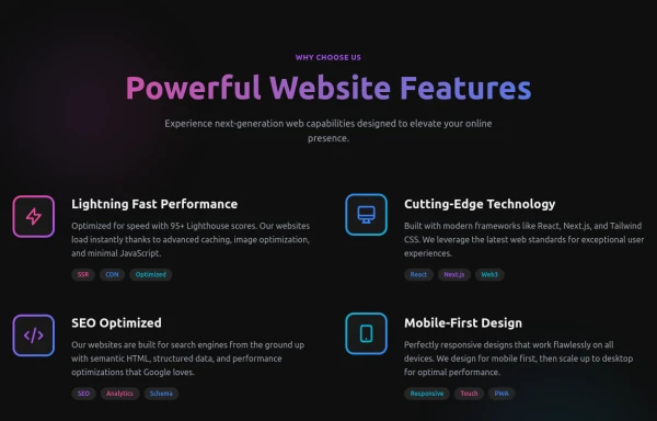 Powerful Website Features
Open Layout Design: No traditional boxes - content flows naturally Gradient Accents: Vibrant color gradients for visual interest Animated Icons: Subtle floating animations on feature icons Hover Effects: Soft glow backgrounds appear on hover Tag System: Color-coded tags for each feature's attributes Dark Theme: Sophisticated dark background with perfect contrast
7 months ago1.1k -
 2 years ago17.1k
 -
 Feature Showcase
The feature showcase's responsive grid can also be used as testimonial cards.
3 years ago25.8k -
 1 year ago7k
 -
 Responsive Features Section
It's a Handy Ready to Use Responsive Features or Services Component with Dark Mode
2 years ago5.3k -
 8 months ago995
 -
 Facts
FactsLarge fact counters with the "centered" title, a quarter overstand to the right site. Die JS-Line set the titles, so you only have to change the text -- and or modify the counters- or the titles background-color. [VIEW-NOTICE] If you change the from XS over MD to XL ... right-click here into the showcase and click "reload frame" or test it on you own site directly.
1 year ago2k


Explore components by Tags
Didn't find component you were looking for?
Search from 3000+ components