- Home
-
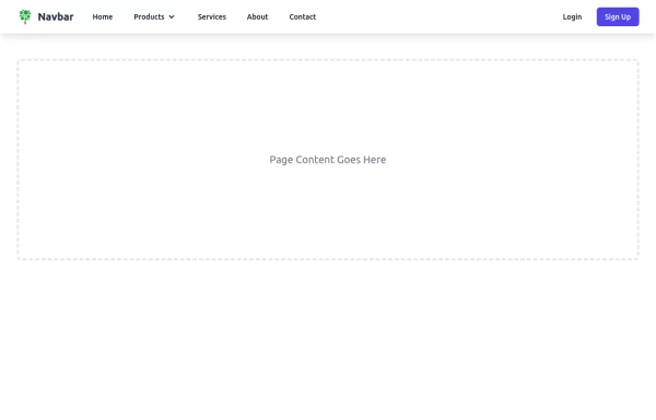
Responsive Navbar with TailwindCSS and AlpineJS
Responsive Navbar with TailwindCSS and AlpineJS
This tailwind example is contributed by ariaw, on 16-Oct-2025. Component is made with Tailwind CSS v3. It is responsive.
Author ariaw
Related Examples
-
2 years ago27.4k
-
Tailwind Header
responsive mobile menu with a smooth transition
1 year ago3.7k -
1 year ago1.9k
-
Minimalistic navbar
Responsive navbar
3 years ago21.1k -
1 year ago2.1k
-
1 year ago2.7k
-
e-commerce website landing page template with Tailwind CSS.
A clean, responsive e-commerce & blog template built with Tailwind CSS. Features light/dark mode, dynamic featured posts, hero, CTA, and SEO-ready sections.
2 months ago526 -
3 years ago14.3k
-
Hero simple
hero design simple
9 months ago1.4k -
avigation Mobile iOS - SPA
avigation Mobile iOS - SPA
3 months ago263 -
Responsive Navbar
Tailwind Navbar
1 year ago7.9k -
1 year ago2.7k
Explore components by Tags
Didn't find component you were looking for?
Search from 3000+ components


