Radial Progress Indicator with TailwindCSS
A sleek and customizable radial progress indicator built with SVG and styled using TailwindCSS. The progress bar is animated with smooth transitions, featuring a circular background, dynamic progress, and centered text or optional imagery. Perfect for showcasing percentages, stats, or any progress-related metrics in your projects.
This tailwind example is contributed by SHARIFUL ISLAM, on 05-Feb-2025. Component is made with Tailwind CSS v3. It is responsive.

Author SHARIFUL ISLAM
Related Examples
-
 Skill showcase section for resume / porfolio website
show skill progression
2 years ago14k -
 Multi Step form with javascript
A Beautiful multi step form using HTML CSS and JS
1 year ago1.4k -
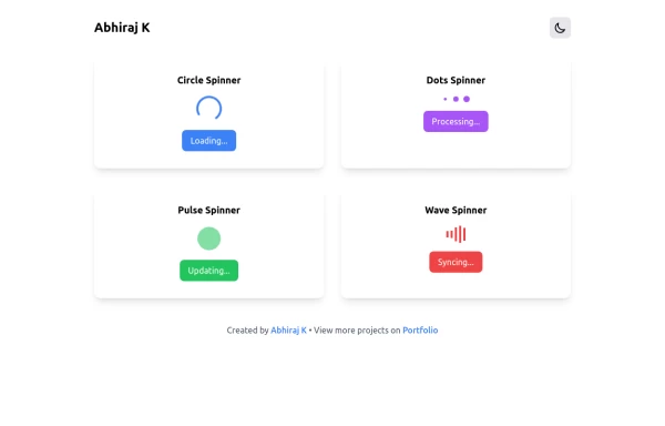 Spinner
The Spinner is a simple and visually appealing component that indicates ongoing processes like loading or data fetching. It's a great way to improve user engagement and reduce frustration during wait times. Different styles and animations (circular, dots, pulsating). Customizable size, color, and speed. Easy to integrate with loading states in any app. Lightweight and responsive.
1 year ago2.2k -
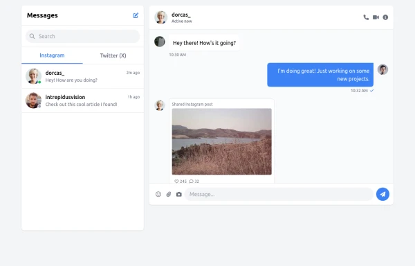 chat bar
live chat
9 months ago1.3k -
 Forgot password?
you can change password an time
9 months ago682 -
 Card KPI
Targetas
4 months ago495 -
 Chat Bot
Simulation of a chat bot that can be used for conversations as a sketch idea
1 year ago3.7k -
 Checkbox models
Tailwind Checkbox models
10 months ago1.1k -
 2 weeks ago39
 -
 Custom Audio Player
🎧 Custom Audio Player (HTML, Tailwind CSS & Alpine.js) A modern, responsive custom audio player built with Tailwind CSS and Alpine.js, designed for a smooth user experience and elegant visuals in both light and dark mode. ✨ Features: 🎵 Play, pause, and mute/unmute controls 📈 Interactive progress bar with seek functionality 🔊 Dynamic volume slider with live preview 🖼️ Album art and track details display ⌨️ Keyboard support — toggle play/pause with the spacebar 🌓 Fully responsive and dark-mode compatible This player uses minimal JavaScript, relying on Alpine.js for reactivity, and can be easily customized or integrated into any web project. Perfect for portfolios, podcasts, or music web apps.
5 months ago762 -
 Resizable container
Resizable container
2 months ago130 -
 Life Tree
by salvator
10 months ago990


Explore components by Tags
Didn't find component you were looking for?
Search from 3000+ components