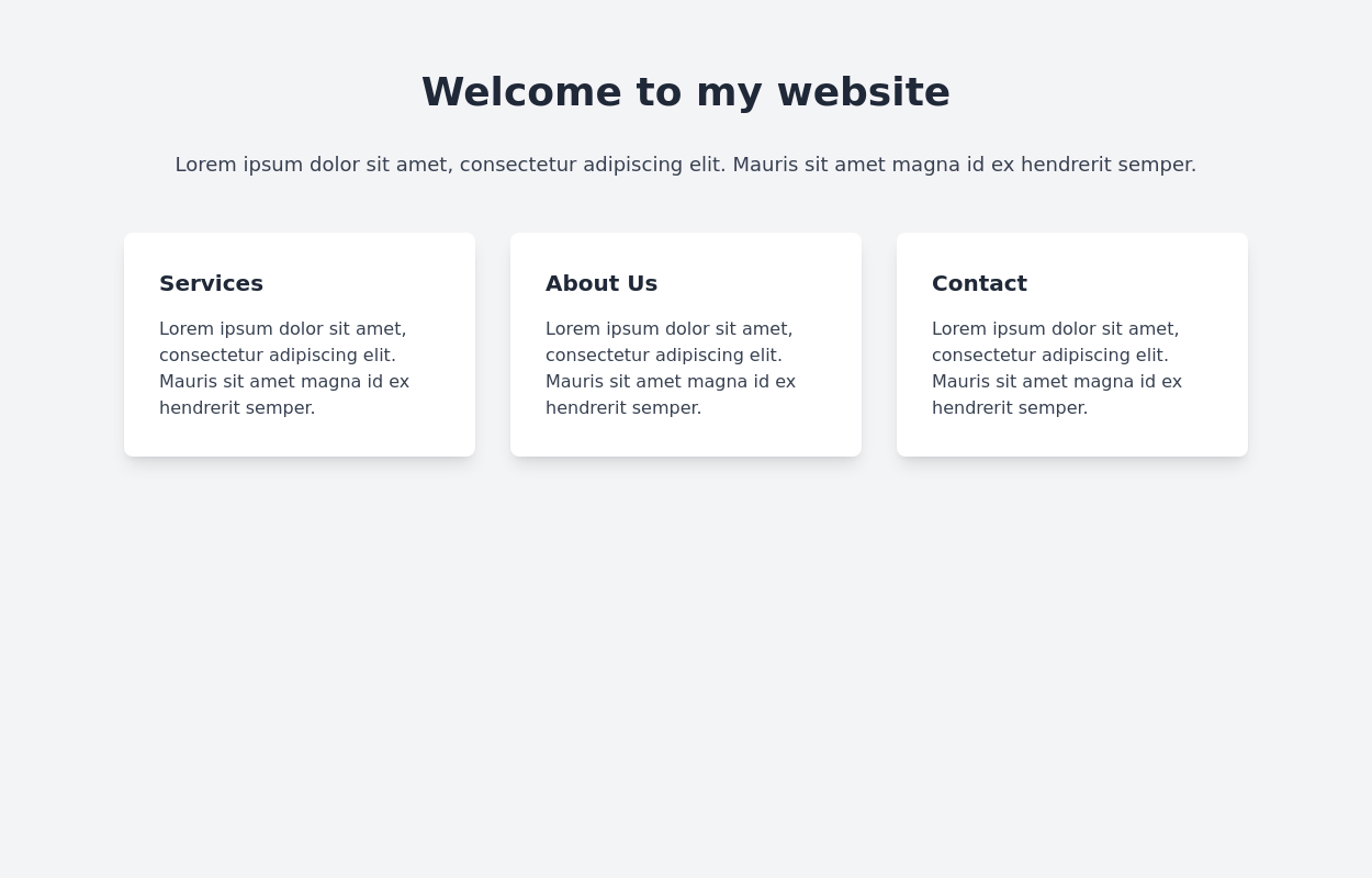
Feature showcase cards
This tailwind example is contributed by Lukas Müller, on 19-Feb-2023. Component is made with Tailwind CSS v3. It is responsive. similar terms for this example are Services,Why choose us

Author Lukas Müller
Related Examples
-
 Responsive Card Grid
Tailwind CSS responsive grid for feature listing. The cards have a teal background, rounded corners, and a concise display of feature titles, descriptions, and a "Learn More" link.
3 years ago52.2k -
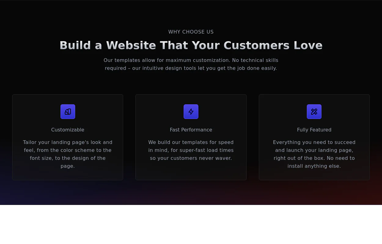 Why choose us section
list your product features beautifully
2 years ago28.7k -
 2 years ago14.4k
 -
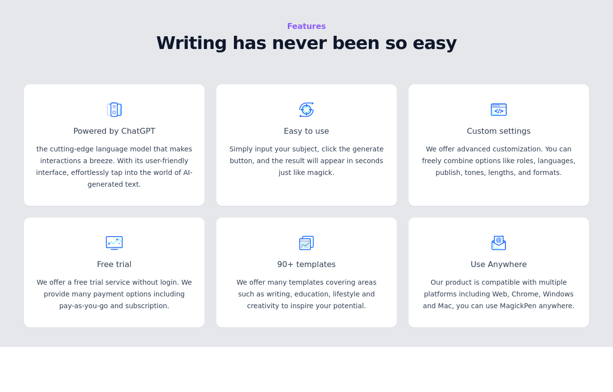
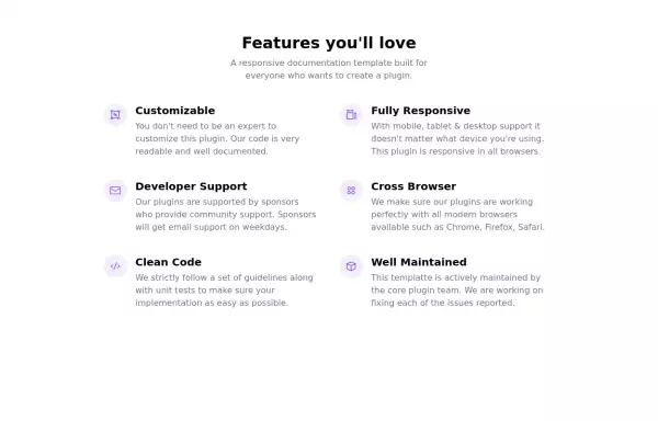
 Features section
Showcase your key features
3 years ago16.8k -
 Feature Showcase
The feature showcase's responsive grid can also be used as testimonial cards.
3 years ago25.7k -
 Responsive products grid
Responsive product card grid using tailwind CSS.
3 years ago44.8k -
 Feature / Icon grid
Present information in a clear and organized manner with icons.
3 years ago15k -
 3 years ago19.9k
 -
 3 years ago12.2k
 -
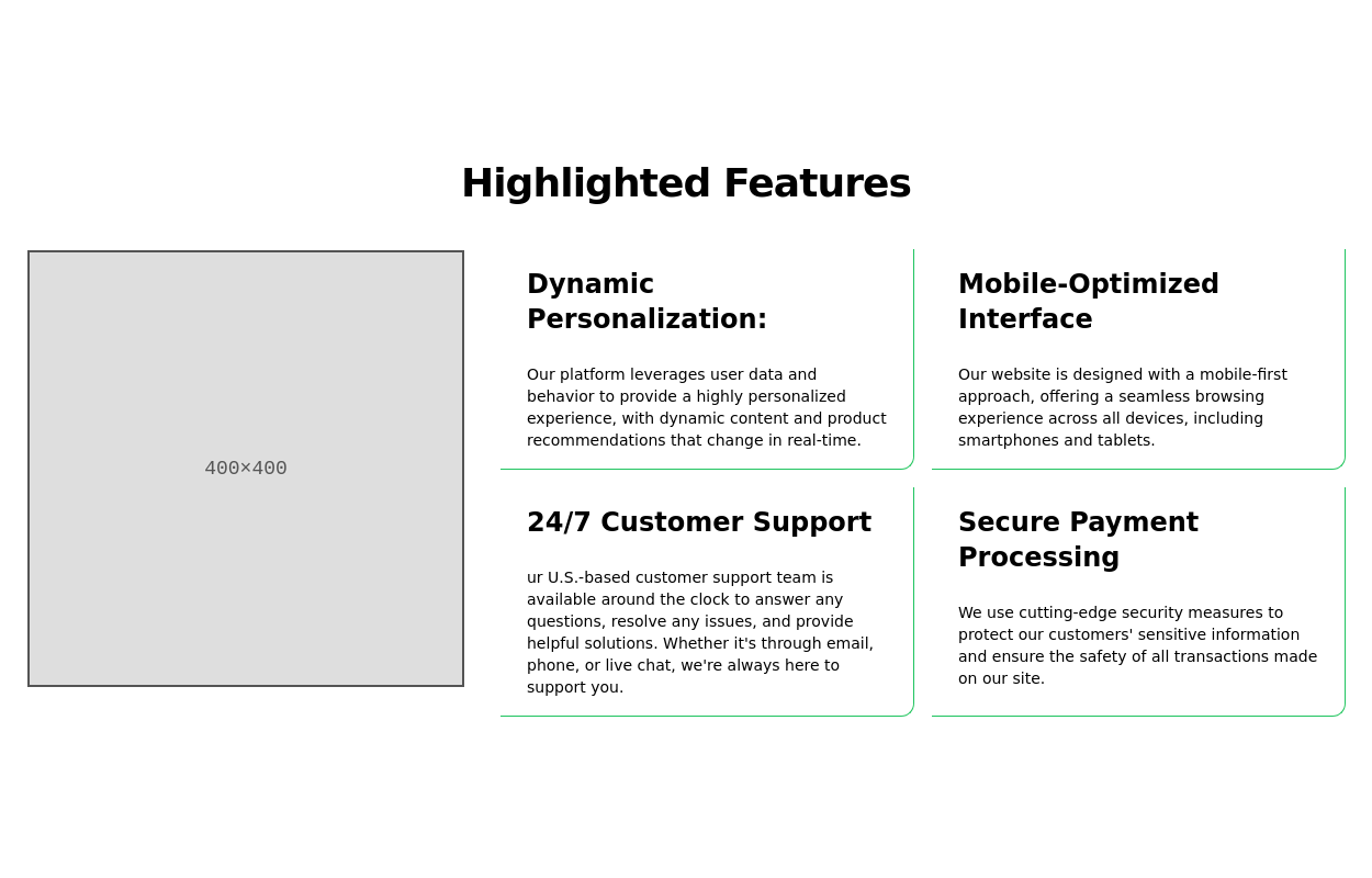
 Product feature section
Showcase product features with an image
2 years ago14k -
 3 years ago11.1k
 -
 2 years ago14.5k
 -
 Products card grid
Example of product card grid with product image and pricing
3 years ago24k -
 Work Showcase Cards
Highlight your top projects or products with these cards, featuring images and brief descriptions. This example has a subtle hover effect.
2 years ago12.5k -
 3 years ago15.5k
 -
 2 years ago16.9k
 -
 3 years ago11k
 -
 3 years ago10.2k


Explore components by Tags
Didn't find component you were looking for?
Search from 3000+ components