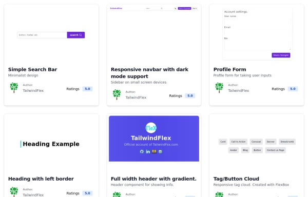
Card grid
This tailwind example is contributed by Leon Bachmann, on 17-Jan-2023. Component is made with Tailwind CSS v3. It is responsive. It supports dark mode.

Author Leon Bachmann
Related Examples
-
 3 years ago14.2k
 -
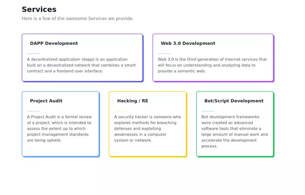
 Process Steps Grid
A structured way to present information about each step, along with corresponding icons and descriptions. Each step card is designed with a hover effect.
2 years ago11.8k -
 3 years ago10.6k
 -
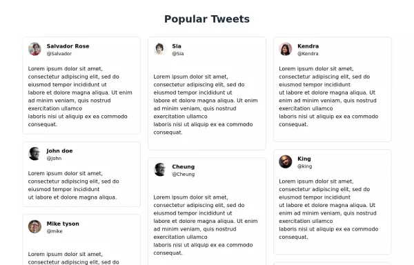 Tweets showcase grid
Responsive tweets showcase grid
3 years ago11.2k -
 Responsive Card Grid
Tailwind CSS responsive grid for feature listing. The cards have a teal background, rounded corners, and a concise display of feature titles, descriptions, and a "Learn More" link.
3 years ago52.2k -
 Products card grid
Example of product card grid with product image and pricing
3 years ago24.1k -
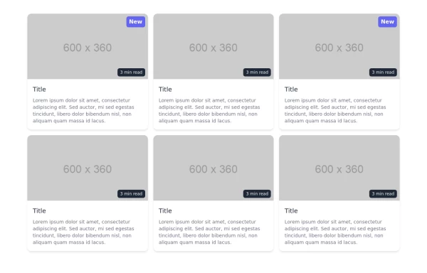
 Tailwind image gallery
Responsive grid with evenly spaced image cards. Each card has a title label at the bottom, and there's a subtle hover effect for interactive engagement.
3 years ago61.1k -
 3 years ago11.3k
 -
 Feature Showcase
The feature showcase's responsive grid can also be used as testimonial cards.
3 years ago25.8k -
 Twitter Post (Tweet) UI Mockup
A detailed static HTML and Tailwind CSS component replicating the user interface of a single Twitter post (Tweet). This mockup includes the user avatar, tweet header (name, handle, timestamp), tweet text with styled hashtags/mentions, optional media display, and the action bar with icons and counts (Reply, Retweet, Like, Views, Share). It is responsive, supports light and dark modes, and uses accurate iconography and hover states to closely resemble the real Twitter UI.
10 months ago771 -
 2 years ago20.5k
 -
 Animated Feature Grid Component with Tailwind CSS
Animated feature grid component built with Tailwind CSS. Features smooth hover animations, gradient cards, dark mode support, and responsive design. Perfect for showcasing product features.
2 months ago411


Explore components by Tags
Didn't find component you were looking for?
Search from 3000+ components