Work Showcase Cards
Highlight your top projects or products with these cards, featuring images and brief descriptions.
This example has a subtle hover effect.
This tailwind example is contributed by Computer guy, on 09-Sep-2023. Component is made with Tailwind v3.4. It is responsive. similar terms for this example are Services,Why choose us

Related Examples
-
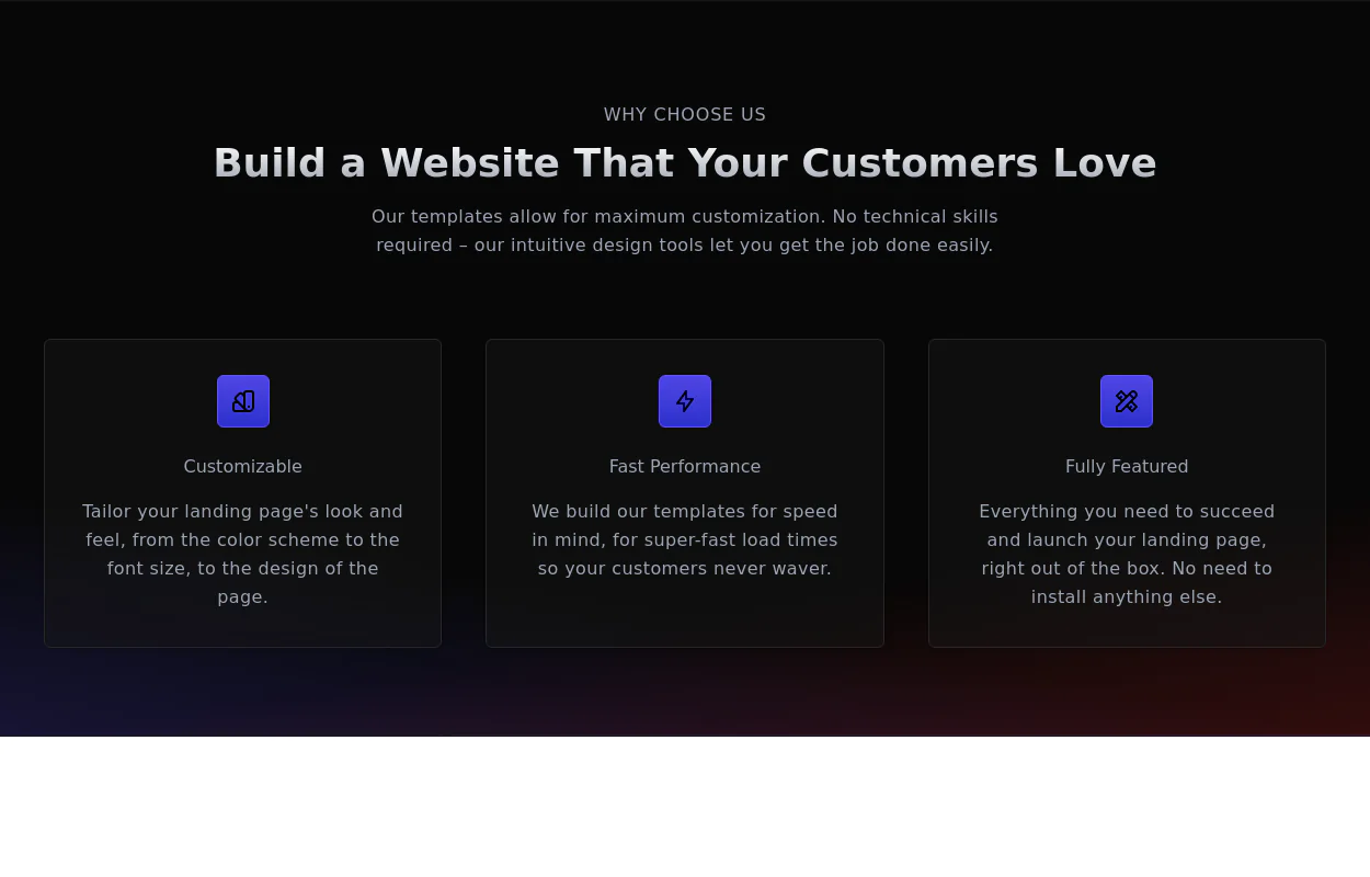 Why choose us section
list your product features beautifully
29.5k -

-
 Product page
Product Information Card component that provides comprehensive details about a product, including an image, name, description, price, availability, color and size options, and a product description.
49.4k -
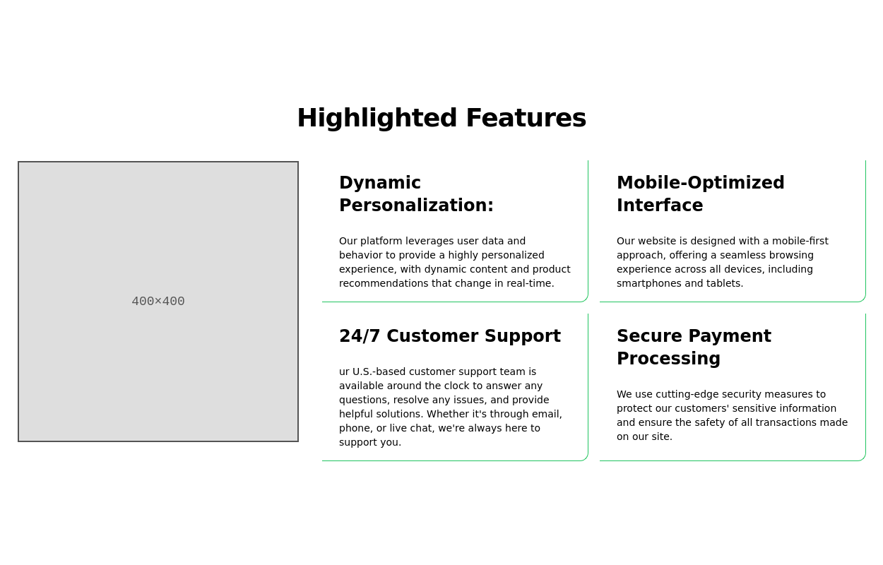
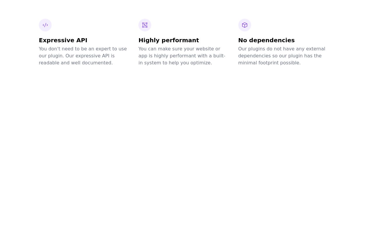 tailwind services section
display features/services of your product
21.4k -

-

-
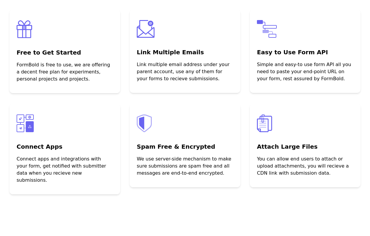
 Feature / Icon grid
Present information in a clear and organized manner with icons.
15.5k -
 Features grid example
Tailwind clean and responsive features section with the heading
14.6k -
 Tailwind image gallery
Responsive grid with evenly spaced image cards. Each card has a title label at the bottom, and there's a subtle hover effect for interactive engagement.
62.4k -
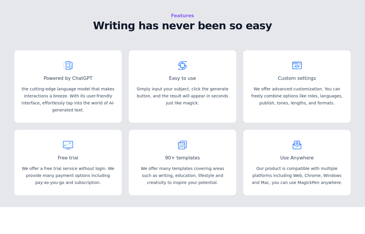 15.2k
15.2k -
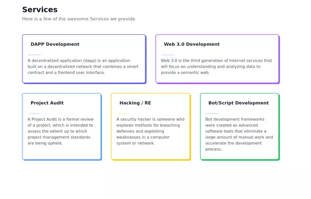 Feature Showcase
The feature showcase's responsive grid can also be used as testimonial cards.
26.7k -
 Features section
Showcase your key features
17.6k -
 Process Steps Grid
A structured way to present information about each step, along with corresponding icons and descriptions. Each step card is designed with a hover effect.
12k -
 Responsive Card Grid
Tailwind CSS responsive grid for feature listing. The cards have a teal background, rounded corners, and a concise display of feature titles, descriptions, and a "Learn More" link.
53.8k -
-
-

-






Browse by topic
Explore components by Tags
Jump straight to the UI pattern you need.
Can't find it?
Didn't find the component you were looking for?
Search across 3,000+ community-built components and grab the code in seconds.