Features grid
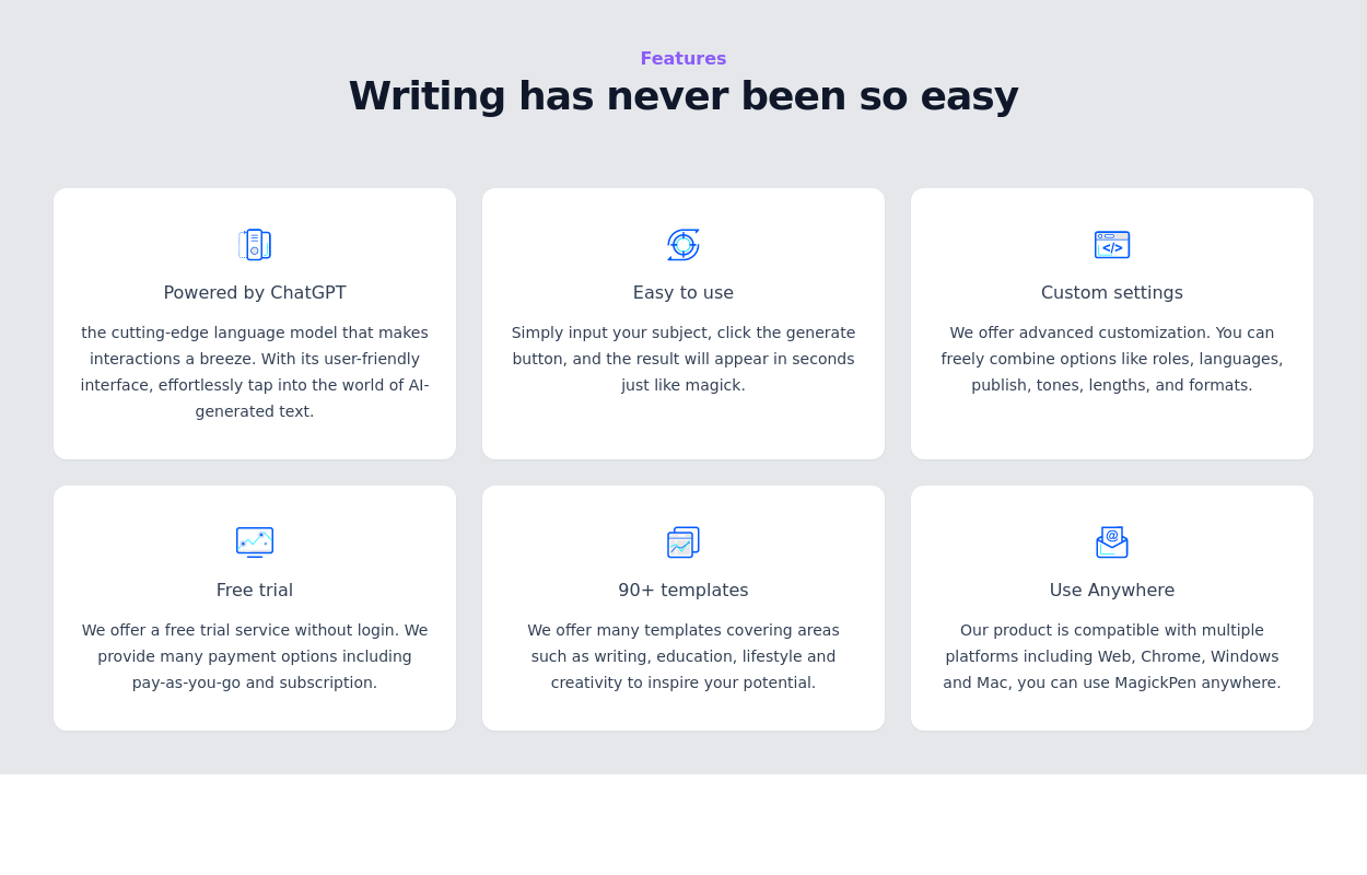
This tailwind example is contributed by Sophia Baker, on 20-Jan-2023. Component is made with Tailwind v3.4. It is responsive. It supports dark mode. similar terms for this example are Services,Why choose us

Related Examples
-

-
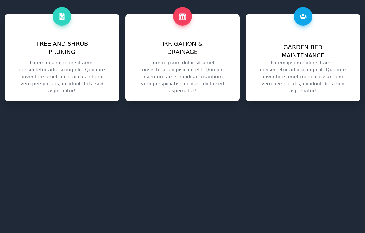
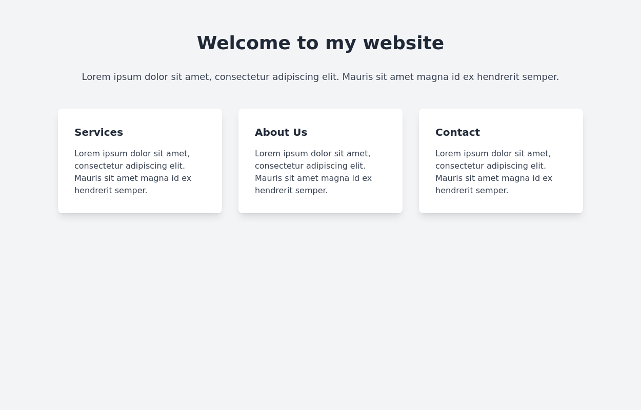
 Responsive Card Grid
Tailwind CSS responsive grid for feature listing. The cards have a teal background, rounded corners, and a concise display of feature titles, descriptions, and a "Learn More" link.
53.8k -
-
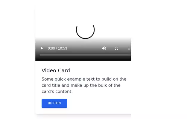 Video card
Video card component for tailwind css
18.3k -
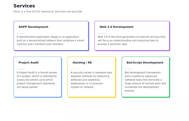 Feature Showcase
The feature showcase's responsive grid can also be used as testimonial cards.
26.7k -

-
 15.2k
15.2k -
 11.5k
11.5k -
 Images grid
Responsive image grid with tailwindcss.
20.1k -
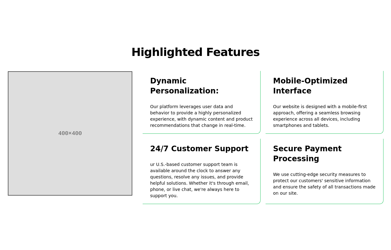
 Features section
Showcase your key features
17.6k -
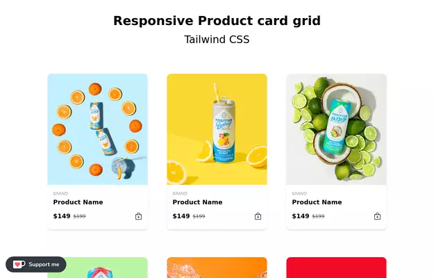 Responsive products grid
Responsive product card grid using tailwind CSS.
46.2k -
-
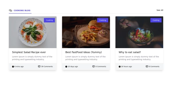 Card grid section
Display article/blog grid
31.2k -
 Clickable and Responsive Card Grid
It is designed to showcase and link to various topics or content categories.
11.8k -

-
 Responsive card grid
responsive card grid for articles
16.6k -
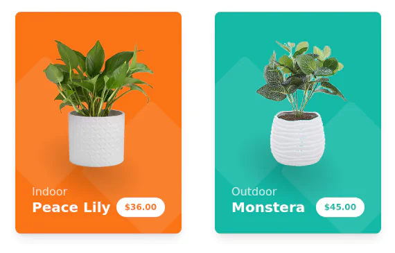 Products cards w/ hover effect
Example of product card grid with product image, pricing and a hover effect FORKED FROM: https://tailwindflex.com/noob_dev/products-card-grid
20.2k



Browse by topic
Explore components by Tags
Jump straight to the UI pattern you need.
Can't find it?
Didn't find the component you were looking for?
Search across 3,000+ community-built components and grab the code in seconds.