Company Logos Showcase
Client showcase with icons
This tailwind example is contributed by Brandon D, on 24-Sep-2022. Component is made with Tailwind CSS v3. It is responsive. It supports dark mode.

Author Brandon D
Related Examples
-
 2 years ago10.3k
 -
 2 years ago12.9k
 -
 image gallery
image gallery [lightbox]
2 years ago19.8k -
 Image gallery using grid
basic image gallery that displays images in a responsive grid, with an overlay and a "View" button that appears on hover. You can further customize and enhance it to fit your design and functionality requirements.
2 years ago10.5k -
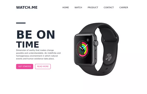 Product Page
Showcase for the product.
3 years ago32.4k -
 Products card grid
Example of product card grid with product image and pricing
3 years ago23.8k -
 Company icons grid
responsive company icons showcase grid
2 years ago11.8k -
 Overlapped icons showcase
Al pasar el cursor sobre el ícono apilado, se revela el ícono completo. Hovering over the stacked icon unveils the complete icon.
1 year ago2.1k -
 Logo cloud - Htmlwind
Grid logo cloud
6 months ago609 -
 2 years ago12.9k
 -
 2 years ago13k
 -
 6 months ago684


Explore components by Tags
Didn't find component you were looking for?
Search from 3000+ components