an off line game of catching afox
an off line game of catching afox
This tailwind example is contributed by Bonimater, on 29-May-2025. Component is made with Tailwind CSS v3. It is responsive. similar terms for this example are CTA,banner,Masonry, Image grid

Author Bonimater
Related Examples
-
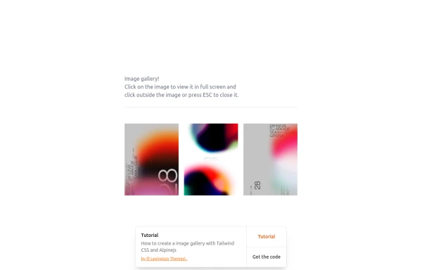
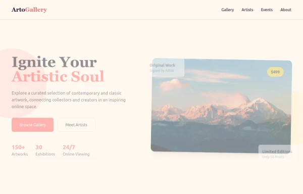 ArtoGallery
Explore a curated selection of contemporary and classic artwork, connecting collectors and creators in an inspiring online space.
9 months ago1.2k -
 3 years ago15.4k
 -
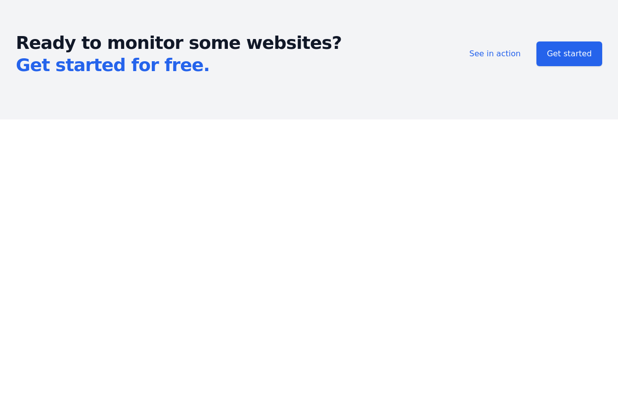
 Responsive CTA
Tailwind CTA card
1 year ago2.5k -
 Call-to-Action Card
Early Access Signup Card
1 year ago2k -
 3 years ago10.6k
 -
 3 years ago9.9k
 -
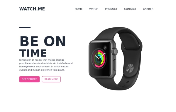 Product Page
Showcase for the product.
1 year ago2.6k -
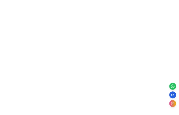 Floating Action Button
This component displays a fixed, floating contact button panel positioned at the bottom-right corner of the screen. It provides users with quick access to key communication channels including WhatsApp, Email, and Instagram. Each icon is styled with vibrant, platform-specific colors and includes subtle hover animations for an interactive user experience. Ideal for improving accessibility and encouraging user engagement, especially on mobile devices.
11 months ago1.6k -
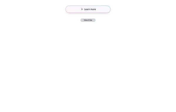 Bubblegum Button
This interactive button component is designed with a sleek gradient background and smooth hover effects, making it an eye-catching call-to-action element for modern web interfaces. Styling and Features: ✅ Gradient Background & Rounded Shape • The button container has a subtle gradient overlay (bg-gradient-to-tr) that smoothly transitions from soft pink (from-pink-300) to light blue (to-blue-300), giving it a vibrant and modern look. • Wrapped in a rounded-full container for a pill-shaped aesthetic. ✅ Floating & Shadow Effects • The shadow-lg property creates a soft floating effect, enhancing depth and visibility. • Will-change-transform optimizes animations for a seamless hover experience. ✅ Interactive Hover Animations • On hover, the inner button scales up (hover:scale-105) and lifts slightly (hover:-translate-y-2), simulating a press-and-release motion. • The transition is smooth, with a 500ms animation (transition duration-500). ✅ Content & Icon • The “Learn more” label is paired with a right-arrow icon (svg) for clear visual guidance. • The icon and text are flex-aligned (items-center flex), ensuring a balanced and responsive layout. This button is ideal for call-to-action elements, product highlights, or download prompts, offering a modern, sleek, and engaging user experience. 🚀
1 year ago1.4k -
 gallary
html , css
10 months ago664 -
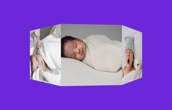 3D Animated Image Gallery
3D Animated Image Gallery
1 year ago8.9k -
 e-commerce website landing page template with Tailwind CSS.
A clean, responsive e-commerce & blog template built with Tailwind CSS. Features light/dark mode, dynamic featured posts, hero, CTA, and SEO-ready sections.
2 months ago536


Explore components by Tags
Didn't find component you were looking for?
Search from 3000+ components