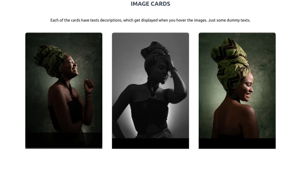
image gallery with Tailwind CSS and Alpinejs
This tailwind example is contributed by Michael Andreuzza, on 27-Apr-2024. Component is made with Tailwind CSS v3. It is responsive. similar terms for this example are Masonry, Image grid

Author Michael Andreuzza
Related Examples
-
 1 year ago5.3k
 -
 Image gallery using grid
basic image gallery that displays images in a responsive grid, with an overlay and a "View" button that appears on hover. You can further customize and enhance it to fit your design and functionality requirements.
2 years ago10.6k -
 image gallery
image gallery [lightbox]
2 years ago20.4k -
 Gallery
Masonry Grid
1 year ago3.4k -
 1 year ago2.2k
 -
 Avant & Après
Avant & Après
3 months ago399 -
 2 years ago22k
 -
 Image Grid
The layout is designed to showcase various categories or items using images and descriptive text. Each grid item features a high-quality image and a centered text overlay with a semi-transparent background
2 years ago14.7k -
 1 year ago1.2k
 -
 Responsive Tailwind CSS Listing Cards
This is a collection of responsive listing cards built with Tailwind CSS, optimized for modern web applications. The component features a flexbox layout, ensuring seamless responsiveness across mobile, tablet, and laptop screens. Each card includes an image, title, and description, styled for both light and dark modes. Perfect for showcasing products, portfolio items, or blog posts.
1 year ago2.1k -
 3D Animated Image Gallery
3D Animated Image Gallery
1 year ago8.9k -
 gallary
html , css
10 months ago666


Explore components by Tags
Didn't find component you were looking for?
Search from 3000+ components