responsive slider carousel
slider carousel
This tailwind example is contributed by Abhiraj, on 01-Jan-2025. Component is made with Tailwind CSS v3. It is responsive. It supports dark mode. similar terms for this example are Masonry, Image grid

Author Abhiraj
Related Examples
-
 Simple Multi-Purpose Slider
This is a very minimalistic though very usable slider for various situations like CTA's, quotes or other uncomplicated content. I only used Tailwindcss which makes it very lightweight, but due to limitations it's not as flexible as I wished for. This could be easily achieved by a little piece of JS to make it as dynamic as you wish.
1 year ago2.5k -
 ACODE MASTER — Cyberpunk Full Stack Developer from Rwanda
"I’m ACODE MASTER — a visionary Full Stack Developer from Rwanda, blending cutting-edge tech with bold design. I specialize in building modern web applications using React, Node.js, and TailwindCSS, inspired by the cyberpunk aesthetic and driven by a passion for digital innovation. Welcome to the future of code."
9 months ago1.5k -
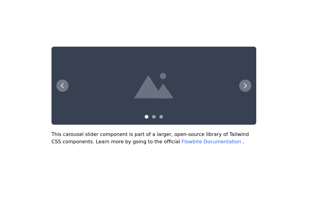 Image carousel
Uses Flowbite
3 years ago31.4k -
 3D Animation Studio
3D animation is the process of creating three-dimensional products, objects, backgrounds, etc., and setting them in motion within a digital environment. It's commonly used for the web, social media marketing, product design, film, cartoons, commercials, and video games.
9 months ago1.7k -
 Premium High-Performance Web Gaming Hub
Experience the future of browser-based gaming. I’ve developed a premium arcade hub designed for speed, clarity, and zero-latency gameplay. Built with modern web technologies, Ayyamperumal Games brings AAA-inspired visuals and high-octane mechanics directly to your browser—no downloads, no lag, just pure performance. Explore a curated library of titles ranging from minimalist logic puzzles like Sudoku Elite to fast-paced action in Neon Drift. This is where clean code meets high-level entertainment.
1 month ago279 -
 Responsive Image Carousel with Alpine.js
This component is a fully responsive image carousel/slider that displays: 1 slide at a time on mobile devices (screen width < 768px) 3 slides at a time on desktop (screen width ≥ 768px)
3 months ago241 -
 Team Hero Section with Carousel
A clean and responsive hero section featuring an experts carousel built with Tailwind CSS, Swiper, and Alpine.js. The section highlights key experts with contact details and a clear call-to-action, making it ideal for landing pages and service-focused websites.
1 month ago64 -
 1 year ago5.3k
 -
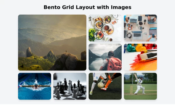
 Images grid
Responsive image grid with tailwindcss.
3 years ago19.2k -
 BONIMATOR Game Portal
BONIMATOR Game Portal
6 months ago702 -
 Next-Gen Hero Section – Tailwind CSS Component
A stunning, futuristic Hero Section built with Tailwind CSS, designed to capture user attention with glowing animations, smooth gradients, and bold typography. Perfect for modern web apps, education platforms like EduForce, landing pages, or portfolios. This component is responsive, interactive, and visually unique — not commonly found in typical UI libraries.
9 months ago1.3k -
 Multi Range Slider
Adjust the sliders to set your preferred price range. The left slider sets the minimum price, and the right slider sets the maximum price. The selected range is displayed below the sliders in real-time, allowing you to easily filter products within your budget.
1 year ago1.9k


Explore components by Tags
Didn't find component you were looking for?
Search from 3000+ components