AcodeMaster GameZone – Play Your Favorite Games Online
AcodeMaster GameZone is a modern gaming website where you can discover, explore, and play exciting games anytime, anywhere. Designed with smooth animations and a stylish dark theme using Tailwind CSS, it offers a fast and fun experience for every gamer.
This tailwind example is contributed by Code Master(Mfuranziza Dusabe Hamza), on 22-May-2025. Component is made with Tailwind CSS v3. It is responsive. similar terms for this example are Masonry, Image grid

Related Examples
-
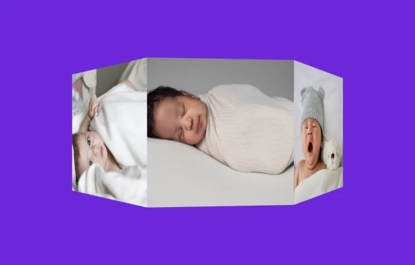 3D Animated Image Gallery
3D Animated Image Gallery
1 year ago8.9k -
 Modern Responsive Footer with Tailwind CSS
This sleek and modern responsive footer is built using HTML and Tailwind CSS. It features three sections: brand information, useful links, and social media icons. The footer includes smooth hover effects, subtle fade-in animations, and a fully responsive design that adapts seamlessly to different screen sizes. Perfect for websites looking for a professional and stylish footer section.
1 year ago2k -
 Clean AI Chat UI with Tailwind CSS – ChatGPT-Style Interface
A polished and responsive AI chat interface built using modern Web Components and Tailwind CSS. This UI replicates the smooth, minimal experience of ChatGPT with a clean layout, floating input bar, animated scrollable message feed, and mock AI responses. Ideal for SaaS dashboards, AI assistants, or frontend prototypes. Designed with professional spacing, accessible colors, and reusable components. Key features: Responsive layout with mobile support Floating input bar with auto-expanding textarea Tailwind-powered message bubbles with clear sender roles Modern dark theme with subtle gradients and shadows Easily extendable to real AI APIs (e.g., OpenAI)
9 months ago1.9k -
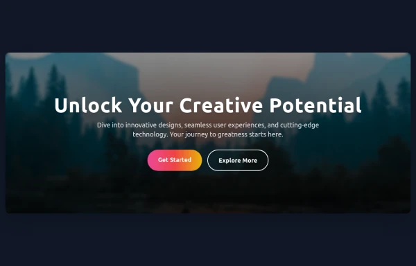 Hero Section
Responsive Hero Section for you Project Background Image: A stunning, high-quality Unsplash photo that creates a unique visual impact. Overlay: Semi-transparent black overlay with blur effect for readability and a modern aesthetic. Content Area: Centered with a gradient background overlay for contrast, bold headline, engaging subtext. Buttons: Vibrant gradient and clean border with smooth hover animations to draw attention. Responsive Design: Looks great on all screen sizes with adaptable padding and font sizes.
8 months ago1.5k -
 "Visit Rwanda" tourism website focusing on wildlife, particularly mountain gorillas
Key Features of This Rwanda Tourism Website: Focus on Mountain Gorillas ("Ingagi"): Dedicated section highlighting gorilla trekking experiences Information about conservation efforts Booking options for gorilla permits Wildlife Showcase: Featured animals including gorillas, golden monkeys, elephants, lions, and more Beautiful image cards for each species Conservation-focused messaging National Parks Information: Sections on Volcanoes, Akagera, and Nyungwe National Parks Visual highlights of each park's unique features User Experience: Responsive design that works on all devices Attractive color scheme inspired by Rwanda's landscapes Easy navigation with clear calls-to-action Practical Information: Contact form for tour inquiries Testimonials from previous visitors Footer with important links and contact details
8 months ago755 -
 My Coding Journey
To transform a standard timeline into an engaging, scroll-driven narrative experience.
5 months ago591 -
 FLESH & BONE
Stranded in the heart of a cannibal-infested jungle, you must make unthinkable choices to survive. How far will you go to see another sunrise?
3 months ago284 -
 Premium Gaming UI Card, Form & Animated Button (Tailwind CSS)
A modern, senior-level gaming UI built with Tailwind CSS focusing on spacing, typography, and calm visual hierarchy rather than noisy effects. This component set includes: A premium gaming card with clear content structure and outcome-focused copy A clean player signup form with accessible focus states and minimal visual noise A custom animated button using a restrained light-sweep effect for premium interaction feedback Designed to resemble real production gaming platforms rather than demo or template UI. Fully responsive, copy-paste ready, and easy to extend for real-world projects.
1 month ago144 -
 hero modern
hero modern
1 month ago128 -
 Premium High-Performance Web Gaming Hub
Experience the future of browser-based gaming. I’ve developed a premium arcade hub designed for speed, clarity, and zero-latency gameplay. Built with modern web technologies, Ayyamperumal Games brings AAA-inspired visuals and high-octane mechanics directly to your browser—no downloads, no lag, just pure performance. Explore a curated library of titles ranging from minimalist logic puzzles like Sudoku Elite to fast-paced action in Neon Drift. This is where clean code meets high-level entertainment.
1 month ago271 -
 LIQUID PLASMA by omerlinks
LIQUID PLASMA by omerlinks
1 month ago87 -
 Pagination
It's my first project which i made him in the using tailwind css and html
3 months ago189


Explore components by Tags
Didn't find component you were looking for?
Search from 3000+ components