Hero Slider with Alpine.js
This responsive hero slider features full-screen image backgrounds with elegant text overlays and smooth transitions.
This tailwind example is contributed by Juraj, on 16-May-2025. Component is made with Tailwind CSS v3. It is responsive.

Author Juraj
Related Examples
-
 3D Animated Image Gallery
3D Animated Image Gallery
1 year ago9k -
 Hero Section
Responsive Hero Section for you Project Background Image: A stunning, high-quality Unsplash photo that creates a unique visual impact. Overlay: Semi-transparent black overlay with blur effect for readability and a modern aesthetic. Content Area: Centered with a gradient background overlay for contrast, bold headline, engaging subtext. Buttons: Vibrant gradient and clean border with smooth hover animations to draw attention. Responsive Design: Looks great on all screen sizes with adaptable padding and font sizes.
9 months ago1.5k -
 Linear dinamique section by Raul antonio de la cruz hernandez remix omerlinx responsive
Linear dinamique section by Raul antonio de la cruz hernandez remix omerlinx responsive
2 months ago216 -
 tinderclone By omerlinks
tinderclone By omerlinks
2 months ago167 -
 omerlinkStream
omerlinkStream
2 months ago532 -
 Premium High-Performance Web Gaming Hub
Experience the future of browser-based gaming. I’ve developed a premium arcade hub designed for speed, clarity, and zero-latency gameplay. Built with modern web technologies, Ayyamperumal Games brings AAA-inspired visuals and high-octane mechanics directly to your browser—no downloads, no lag, just pure performance. Explore a curated library of titles ranging from minimalist logic puzzles like Sudoku Elite to fast-paced action in Neon Drift. This is where clean code meets high-level entertainment.
2 months ago433 -
 Team Hero Section with Carousel
A clean and responsive hero section featuring an experts carousel built with Tailwind CSS, Swiper, and Alpine.js. The section highlights key experts with contact details and a clear call-to-action, making it ideal for landing pages and service-focused websites.
2 months ago72 -
 card section neon
card section neon
1 month ago318 -
 1 year ago3.2k
 -
 3 months ago175
 -
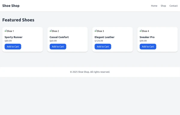 SHOES SHOP
all categories of shoes like women ,men ,and children
10 months ago755 -
 Responsive Portfolio Webpage with Tailwind CSS
This is a reusable and responsive portfolio webpage template created with HTML and Tailwind CSS. Designed for developers or creatives, the template includes essential sections like Header, Hero, About, Skills, Experience, Projects, Testimonials, Contact Form, and Footer. It features a clean, modern design and is fully customizable without requiring JavaScript. Perfect for showcasing personal or professional work on the web.
1 year ago2.5k


Explore components by Tags
Didn't find component you were looking for?
Search from 3000+ components