Trending Components of
-
# 1
author
Brandon D540 -
# 2
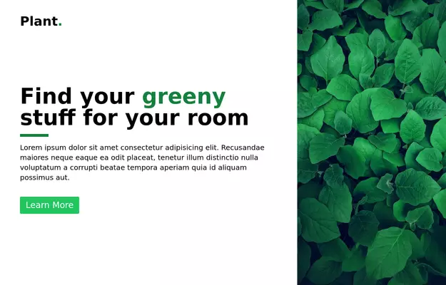
 Tailwind flex Hero
Show Image with flex image gallery

author
Riaz Uddin Masum474 -
# 3
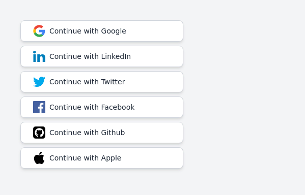 Continue with social login buttons (google, linkedin, twitter, facebook, github, apple)
Login/signup buttons for Google, LinkedIn, Twitter, Facebook, GitHub, and Apple
author
Prajwal Hallale420 -
# 4
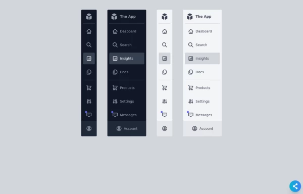 Responsive Sidebar
Fully Responsive sidebar in both color modes light & dark with mini bar too.
author
AKASH GANDHAR402 -
# 5
 Flour mill website landing page template
flour mill and services template website which comprise of many sections like about us, featured products, why us, visit us

author
Amit Pachange395 -
# 6
 Carousel with Tailwind CSS and Alpine.js
Simple card Carousel
author
Brandon D391 -
# 7
-
# 8
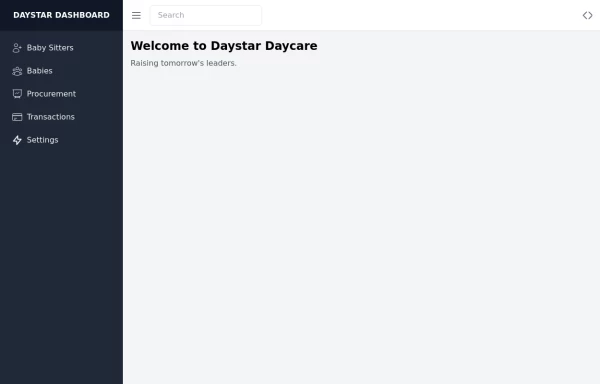 Daystar Day care Dashboard
Daystar Day care Dashboard
author
Paul Livingstone Ssenoga381 -
# 9
 Modern Login Page
Dive into a world of cool animations and captivating visuals. This beautifully crafted interface is not only eye-catching but also highly functional. You can use it as-is or customize it to make it your own. Share your ideas, and let’s create something extraordinary together!” Feel free to tweak it further or add any specific details you’d like. 😊🎨
author
AyDin VM356 -
# 10
 omerlinkStream
omerlinkStream
author
Omer fils ELENGA321 -
# 11
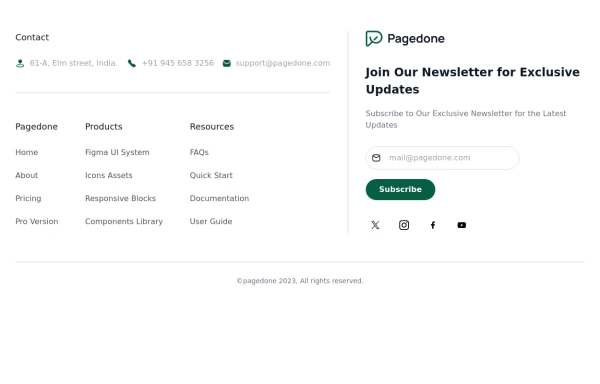 Tailwind Footer Template
Following is the Tailwind CSS template for creative footer with contact information like address, email, phone number and a newsletter with social icons and site links.

author
Pagedone319 -
# 12
-
# 13
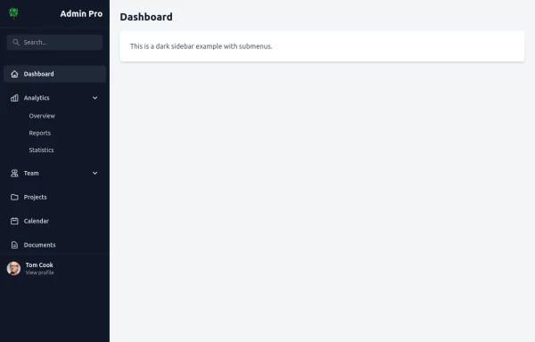
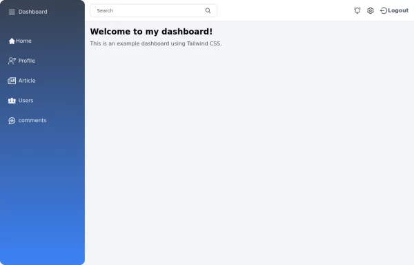 Tailwind Sidebar Layout
Place edited for the search button
author
Nur Pratap Karki306 -
# 14

author
pablitodgb302 -
# 15
author
Aman kumar290 -
# 16
 sidebar responsive
responsive sidebar with working links
author
Ganesh Salunke284 -
# 17
-
# 18

-
# 19

author
Omer fils ELENGA270 -
# 20


author
Maxim269


