Multi Range Slider
Adjust the sliders to set your preferred price range. The left slider sets the minimum price, and the right slider sets the maximum price. The selected range is displayed below the sliders in real-time, allowing you to easily filter products within your budget.
This tailwind example is contributed by SHARIFUL ISLAM, on 16-Feb-2025. Component is made with Tailwind v3.4. It is responsive.

Related Examples
-
 14.7k
14.7k -
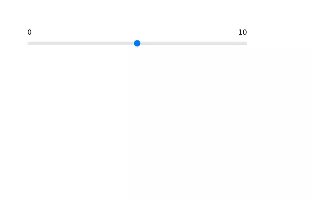 Range slider
Range slider with upper limit and lower limit.
13.1k -

-

-
 13.4k
13.4k -
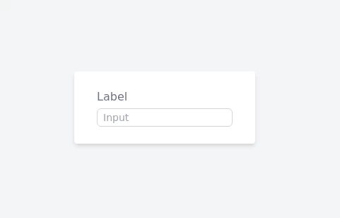 Serious Input Html
Input text serious like apple or smth
2.8k -
-
-
 Responsive Footer Section
This modern and responsive footer adapts seamlessly to all screen sizes, ensuring a clean and organized layout. It includes essential navigation links, contact details, and a subscription form, all structured for easy access. Using display: contents;, the design remains flexible and visually balanced, enhancing the user experience across devices.
1.2k -
 beautiful tailwind contact form
beautiful tailwind contact form
6.5k -
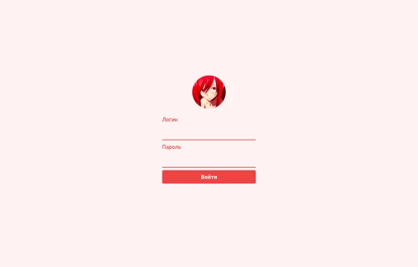
 login
loginhtml , css
1.3k -







Browse by topic
Explore components by Tags
Jump straight to the UI pattern you need.
Can't find it?
Didn't find the component you were looking for?
Search across 3,000+ community-built components and grab the code in seconds.