Gallery
Masonry Grid
This tailwind example is contributed by Aman kumar, on 28-Jun-2024. Component is made with Tailwind CSS v3. It is responsive. similar terms for this example are Masonry, Image grid

Author Aman kumar
Related Examples
-
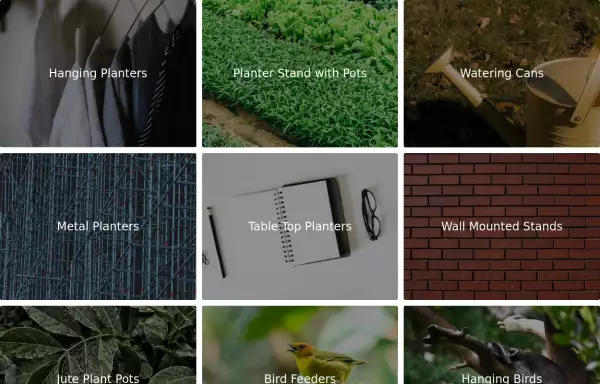 Image Grid
The layout is designed to showcase various categories or items using images and descriptive text. Each grid item features a high-quality image and a centered text overlay with a semi-transparent background
2 years ago14.5k -
 gallary
html , css
10 months ago664 -
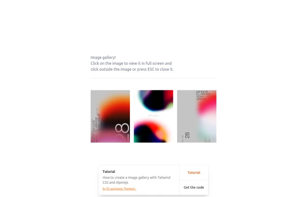
 image gallery
image gallery [lightbox]
1 year ago3.6k -
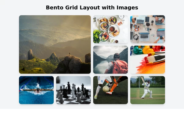
 Tailwind image gallery
Responsive grid with evenly spaced image cards. Each card has a title label at the bottom, and there's a subtle hover effect for interactive engagement.
3 years ago61.1k -
 ULTIMATE SNAKE
(click to https://quantum-snake.netlify.app/ )ULTIMATE SNAKE is a modern reimagining of the classic Snake game, blending retro gameplay with enhanced visuals, power-ups, and a dynamic difficulty system. Designed for both casual players and high-score chasers, this game brings nostalgia and excitement in every move.
9 months ago915 -
 2 years ago21.9k
 -
 responsive slider carousel
slider carousel
1 year ago2.3k -
 1 year ago2k
 -
 1 year ago5.3k
 -
 1 year ago12.1k
 -
 1 year ago2.1k
 -
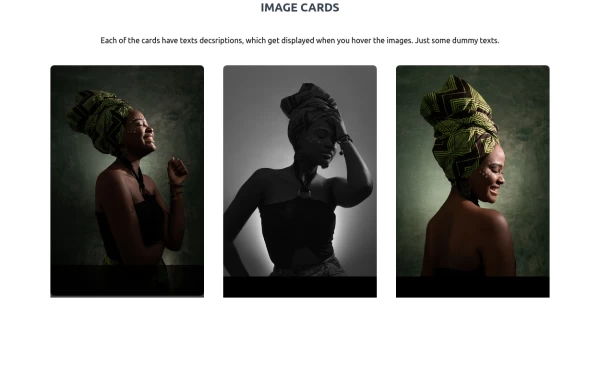
 Image gallery using grid
basic image gallery that displays images in a responsive grid, with an overlay and a "View" button that appears on hover. You can further customize and enhance it to fit your design and functionality requirements.
2 years ago10.6k


Explore components by Tags
Didn't find component you were looking for?
Search from 3000+ components