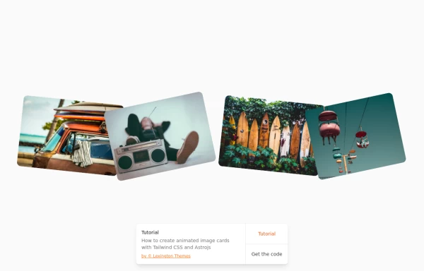
Image cards
This tailwind example is contributed by Reuben Enahoro, on 25-Nov-2024. Component is made with Tailwind CSS v3. It is responsive. similar terms for this example are Masonry, Image grid

Author Reuben Enahoro
Related Examples
-
 1 year ago12.1k
 -
 1 year ago5.3k
 -
 Responsive Tailwind CSS Listing Cards
This is a collection of responsive listing cards built with Tailwind CSS, optimized for modern web applications. The component features a flexbox layout, ensuring seamless responsiveness across mobile, tablet, and laptop screens. Each card includes an image, title, and description, styled for both light and dark modes. Perfect for showcasing products, portfolio items, or blog posts.
1 year ago2.1k -
 Profile Card
User profile card
4 months ago181 -
 Card
CardCard
1 year ago2.6k -
 masonary grids effect for cards using columns
As part of the redesign I was trying to think of ways to lay out testimonials from students, which may have varying length/content, I stumbled onto the idea of using a masonry layout (think bricks, think Pinterest).
1 year ago1.3k -
 3 years ago12.7k
 -
 Card
CardCard with Likes and download Button
2 years ago10.8k -
 1 year ago2.3k
 -
 Beautiful info cards
Responsive and minimal design
3 years ago10.6k -
 Labs card
Lab item list card
1 year ago2k -
 Play Music - Reproductor
Multimedia music player, with its respective dark mode
1 year ago2.7k


Explore components by Tags
Didn't find component you were looking for?
Search from 3000+ components