Simple Footer 2
This tailwind example is contributed by $@(\/)(\/)¥, on 14-Nov-2024. Component is made with Tailwind CSS v3. It is responsive. similar terms for this example are Masonry, Image grid,Email campaign

Author $@(\/)(\/)¥
Related Examples
-
 1 year ago1.7k
 -
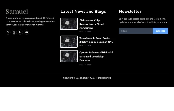
 Modern Dark Footer with Overlapping Gradient CTA
A comprehensive, dark-themed website footer component built with HTML and Tailwind CSS. It features a visually distinct overlapping section with a colorful gradient background containing a prominent call-to-action (CTA) block. The main footer area utilizes a multi-column grid layout for organized navigation links, a newsletter signup form, and social media icons. A final bottom bar includes legal links and copyright information. The design is responsive and adapts its layout for different screen sizes.
9 months ago1.1k -
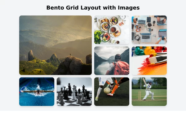
 Galerie Interactive
Galerie Interactive
1 week ago15 -
 1 year ago5.2k
 -
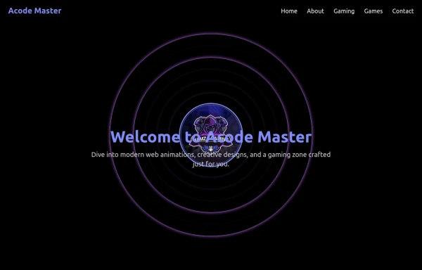 AcodeMaster GameZone – Play Your Favorite Games Online
AcodeMaster GameZone is a modern gaming website where you can discover, explore, and play exciting games anytime, anywhere. Designed with smooth animations and a stylish dark theme using Tailwind CSS, it offers a fast and fun experience for every gamer.
8 months ago1k -
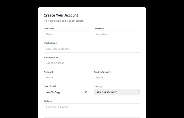 Responsive Form
This modern, fully responsive account creation form is designed using HTML and Tailwind CSS, ensuring a clean, professional, and accessible user experience. It features a card-based layout with smooth spacing, a subtle shadow effect, and a structured grid system for optimal responsiveness across all devices.
11 months ago1.3k -
 Basic footer
Basic footer with subscribe to the newsletter section
3 years ago9.7k -
 2 years ago13.3k
 -
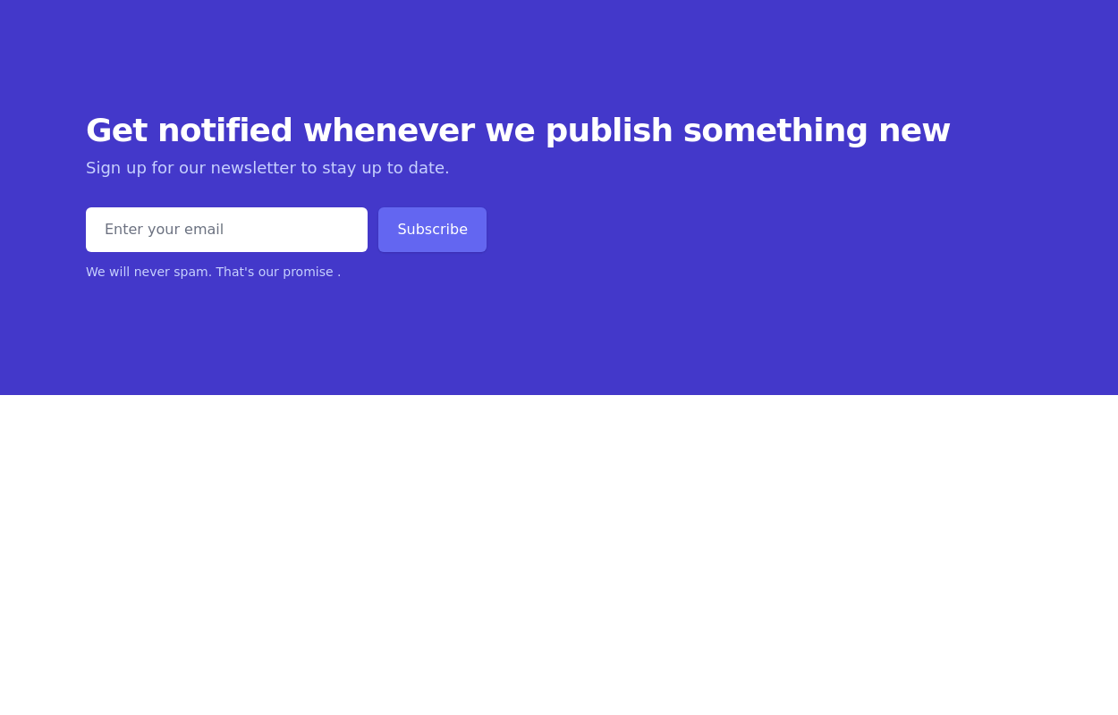
 Beta Program Signup Section
Collect user emails for your app
1 year ago2.6k -
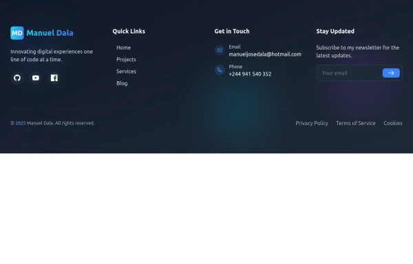
 Responsive Website Footer
A modern and clean website footer component with sections for branding, navigation links, social media icons, and copyright text. Designed to be fully responsive and suitable for portfolios, business websites, and web applications.
1 month ago223 -
 footer
footer
9 months ago1.8k -
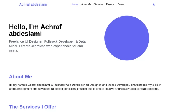 Responsive portfolio with dark mode
responsive and support dark mode .portfolio website
1 year ago3.7k


Explore components by Tags
Didn't find component you were looking for?
Search from 3000+ components