Process Steps Grid
A structured way to present information about each step, along with corresponding icons and descriptions. Each step card is designed with a hover effect.
This tailwind example is contributed by Computer guy, on 01-Oct-2023. Component is made with Tailwind v3.4. It is responsive. similar terms for this example is stepper

Related Examples
-

-
 Stepper example
Explain How it works to your audience
15.9k -
 Work Showcase Cards
Highlight your top projects or products with these cards, featuring images and brief descriptions. This example has a subtle hover effect.
13.4k -
 Tailwind image gallery
Responsive grid with evenly spaced image cards. Each card has a title label at the bottom, and there's a subtle hover effect for interactive engagement.
62.4k -
 12.7k
12.7k -
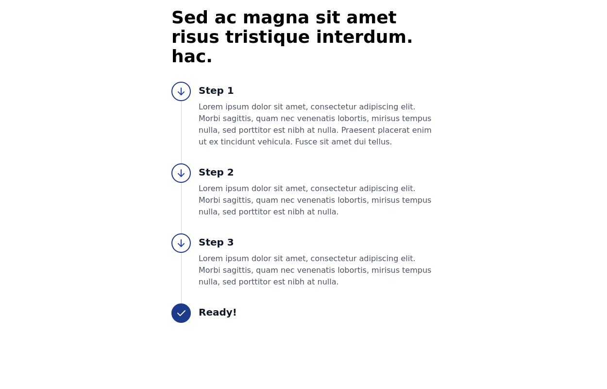
-
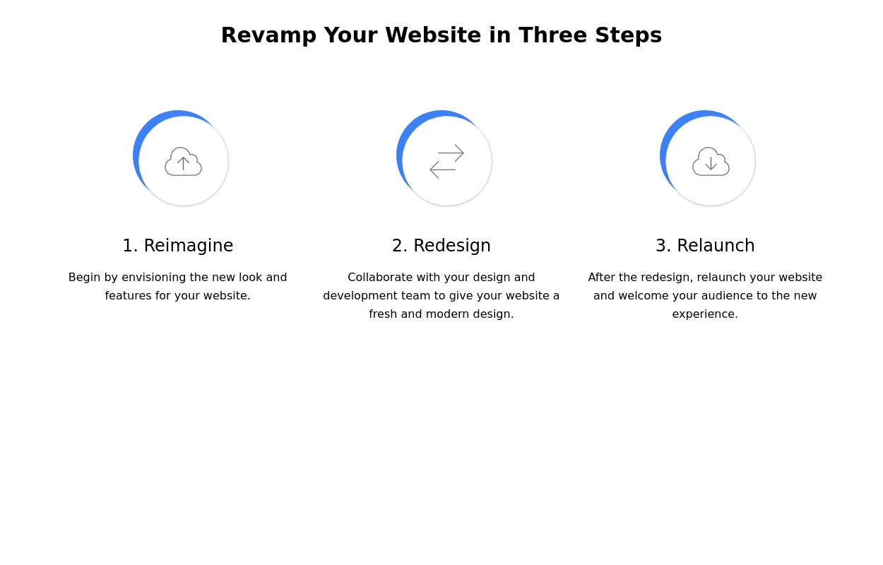 Steps section
Show features or steps of your website. Each step Includes Icons.
10.5k -
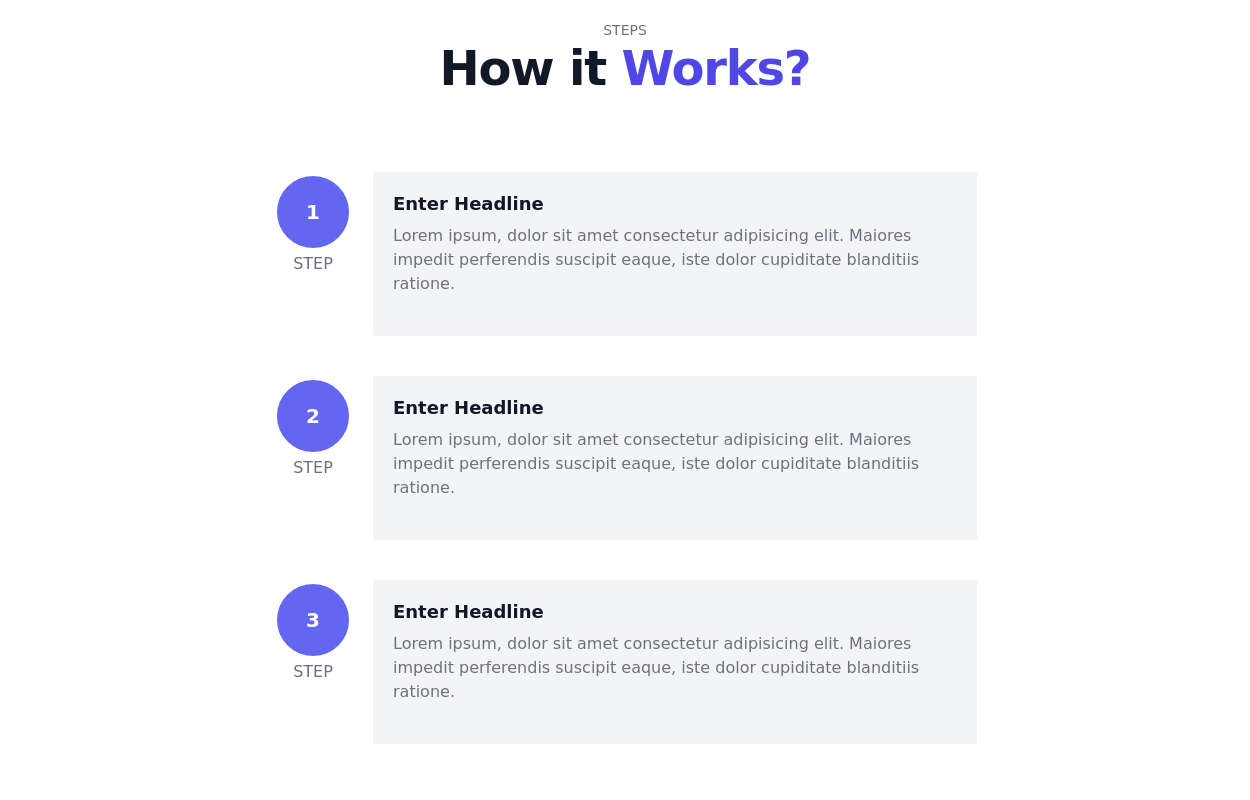 Stepper block
A full-width steps section
13k -
 Steps section for explaining process
Step component with a curved line connecting all steps
10.8k -
 Products card grid
Example of product card grid with product image and pricing
24.9k -
 Feature / Icon grid
Present information in a clear and organized manner with icons.
15.5k -
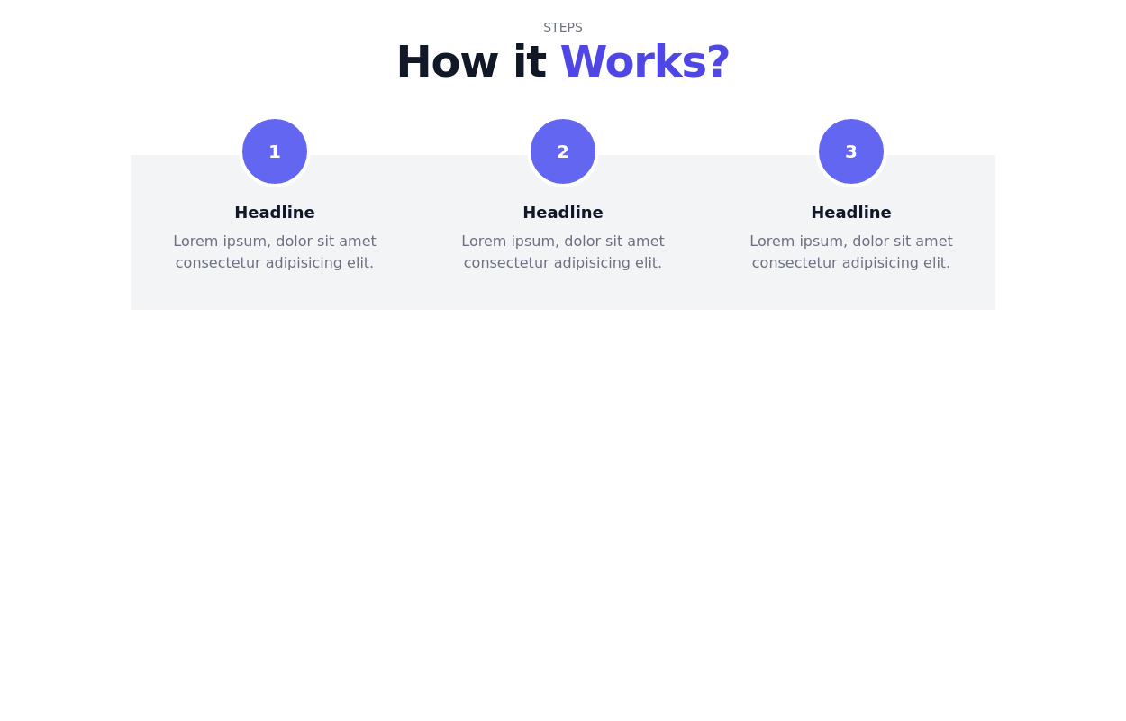 13.2k
13.2k -

-
 Data Metrics Showcase
An information panel designed to instill trust, presenting vital statistics about a service or product. The grid layout offers a clean and organized look for displaying key data.
9k -
 10.6k
10.6k -
 Masonry Grid
Auto-adjusting masonry grid
32.9k







Browse by topic
Explore components by Tags
Jump straight to the UI pattern you need.
Can't find it?
Didn't find the component you were looking for?
Search across 3,000+ community-built components and grab the code in seconds.