Product page
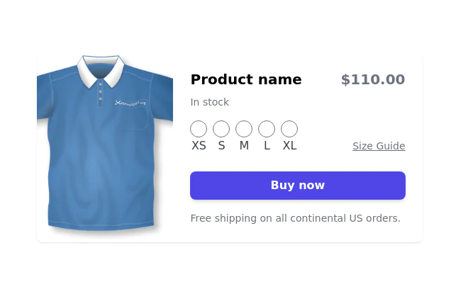
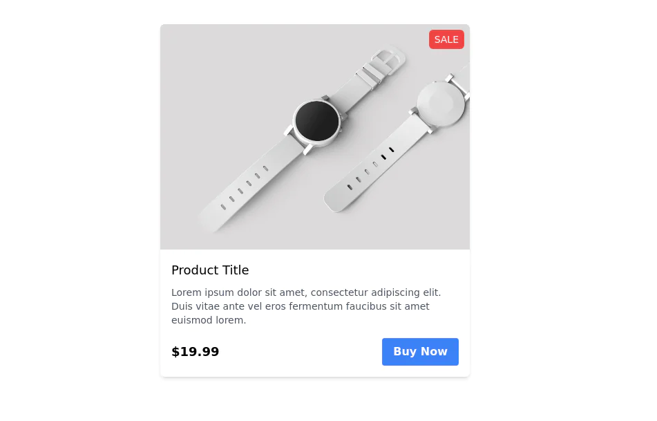
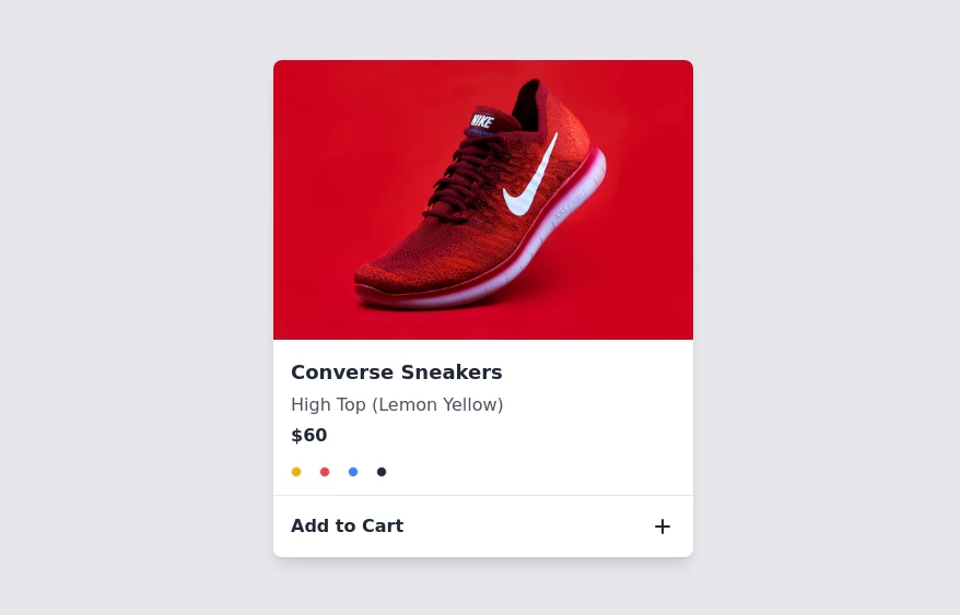
Product Information Card component that provides comprehensive details about a product, including an image, name, description, price, availability, color and size options, and a product description.
This tailwind example is contributed by JaxStone, on 28-Jan-2023. Component is made with Tailwind CSS v3. It is responsive. It supports dark mode. similar terms for this example are Product Showcase, Product card

Author JaxStone
Related Examples
-
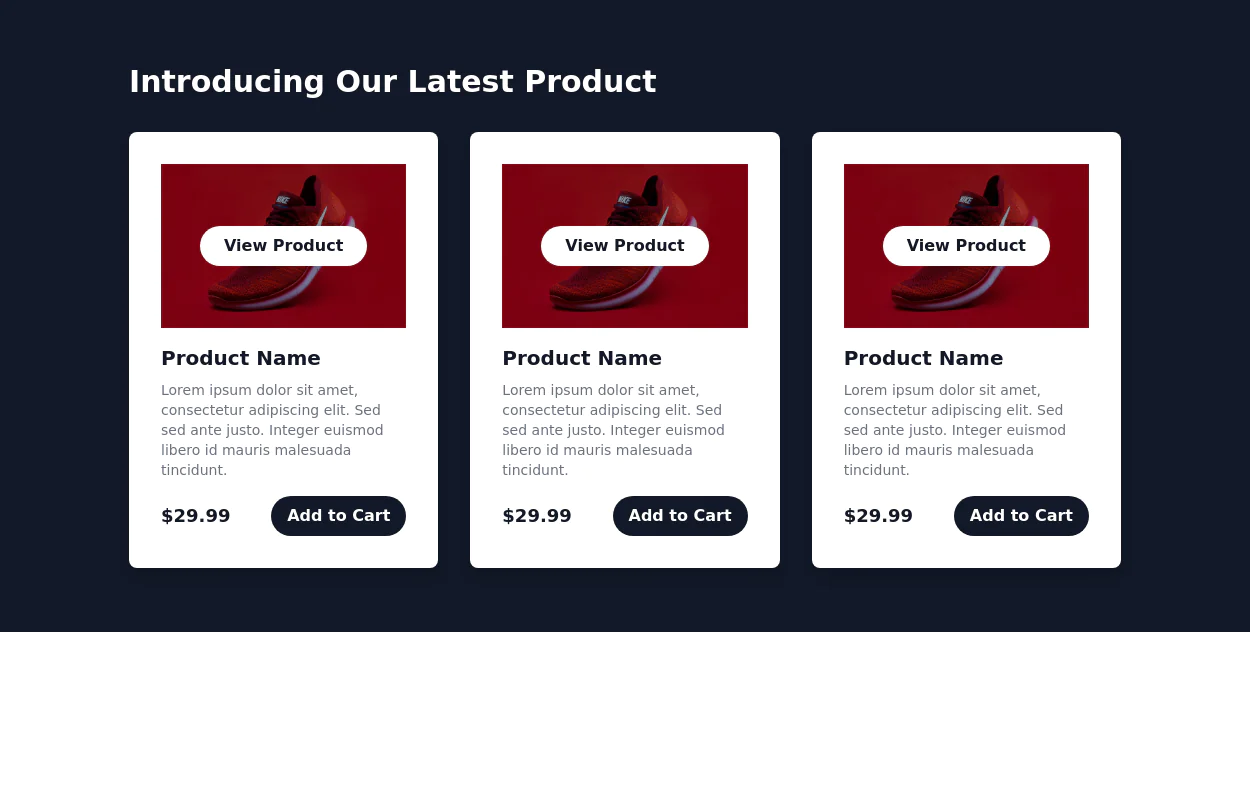
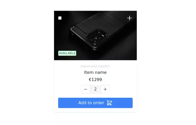
 Responsive products grid
Responsive product card grid using tailwind CSS.
3 years ago45k -
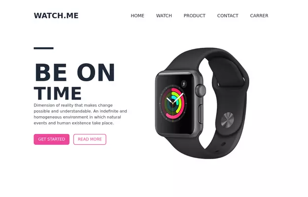 Product Page
Showcase for the product.
3 years ago33.3k -
 3 years ago31.7k
 -
 3 years ago27.2k
 -
 3 years ago14k
 -
 3 years ago14k
 -
 3 years ago10.1k
 -
 3 years ago12.9k
 -
 Work Showcase Cards
Highlight your top projects or products with these cards, featuring images and brief descriptions. This example has a subtle hover effect.
2 years ago12.6k -
 3 years ago11.3k
 -
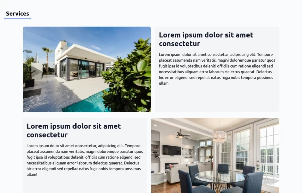 House Cleaning Website Services Section
House Cleaning Website Services Section Photo by @candjstudios & @framesforyourheart on Unsplash
2 years ago7.7k -
 Card Component
A Simple Card Component with full responsiveness and dark mode supported
2 years ago3.8k -
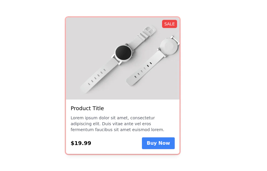
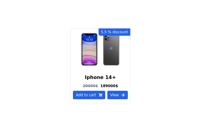
 Product card
sleek and modern product card
1 year ago6.6k


Explore components by Tags
Didn't find component you were looking for?
Search from 3000+ components