itskoti.com
ssdas
This tailwind example is contributed by Tendy Rivaldo, on 12-Jan-2025. Component is made with Tailwind CSS v3. It is responsive. It supports dark mode. similar terms for this example are simulation,copy,dummy,miniature,like

Author Tendy Rivaldo
Related Examples
-
 3 years ago9.4k
 -
 1 year ago1.4k
 -
 Website Mockup
An Onyx Component. This can be used for landing pages / other website mockup purposes. It's clean design will fit with most SAAS projects.
1 year ago1.9k -
 Mobile device mockup
Smartphone (with punch hole notch) mockup in tailwind
2 years ago9.3k -
 5 months ago715
 -
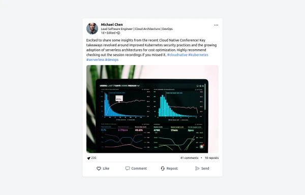 LinkedIn Post UI Mockup
A static HTML and Tailwind CSS component designed to replicate the user interface of a LinkedIn post. This mockup accurately represents the post structure including the header (avatar, name, headline, timestamp), content area (text, optional media), engagement statistics (likes, comments, reposts), and the action bar (Like, Comment, Repost, Send). It's fully responsive, supports light and dark themes, and uses appropriate iconography and styling to closely mimic the LinkedIn feed experience.
10 months ago1.3k -
 Macbook Air 13" Mockup
A gorgeous component that can be used for landing pages, hero statements and more. Interested in our UI library? Check out the discord link in my bio.
1 year ago2.4k -
 Safari mockup Browser page
This component is a mockup of a Safari browser window, featuring a realistic and responsive design created with Tailwind CSS. It includes the following elements: Tab Bar: Positioned at the top of the window, the tab bar showcases an active tab with a favicon and a title. The active tab is highlighted with a background color and border for clarity. Toolbar: Below the tab bar, the toolbar mimics the Safari browser's functionality with close, minimize, and maximize buttons. It also features an address bar pre-filled with a URL, styled for a polished look. Navigation Buttons: The toolbar contains navigation buttons designed with SVG icons to represent back, forward, and other standard browser actions. Content Area: The main section of the browser window, styled to display content within the mockup. It includes a heading and a description to illustrate the use of the component.
1 year ago1.5k -
 3 months ago291
 -
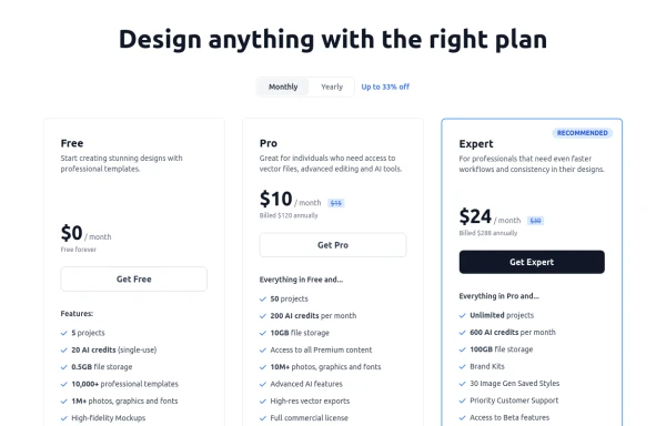 Modern Responsive Pricing Section with Toggle
A sleek, responsive pricing section built with HTML and Tailwind CSS, showcasing three distinct plans (e.g., Free, Pro, Expert) in a card layout. It features a clean monthly/yearly toggle switch with savings indication, highlights a recommended plan with distinct styling and a badge, and uses checkmarks for clear feature comparison. The layout stacks vertically on smaller screens and transitions to a 3-column grid on large screens (lg breakpoint). Includes generic content for easy adaptation and a final "Compare Plans" button.
10 months ago1.1k -
 1 year ago883
 -
 3 years ago8.8k


Explore components by Tags
Didn't find component you were looking for?
Search from 3000+ components