Safari mockup Browser page
This component is a mockup of a Safari browser window, featuring a realistic and responsive design created with Tailwind CSS. It includes the following elements:
Tab Bar: Positioned at the top of the window, the tab bar showcases an active tab with a favicon and a title. The active tab is highlighted with a background color and border for clarity.
Toolbar: Below the tab bar, the toolbar mimics the Safari browser's functionality with close, minimize, and maximize buttons. It also features an address bar pre-filled with a URL, styled for a polished look.
Navigation Buttons: The toolbar contains navigation buttons designed with SVG icons to represent back, forward, and other standard browser actions.
Content Area: The main section of the browser window, styled to display content within the mockup. It includes a heading and a description to illustrate the use of the component.
This tailwind example is contributed by Mahmoud Abdelaziz Salama, on 16-Dec-2024. Component is made with Tailwind CSS v3. It is responsive. similar terms for this example are simulation,copy,dummy,miniature,like

Author Mahmoud Abdelaziz Salama
Related Examples
-
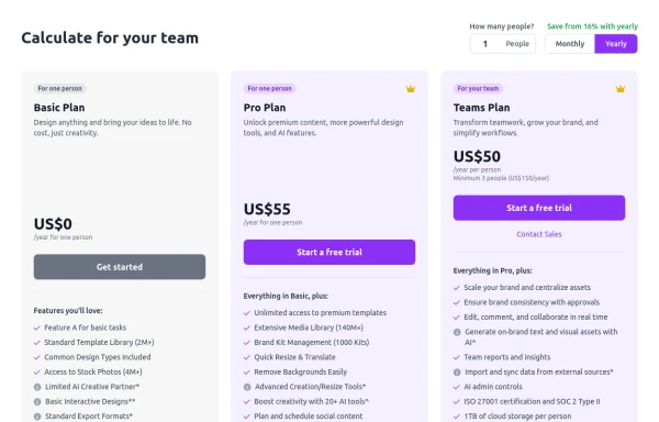 Configurable 3-Tier Responsive Pricing Table
A modern, responsive pricing table component inspired by SaaS layouts, built with HTML and Tailwind CSS. Features three distinct pricing tiers displayed in cards, stacking vertically on smaller screens and transitioning to a 3-column grid on large screens (lg breakpoint). Includes interactive top controls for selecting the number of users and toggling between monthly/yearly billing cycles. Each card uses placeholder content for icons, titles, descriptions, features (with checkmarks/info icons), and distinct call-to-action buttons, making it easily adaptable. Styled with subtle background colors and clear typography for excellent readability.
10 months ago848 -
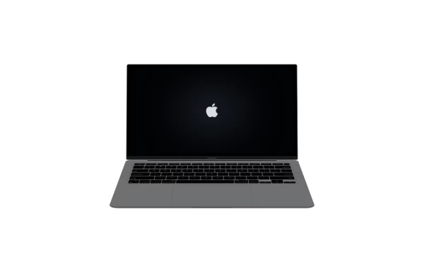 Macbook Air 13" Mockup
A gorgeous component that can be used for landing pages, hero statements and more. Interested in our UI library? Check out the discord link in my bio.
1 year ago2.4k -
 1 year ago2.7k
 -
 3 months ago211
 -
 1 year ago883
 -
 3 years ago9.4k
 -
 5 months ago387
 -
 YouTube Community Post UI Mockup
A static HTML and Tailwind CSS component mimicking the user interface of a YouTube Community Post. This mockup features the channel header (avatar, name, verified badge, timestamp), post content (text and optional media), engagement actions (Like, Dislike, Comment, Share with counts), and the 'Add a comment' section. It's designed to be responsive, supports YouTube's light and dark themes via custom styling, and uses accurate iconography.
10 months ago971 -
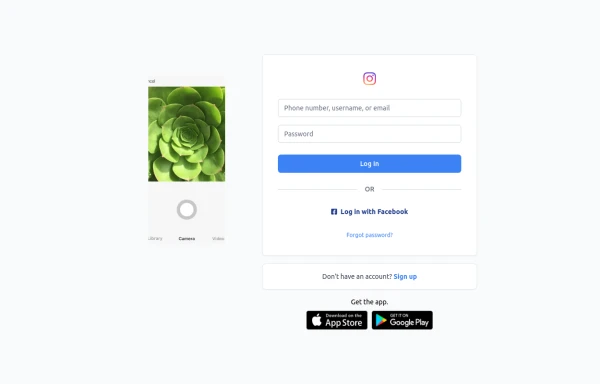 Best Log In page ever
Instagram look like but not copy right 🤗,best login and sign and even for many others
9 months ago849 -
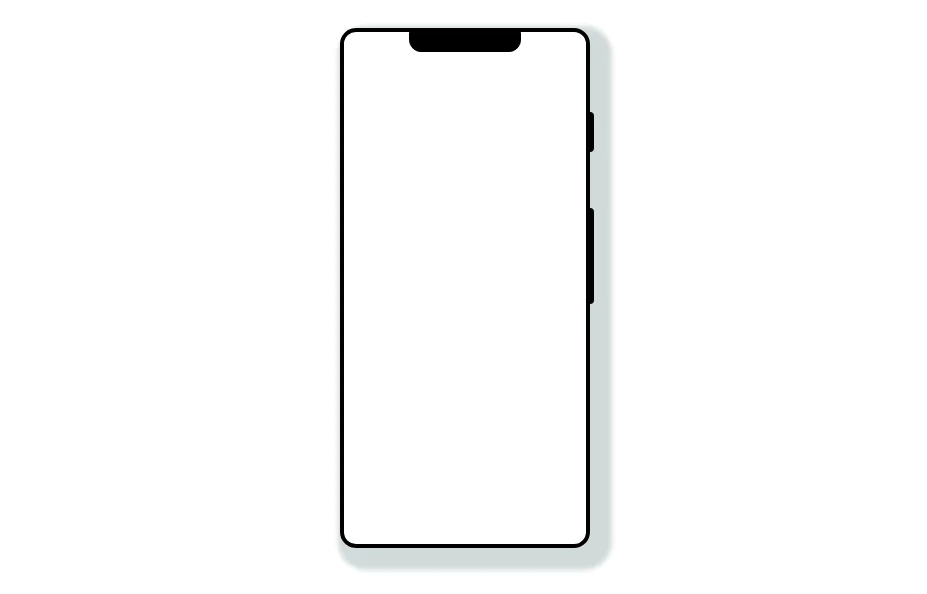 Mobile device mockup
Smartphone (with notch) mockup in tailwind
3 years ago10.8k -
 Modern Dark Footer with Overlapping Gradient CTA
A comprehensive, dark-themed website footer component built with HTML and Tailwind CSS. It features a visually distinct overlapping section with a colorful gradient background containing a prominent call-to-action (CTA) block. The main footer area utilizes a multi-column grid layout for organized navigation links, a newsletter signup form, and social media icons. A final bottom bar includes legal links and copyright information. The design is responsive and adapts its layout for different screen sizes.
10 months ago1.1k -
 3 years ago10.5k


Explore components by Tags
Didn't find component you were looking for?
Search from 3000+ components