Safari browser mockup
This tailwind example is contributed by Leon Bachmann, on 31-Dec-2022. Component is made with Tailwind CSS v3. similar terms for this example are simulation,copy,dummy,miniature,like

Author Leon Bachmann
Related Examples
-
 3 years ago10.6k
 -
 2 years ago10.9k
 -
 Mobile device mockup
Smartphone (with notch) mockup in tailwind
3 years ago10.8k -
 Mobile device mockup (iPhone 14 pro)
Smartphone (with dynamic island notch) mockup in tailwind
3 years ago10.1k -
 3 years ago9.4k
 -
 itskoti.com
ssdas
1 year ago1.3k -
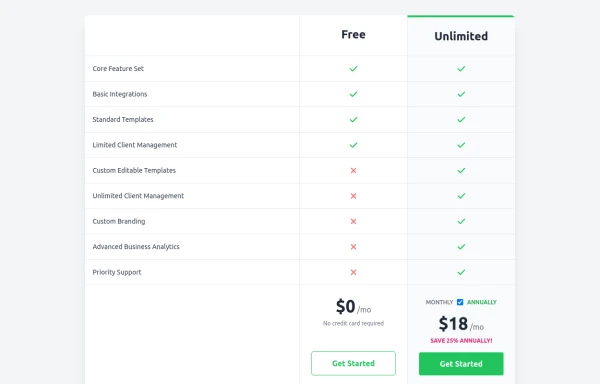 Comparison Pricing Table Component
A responsive pricing table built with HTML and Tailwind CSS, comparing two plans (Free and Unlimited) with a clear feature checklist. Includes distinct styling for the premium plan and a toggle for monthly/annual pricing display.
10 months ago1.5k -
 11 months ago1.2k
 -
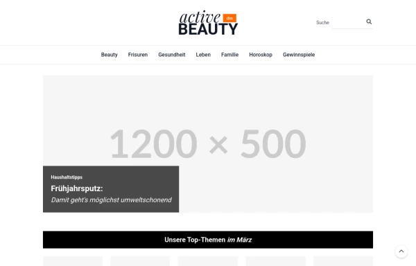
 Website Mockup
An Onyx Component. This can be used for landing pages / other website mockup purposes. It's clean design will fit with most SAAS projects.
1 year ago1.9k -
 Hero donate
the donation hero
9 months ago754 -
 8 months ago863
 -
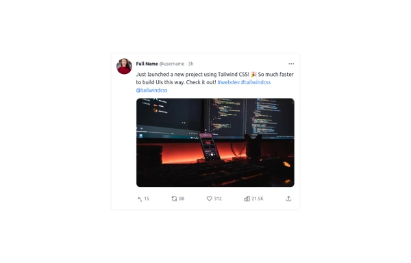 Twitter Post (Tweet) UI Mockup
A detailed static HTML and Tailwind CSS component replicating the user interface of a single Twitter post (Tweet). This mockup includes the user avatar, tweet header (name, handle, timestamp), tweet text with styled hashtags/mentions, optional media display, and the action bar with icons and counts (Reply, Retweet, Like, Views, Share). It is responsive, supports light and dark modes, and uses accurate iconography and hover states to closely resemble the real Twitter UI.
10 months ago771


Explore components by Tags
Didn't find component you were looking for?
Search from 3000+ components