Mac terminal mockup
This tailwind example is contributed by Sean Gantly, on 27-Aug-2024. Component is made with Tailwind CSS v3. similar terms for this example are simulation,copy,dummy,miniature,like

Author Sean Gantly
Related Examples
-
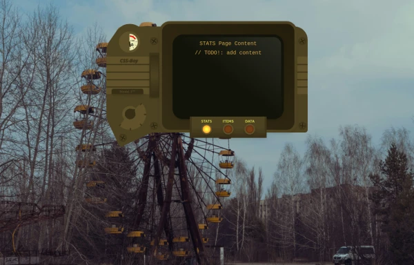 CSS-Boy
Inspired by the Pip-Boy Model 3000 from Fallout: New Vegas. Comes with multiple pages and some animations. All decorative background elements disappear when the screen is <sm (it's responsive).
9 months ago888 -
 Mobile device mockup
Smartphone (with punch hole notch) mockup in tailwind
2 years ago9.3k -
 Website Mockup
An Onyx Component. This can be used for landing pages / other website mockup purposes. It's clean design will fit with most SAAS projects.
1 year ago1.9k -
 Atlas AI Analyst Workspace
A premium, document-centric AI chat interface that moves beyond standard bubbles into a professional "editor" layout. Designed for power users, it features a floating glassmorphic command bar, a dedicated "Memory & Context" sidebar with interactive widgets, and rich data visualization blocks. The aesthetic combines a deep charcoal base with luxury bronze/orange accents, making it ideal for high-end SaaS tools, financial analysis dashboards, or enterprise AI assistants.
1 month ago93 -
 Hero donate
the donation hero
8 months ago753 -
 3 years ago10.5k
 -
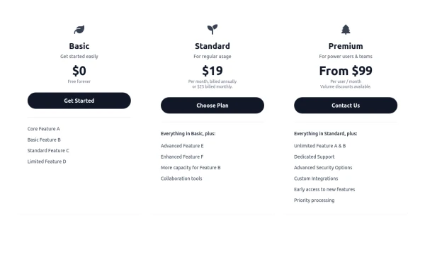 Responsive 3-Tier Pricing Card Section
A clean and responsive pricing table component featuring three distinct tiers (e.g., Basic, Standard, Premium) presented in a card layout. Built with HTML and Tailwind CSS, it stacks vertically on small screens and transitions to a side-by-side view on medium screens (md breakpoint - 768px) and up. Each plan card includes a placeholder icon, title, description, price details, a call-to-action button, and a bulleted list of features with checkmarks. The generic content makes it easy to adapt for various websites or applications needing a clear pricing comparison structure.
10 months ago613 -
 iPhone 15 Mockup
The "Screen Content" div can be manipulated to have anything inside the screen.
1 year ago1.6k -
 Calculator
This calculator uses CSS although it can be passed directly to tailwind
1 year ago2.2k -
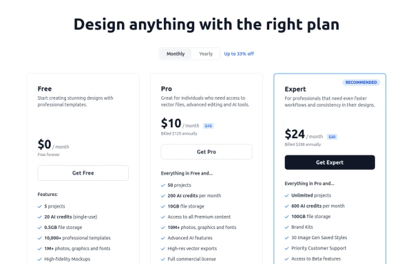 Modern Responsive Pricing Section with Toggle
A sleek, responsive pricing section built with HTML and Tailwind CSS, showcasing three distinct plans (e.g., Free, Pro, Expert) in a card layout. It features a clean monthly/yearly toggle switch with savings indication, highlights a recommended plan with distinct styling and a badge, and uses checkmarks for clear feature comparison. The layout stacks vertically on smaller screens and transitions to a 3-column grid on large screens (lg breakpoint). Includes generic content for easy adaptation and a final "Compare Plans" button.
10 months ago1.1k -
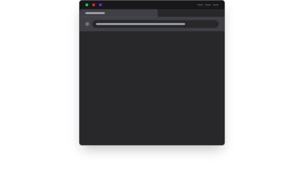
 Safari mockup Browser page
This component is a mockup of a Safari browser window, featuring a realistic and responsive design created with Tailwind CSS. It includes the following elements: Tab Bar: Positioned at the top of the window, the tab bar showcases an active tab with a favicon and a title. The active tab is highlighted with a background color and border for clarity. Toolbar: Below the tab bar, the toolbar mimics the Safari browser's functionality with close, minimize, and maximize buttons. It also features an address bar pre-filled with a URL, styled for a polished look. Navigation Buttons: The toolbar contains navigation buttons designed with SVG icons to represent back, forward, and other standard browser actions. Content Area: The main section of the browser window, styled to display content within the mockup. It includes a heading and a description to illustrate the use of the component.
1 year ago1.4k -
 10 months ago1.2k


Explore components by Tags
Didn't find component you were looking for?
Search from 3000+ components