Macbook Air 13" Mockup
A gorgeous component that can be used for landing pages, hero statements and more. Interested in our UI library? Check out the discord link in my bio.
This tailwind example is contributed by Coastal UI, on 13-Nov-2024. Component is made with Tailwind CSS v3. It is responsive. similar terms for this example are simulation,copy,dummy,miniature,like

Author Coastal UI
Related Examples
-
 Website Mockup
An Onyx Component. This can be used for landing pages / other website mockup purposes. It's clean design will fit with most SAAS projects.
1 year ago1.9k -
 DailyDev Card
Card -based card used in the Dailydev Card, this is created to be modified to taste of each user
1 year ago1.8k -
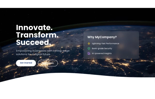
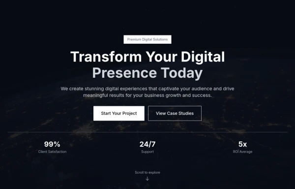
 Hero Section
Created a good and responsive web Hero Page
1 year ago2.7k -
 Tailwind Hero Section
Fully Responsive Hero Section with Navbar
1 year ago5k -
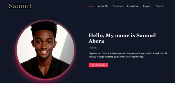
 new potifolio
How to Build a Powerful Web Developer Portfolio (With Examples!)
9 months ago993 -
 Portfolio Hero Section 1
visually stunning and captivating hero section component for your portfolio website.
1 year ago5.7k -
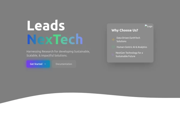
 Hero Section>> visually striking and incorporates some different elements.
Key features of this alternative hero section: 1. Background: - Uses a gradient overlay on top of a background image for depth. - Incorporates a semi-transparent dark overlay for better text contrast. 2. Layout: - Maintains a two-column layout on larger screens, stacking on mobile. - Left side focuses on a bold, three-line tagline and concise description. - Right side features a glassmorphic card with key selling points. 3. Design Elements: - Uses a custom Google Font (Poppins) for a modern look. - Incorporates rounded buttons with hover effects. - Features colorful icons for the selling points. - Adds a decorative wave SVG at the bottom for visual interest. 4. Responsiveness: - Adjusts padding, font sizes, and layout for different screen sizes. - Stacks buttons vertically on very small screens. 5. Interactivity: - Includes hover effects on buttons and links. This design aims to create a more visually impactful first impression while still maintaining clarity and focus on the key messages and call-to-action elements. The use of a background image with overlays adds depth, while the glassmorphic card on the right adds a modern touch. You can further customize this by: - Changing the background image URL to one that fits your brand. - Adjusting colors in the gradient, buttons, and icons to match your brand colors. - Modifying the tagline, description, and selling points to fit your company's message. Would you like me to explain any part of this code or make any further adjustments?
1 year ago5.3k -
 login form
this login form it will be used for sign in to every website
9 months ago538 -
 e-commerce website landing page template with Tailwind CSS.
A clean, responsive e-commerce & blog template built with Tailwind CSS. Features light/dark mode, dynamic featured posts, hero, CTA, and SEO-ready sections.
2 months ago528 -
 card section neon
card section neon
3 weeks ago237 -
 4 months ago338
 -
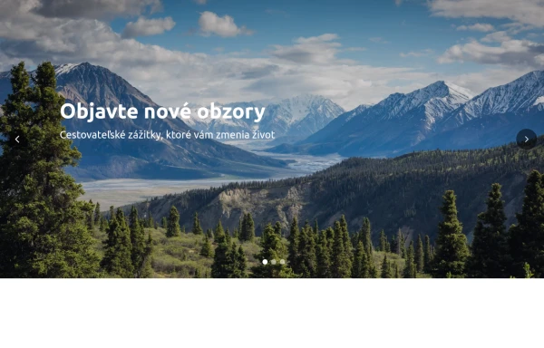 Hero Slider with Alpine.js
This responsive hero slider features full-screen image backgrounds with elegant text overlays and smooth transitions.
9 months ago2.1k


Explore components by Tags
Didn't find component you were looking for?
Search from 3000+ components