COMPLETE SYSTEM FAILURE
This tailwind example is contributed by Bruz, on 15-Sep-2025. Component is made with Tailwind CSS v3. It is responsive. similar terms for this example are simulation,copy,dummy,miniature,like

Author Bruz
Related Examples
-
 2 years ago10.9k
 -
 3 years ago8.9k
 -
 Tailwind CSS Service Card Component
An HTML and Tailwind CSS code snippet for creating a responsive service card component. Ideal for marketplaces, portfolios, or listing pages. Includes sections for image/video preview, seller info, rating, pricing, and additional details. Easy to customize using Tailwind utility classes.
10 months ago1.2k -
 1 year ago883
 -
 1 year ago2.7k
 -
 Hero donate
the donation hero
9 months ago753 -
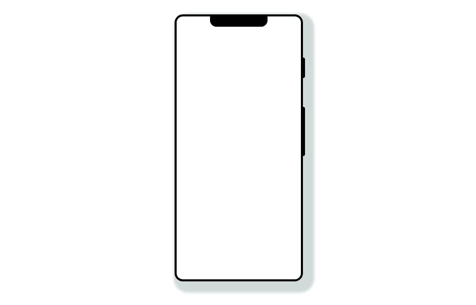 Mobile device mockup
Smartphone (with notch) mockup in tailwind
3 years ago10.8k -
 3 months ago291
 -
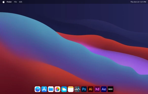 macOS Style Webpage – macOS Design in the Browser
A simple webpage inspired by the macOS interface. It recreates the clean design, dock, and desktop look of macOS using only HTML, tailwind CSS, and JavaScript. This project focuses on front-end styling and layout to bring the visual feel of macOS to the web — not a full simulation, just the look and vibe.
4 months ago1.2k -
 3 months ago211
 -
 11 months ago1.2k
 -
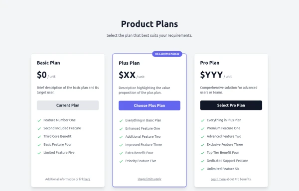 Responsive Multi-Tier Pricing Table Component
flexible and responsive 3-tier pricing table component built with HTML and Tailwind CSS. Features distinct visual styles for different plans (e.g., highlighting a recommended option), adapts to various screen sizes, and supports both light and dark color schemes. Uses generic placeholders for easy adaptation to any product or service.
10 months ago1.5k


Explore components by Tags
Didn't find component you were looking for?
Search from 3000+ components