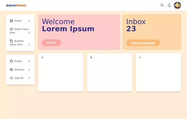
Admin Panel
Source https://gist.github.com/visualval/8aaaad794256313fa2310b997e8a9b8f
This tailwind example is contributed by Lior Medan, on 18-Sep-2024. Component is made with Tailwind CSS v3. It is responsive. It supports dark mode. similar terms for this example are Admin Dashboard, User dashboard

Author Lior Medan
Related Examples
-
 6 months ago818
 -

-
 Taskify Premium Task Management FREE
Website Task management modern and responsif
1 month ago164 -
 3 years ago15.1k
 -
 EVDesign Admin Dashboard modern elegant
EVDesign Admin Dashboard
2 days ago38 -
 High-Performance Hotel Operations & AI Agent Testing Dashboard
A sophisticated, real-time command center designed for modern hotel management. This dashboard features deep integration for monitoring AI agent performance, guest sentiment, and room occupancy. Built with a "Mobile-First" philosophy, it demonstrates advanced data visualization, glassmorphism UI design, and a centralized state-management architecture. Perfect for showcasing full-stack capabilities in AI-driven automation.
2 weeks ago245 -
 MEDICAL profecial #esther developer
medical care
9 months ago550 -
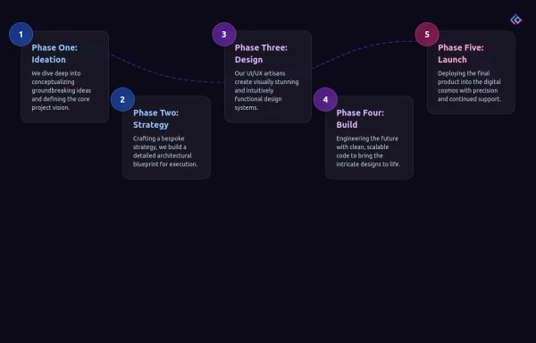 Infographic Component
Design a modern infographic component with Tailwind CSS. This component helps you display data in a clean, responsive, and visually appealing way. With utility classes, gradients, and smooth transitions, you can quickly build infographics that look professional and work perfectly on all devices.
6 months ago949 -
 11 months ago1.7k
 -
 Dash.OS: Drag & Drop Dashboard Widget System
A fully interactive, freeform dashboard builder for the browser. Drop in widgets, drag them anywhere, resize to fit, and your layout is automatically remembered. Ships with a live Chart.js revenue chart, KPI stats, a task tracker, and a notifications feed, all in a single zero-dependency HTML file with dark/light mode built in.
2 days ago11 -
 quora/reddit
reddit / quora have some kind of same template. looksalikes. brothas
1 year ago1.8k -
 3 months ago471


Explore components by Tags
Didn't find component you were looking for?
Search from 3000+ components