Impact
-
Sidebar
This HTML file includes: 1. A responsive sidebar with 3D animation effects: 1. The sidebar slides in and out smoothly. 2. Navigation items have a 3D hover effect using CSS transforms and transitions. 2. Tailwind CSS for styling: 1. Included via CDN for easy setup. 2. Used for layout, colors, and basic styling. 3. Custom CSS for animations and 3D effects: 1. Keyframe animations for sidebar open/close. 2. 3D transform effects for nav items. 4. JavaScript for interactivity: 1. Toggles the sidebar open and close. 2. Adds 3D effect to nav items on hover using mouse position. 3. Closes the sidebar when clicking outside. 5. Accessibility features: 1. ARIA label for the toggle button. 2. Keyboard navigation support (Enter/Space to toggle sidebar). 3. Focus trapping within the sidebar when open. 6. Responsive design: 1. The sidebar is full-height and toggleable, suitable for both desktop and mobile views. This implementation provides a visually appealing sidebar with 3D animations and effects, while maintaining accessibility and responsiveness. It uses HTML for structure, Tailwind CSS for styling, and vanilla JavaScript for interactivity, as requested.
1 year ago2.4k -
Portfolio
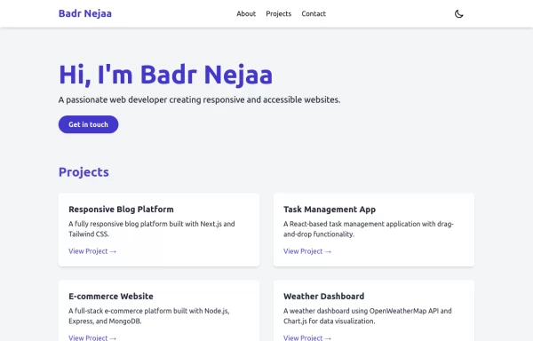
This responsive portfolio with dark mode support includes: 1. Fully responsive design that works on both desktop and mobile devices 2. Dark mode toggle with system preference detection and local storage persistence 3. Indigo-800 and Blue-900 color scheme for primary colors in light and dark modes 4. Beautiful animations and effects: 1. Fade-in and slide-up animations for sections using Intersection Observer 2. Hover effects on projects and buttons 3. Smooth scrolling for navigation 5. Mobile-friendly navigation with a toggle menu 6. Sections for About, Projects, and Contact 7. A contact form with styled inputs 8. Social media links in the footer 9. Accessibility considerations (proper heading structure, color contrast, focus styles, ARIA labels) Key features: - The color scheme uses Indigo-800 for light mode and orange-400 for dark mode as primary colors - Dark mode toggle in the header with a sun/moon icon - Sections fade in and slide up as they enter the viewport - Project cards have a hover effect with scaling and increased shadow - The contact form has animated focus states - Social media icons change color on hover - The layout is responsive, with a hamburger menu for mobile screens - Smooth scrolling behavior for navigation links - Dark mode preference is saved in local storage and syncs with system preference This implementation provides a visually appealing, accessible, and functional responsive portfolio with dark mode support, using HTML, Tailwind CSS, and vanilla JavaScript for the
1 year ago3.1k -
portfolio
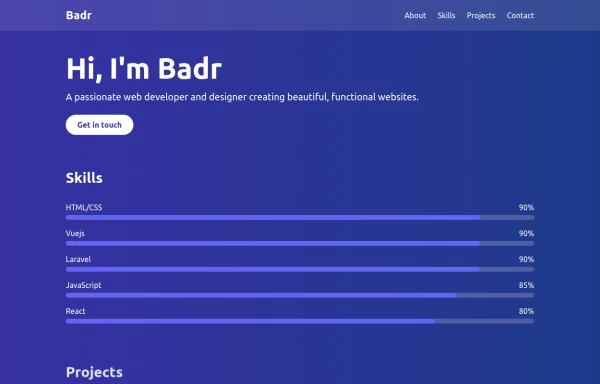
This portfolio page for Claire includes: 1. Responsive design that works on both desktop and mobile 2. Indigo-800 and Blue-900 color scheme for the background 3. Dark mode support (the design is already dark-themed) 4. Beautiful animations and effects: 1. Fade-in and slide-up animations for sections 2. Animated skill bars 3. Hover effects on projects and buttons 4. Smooth scrolling for navigation 5. Mobile-friendly navigation with a toggle menu 6. Sections for About, Skills, Projects, and Contact 7. A contact form with styled inputs 8. Social media links in the footer 9. Accessibility considerations (proper heading structure, color contrast, focus styles) Key features: - The background uses a gradient from Indigo-800 to Blue-900 - The header and footer have a frosted glass effect using backdrop filters - Text is white for high contrast against the dark background - Sections fade in and slide up as they enter the viewport - Skill bars animate when the skills section is in view - Project cards have a hover effect with scaling and increased opacity - The contact form has animated focus states - Social media icons change color on hover - The layout is responsive, with a hamburger menu for mobile screens This implementation provides a visually appealing and functional portfolio page for Claire, using HTML, Tailwind CSS, and vanilla JavaScript for the interactions and animations.
1 year ago2.6k -
Navbar
This navbar implementation includes: 1. Responsive design that works on both desktop and mobile 2. Indigo-800 and Blue-900 color scheme for the background and accents 3. Dark mode support with a toggle button 4. Beautiful animations and effects: 1. Fade-in animation for menu items with staggered delays 2. Hover effects on menu items with underline animation 3. Smooth color transitions 4. Mobile menu slide-down animation 5. SVG icons for the dark mode toggle and mobile menu button 6. "Sign Up" call-to-action button 7. Mobile-friendly dropdown menu 8. Accessibility considerations (proper heading structure, color contrast, focus styles) Key features: - The background uses a gradient from Indigo-800 to Blue-900 - The navbar has a white background in light mode and dark gray in dark mode - Text colors are adjusted for readability in both light and dark modes - Menu items have hover effects with color changes and underline animations - The dark mode toggle changes its icon based on the current mode - The mobile menu slides down with a smooth animation when toggled - Desktop menu items fade in with a staggered delay for a smooth entrance - Dark mode is automatically applied based on system preferences - The layout is responsive, with a hamburger menu for mobile screens This implementation provides a visually appealing and functional navbar with various animations and effects, using HTML, Tailwind CSS, and vanilla JavaScript for the interactions.
1 year ago4.5k -
sidebar
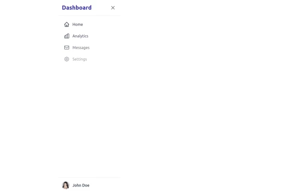
This sidebar implementation includes: 1. Responsive design that works on both desktop and mobile 2. Indigo-800 and Blue-900 color scheme for the background 3. Dark mode support 4. Beautiful animations and effects: 1. Slide-in animation when opening the sidebar 2. Fade-in animation for menu items with staggered delays 3. Hover effects on menu items with underline animation 4. Smooth color transitions 5. SVG icons for menu items 6. User profile section at the bottom of the sidebar 7. Close button for easy dismissal on mobile 8. Main content area with a toggle button for the sidebar 9. Accessibility considerations (proper heading structure, color contrast, focus styles) Key features: - The background uses a gradient from Indigo-800 to Blue-900 - The sidebar has a white background in light mode and dark gray in dark mode - Text colors are adjusted for readability in both light and dark modes - Menu items have hover effects with background color changes and underline animations - Icons change color on hover - The sidebar slides in from the left with a smooth animation - Menu items fade in with a staggered delay for a smooth entrance - Dark mode is automatically applied based on system preferences - The layout is responsive, with the sidebar hiding off-screen on mobile and a toggle button to show/hide it This implementation provides a visually appealing and functional sidebar with various animations and effects, using HTML, Tailwind CSS, and vanilla JavaScript for the interactions.
1 year ago4.5k -
trusted by
1. Color Scheme: 1. Updated the background to a gradient from Indigo-800 to Blue-900 2. Changed text colors to use Indigo-800 and Blue-900 shades 3. Updated ring colors on avatar images to match the new scheme 2. Enhanced Design: 1. Added a containing card with white background (dark gray in dark mode) 2. Increased the size of avatar images for better visibility 3. Added a shadow effect to the card that changes color on hover 3. Responsiveness: 1. Maintained the responsive layout, stacking vertically on smaller screens 4. Animations and Interactions: 1. Added a fade-in animation for the entire component 2. Enhanced hover effects on avatar images (scale and z-index change) 3. Added a ring effect on hover for each avatar 5. Accessibility: 1. Maintained alt text for images 2. Ensured proper color contrast for text readability 6. Dark Mode: 1. Implemented dark mode support 2. Adjusted colors and ring effects for dark mode 7. Additional Enhancements: 1. Increased font sizes for better readability 2. Added font weight variations to emphasize important text 3. Improved spacing and alignment This updated component maintains the original functionality while incorporating the Indigo-800 and Blue-900 color scheme and adding enhanced visual effects and interactions.
1 year ago1.9k -
Avatar
This Avatar component includes: 1. Responsive design using Tailwind CSS classes 2. Indigo-800 and Blue-900 color scheme 3. Dark mode support 4. User avatar with hover effect and online status indicator 5. User name and role 6. Follow button with hover effect 7. Follower count 8. Subtle animations and transitions 9. Accessibility considerations (proper contrast, focus states) Key features: - The background uses a gradient from Indigo-800 to Blue-900 - The avatar card has a white background in light mode and dark gray in dark mode - Text colors are adjusted for readability in both light and dark modes - The avatar image has a border color that changes in dark mode - The avatar has a scale effect on hover and a ring appears around it - The Follow button uses Indigo-800 with a Blue-900 hover state - The card has a shadow effect that changes color on hover - Dark mode is automatically applied based on system preferences - The entire card has a subtle transition effect for smooth color changes - Proper focus states are implemented for the button This design provides a clean, interactive avatar component while incorporating the requested color scheme and maintaining good usability across different devices and color modes.
1 year ago2.3k -
User Profile Card
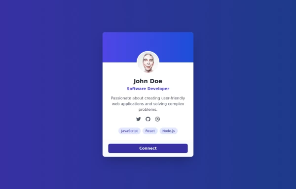
This User Profile Card includes: 1. Responsive design using Tailwind CSS classes 2. Indigo-800 and Blue-900 color scheme 3. Dark mode support with appropriate color adjustments 4. Profile picture with hover effect 5. User name, job title, and a brief description 6. Social media icons with hover effects 7. Skill tags with hover animations 8. Connect button with hover effect 9. Subtle animations and transitions for better user experience 10. Automatic dark mode detection based on system preferences Key features: - The background uses a gradient from Indigo-800 to Blue-900 - The card has a white background in light mode and dark gray in dark mode - Text colors are adjusted for readability in both light and dark modes - The profile picture has a border that changes color in dark mode - Social media icons and skill tags have hover effects - The Connect button uses Indigo-800 with a Blue-900 hover state - The entire card has a shadow effect that changes on hover - Dark mode is automatically applied based on system preferences This design provides a clean, professional look for a user profile card while incorporating the requested color scheme and maintaining good usability across different devices and color modes.
1 year ago2k -
Services
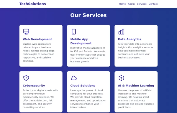
This Services page design includes: 1. Responsive layout using Tailwind CSS grid system 2. Indigo-800 and Blue-900 color scheme 3. Dark mode support 4. Header with navigation 5. Six service cards with icons, titles, and descriptions 6. Footer with copyright information 7. Subtle animations and transitions 8. Accessibility considerations (proper heading structure, color contrast) Key features: - The background uses a gradient from Indigo-800 to Blue-900 - The header and footer have a white background in light mode and dark gray in dark mode - Service cards have a white background in light mode and dark gray in dark mode - Text colors are adjusted for readability in both light and dark modes - Icons use the Indigo-800 color (Indigo-400 in dark mode) for consistency - Each service card has a hover effect that scales it up slightly - Service cards fade in with a staggered delay for a smooth entrance - Dark mode is automatically applied based on system preferences - The design is fully responsive, adjusting from 1 to 3 columns based on screen size This design provides a clean, professional look for a services page while incorporating the requested color scheme and maintaining good usability across different devices and color modes.
1 year ago2.4k -
Cards - Users Card
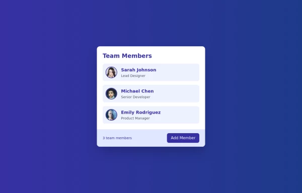
This Users Card design includes: 1. Responsive layout using Flexbox 2. Indigo-800 and Blue-900 color scheme 3. Dark mode support 4. User list with avatars, names, and roles 5. Hover effects on user items 6. "Add Member" button 7. Card footer with team member count 8. Subtle animations and transitions 9. Accessibility considerations (proper heading structure, color contrast) Key features: - The background uses a gradient from Indigo-800 to Blue-900 - The card has a white background in light mode and dark gray in dark mode - Text colors are adjusted for readability in both light and dark modes - User avatars have a border color that changes in dark mode - User items have a hover effect that scales them slightly - The "Add Member" button uses Indigo-800 with a Blue-900 hover state - Dark mode is automatically applied based on system preferences - The entire card fades in on load for a smooth entrance - The card has a hover effect that enhances its shadow This design provides a clean, professional look for displaying team members while incorporating the requested color scheme and maintaining good usability across different devices and color modes.
1 year ago2.3k -
profile page
This profile page design includes: 1. Responsive layout using Flexbox 2. Indigo-800 and Blue-900 color scheme 3. Dark mode support 4. Profile picture with hover effect 5. About Me section 6. Skills section with interactive tags 7. Contact information with icons 8. Edit Profile button 9. Subtle animations and transitions 10. Accessibility considerations (proper heading structure, color contrast) Key features: - The background uses a gradient from Indigo-800 to Blue-900 - The profile card has a white background in light mode and dark gray in dark mode - Text colors are adjusted for readability in both light and dark modes - The profile picture has a border color that changes in dark mode - Skill tags have a hover effect that changes their color - Icons in the contact section use the theme colors - The Edit Profile button uses Indigo-800 with a Blue-900 hover state - Dark mode is automatically applied based on system preferences - The entire card fades in on load for a smooth entrance - The profile picture has a subtle scale effect on hover This design provides a clean, professional look while incorporating the requested color scheme and maintaining good usability across different devices and color modes.
1 year ago5.5k -
Forgot Password Form
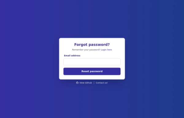
1. Color Updates: 1. Changed background to gradient `from-indigo-800 to-blue-900` 2. Updated text colors to match the new theme 3. Changed button colors to `bg-indigo-800` with `hover:bg-blue-900` 4. Updated focus rings to use indigo colors 5. Made footer links white with indigo hover states 2. Enhanced Styling: 1. Added gradient background 2. Improved border radius to `rounded-xl` 3. Enhanced shadow with `shadow-2xl` 4. Added hover scale effects 5. Added fade-in animation 3. Dark Mode Improvements: 1. Enhanced dark mode colors 2. Added system preference detection 3. Improved dark mode contrast 4. Updated dark mode focus rings 4. Added Functionality: 1. Added form validation 2. Added success message 3. Added form reset after submission 4. Added smooth transitions 5. Accessibility Improvements: 1. Maintained ARIA attributes 2. Enhanced focus states 3. Improved color contrast 4. Added transition animations for better UX 6. Added Interactions: 1. Hover effects on all interactive elements 2. Scale animation on card and button hover 3. Smooth color transitions 4. Form validation feedback The form now matches the Indigo-800 and Blue-900 color scheme while maintaining dark mode support and adding enhanced animations and interactions.
1 year ago1.6k

