quora/reddit
reddit / quora have some kind of same template. looksalikes. brothas
This tailwind example is contributed by Katherine Glenn, on 19-Dec-2024. Component is made with Tailwind CSS v3. It is responsive. similar terms for this example are Admin Dashboard, User dashboard

Author Katherine Glenn
Related Examples
-
 3 months ago416
 -
 Targeta
Targeta
1 week ago86 -
 canvas fully covers
canvas fully covers
11 months ago3.7k -
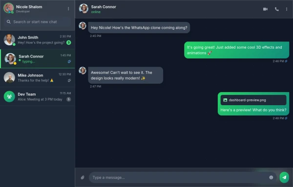 Best Chatting dashboard
create a modern WhatsApp-like chat dashboard with 3D effects, animations, and a sleek design. This will be a static view showcasing the interface with Nicole Shalom as the developer.
6 months ago739 -
 canvas fully covers
canvas fully covers
6 months ago700 -
 2 years ago13k
 -
 quora/reddit
reddit / quora have some kind of same template. looksalikes. brothas
2 years ago12.4k -
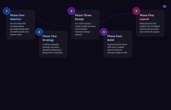 Infographic Component
Design a modern infographic component with Tailwind CSS. This component helps you display data in a clean, responsive, and visually appealing way. With utility classes, gradients, and smooth transitions, you can quickly build infographics that look professional and work perfectly on all devices.
2 months ago500 -
 Adminpanel
Three tabs, switch between each other, change color when clicked. Tables with filter, search, with a drop-down form to fill.
8 months ago1.5k -
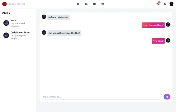 Acode Master - FB & WhatsApp UI Combo
Description (meta description) ni tag ikoreshwa mu mutwe (head) wa HTML igaragaza mu ncamake icyo urubuga cyangwa urupapuro rwawe ruvuga. Iyi description ikoreshwa cyane na search engines (nka Google) mu kwerekana summary y’urubuga mu bisubizo by’ubushakashatsi.
6 months ago556 -
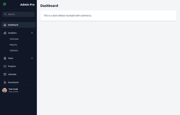
 Responsive Dashboard
1. Background Colors: 1. Main background: `bg-indigo-50` 2. Welcome card: `bg-indigo-100` with `border-indigo-200` 3. Inbox card: `bg-blue-100` with `border-blue-200` 4. Overlay: `bg-indigo-900/50` 2. Text Colors: 1. Header text: `text-indigo-800` 2. Logo: `text-blue-900` and `text-indigo-800` 3. Menu items hover: `hover:text-indigo-800` 4. Card headings: `text-blue-900` 3. Button/Badge Colors: 1. Welcome badge: `bg-indigo-800` 2. Inbox button: `bg-blue-800` with `hover:bg-blue-900` 3. Stats card titles: `text-indigo-800` 4. Maintained all functionality: 1. Responsive design 2. Animations and transitions 3. Mobile menu 4. Hover effects 5. Notification animation The color scheme now uses a mix of Indigo-800 and Blue-900 while maintaining visual hierarchy and accessibility. The colors create a professional and cohesive look across all components.
1 year ago4.2k -
 9 months ago4.5k


Explore components by Tags
Didn't find component you were looking for?
Search from 3000+ components