Adminpanel
Three tabs, switch between each other, change color when clicked. Tables with filter, search, with a drop-down form to fill.
This tailwind example is contributed by Алла Телегина, on 09-Mar-2025. Component is made with Tailwind CSS v3. It is responsive. similar terms for this example are Admin Dashboard, User dashboard

Author Алла Телегина
Related Examples
-
 3 years ago17.7k
 -
 Tab Menu
Tab menu
2 years ago6.6k -
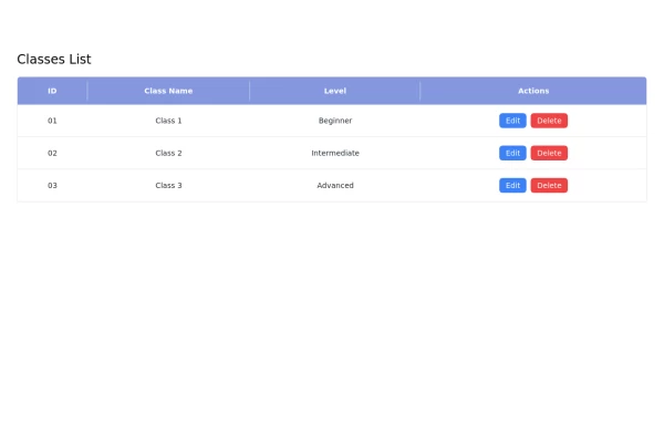 Responsive Classes List Table with Edit and Delete buttons using Tailwind CSS
This responsive classes list table is built using Tailwind CSS and features: - A clean layout with a header displaying column titles. - Action buttons for editing and deleting entries. - Responsive design that adapts to various screen sizes. - Easy customization options to fit your project's needs.
1 year ago3.5k -
 Interactive Pricing Table
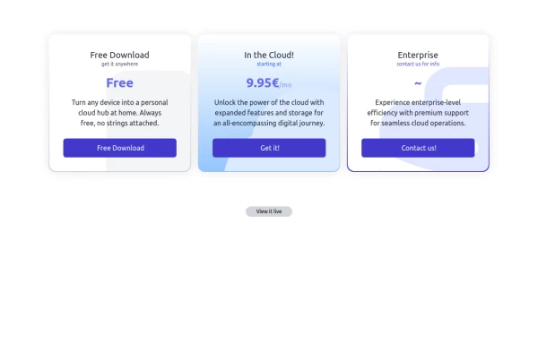
This modern pricing component features a visually appealing, responsive layout with smooth hover effects, making it ideal for showcasing different plans and subscription tiers. Design and Features: ✅ Elegant Gradient Backgrounds • Each pricing card has a unique gradient overlay, transitioning from soft gray, blue, or indigo to white, enhancing contrast and visual appeal. • The rounded-2xl design ensures a polished and smooth aesthetic. ✅ Interactive Hover Effects • Cards have a subtle hover shadow enhancement, making them pop on interaction (hover:shadow-[0_0px_25px_0px_rgba(0,0,0,0.2)]). • Slight floating effect (hover:translate-y-[-5px]) gives the illusion of elevation on hover. ✅ Pricing & Plan Details • Each card presents a plan title, a short subtitle, and a bold price display (text-3xl font-extrabold text-indigo-500). • Supports free, subscription-based, and enterprise-tier pricing, ensuring flexibility for different business models. ✅ Call-to-Action Buttons • Each plan features a highly visible CTA button (bg-indigo-700 text-white rounded-md). • The buttons change color on hover (hover:bg-indigo-500) and expand slightly, encouraging user interaction. ✅ Animated Background Icons • A large, transparent icon (text-[500px] text-gray-100) dynamically moves on hover (group-hover:-translate-y-8 group-hover:-translate-x-8), adding depth and a premium feel. This pricing component is perfect for SaaS platforms, digital subscriptions, and service offerings, ensuring a modern, sleek, and engaging user experience. 🚀
1 year ago1.7k -
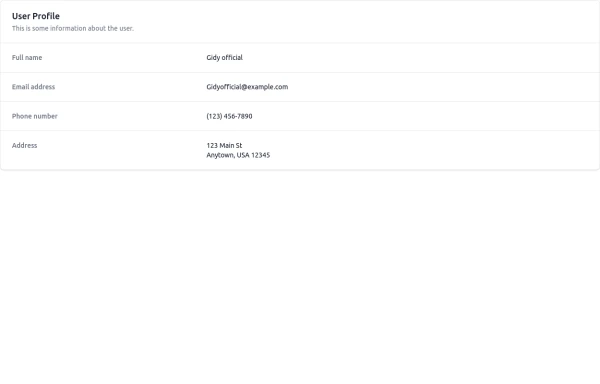 User Profile
This is some information about the user.
10 months ago1k -
 Taskify Premium Task Management FREE
Website Task management modern and responsif
1 month ago179 -
 2 years ago7.6k
 -
 Engineering Project Dashboard
Track engineering assignments, project progress, technology stack, and delivery timelines in one simple dashboard.
1 week ago86 -
 3 years ago13.1k
 -
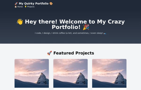 free tailwind personal portfolio template
free tailwind personal portfolio template
2 years ago5.6k -
 Login page with tailwind (SB admin 2)
This component features a split-screen design with a background image on one side and a registration form on the other.
3 years ago24.1k -
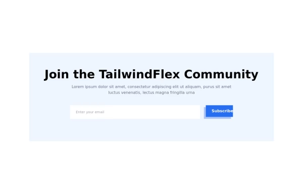 Modern responsive Newsletter form
Responsive newsletter subscriber form
1 year ago3k


Explore components by Tags
Didn't find component you were looking for?
Search from 3000+ components