Popover
basic popover example
This tailwind example is contributed by Dipti narayan, on 08-Sep-2023. Component is made with Tailwind CSS v3. It is responsive. It supports dark mode.

Author Dipti narayan
Related Examples
-
 3 years ago25.5k
 -
2 years ago21.7k
-
background animation
background animation
2 years ago50.8k -
 Date picker
Date picker example using flatpickr library
2 years ago17.2k -
3 years ago11.5k
-
3 years ago10.2k
-
 Gradient Flip-Text Button with Hover Animation
This stylish button features a dynamic gradient background that shifts from a calm green gradient by default to a vibrant purple-pink-red gradient on hover. The button also includes an interactive text flip effect, where the text seamlessly transitions on hover, creating a visually appealing and modern UI element. Perfect for adding flair to your websites or applications while maintaining functionality and responsiveness.
1 year ago1.4k -
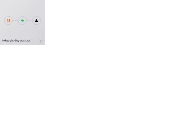 Animated bento box.
A Coastal UI component (coastalui.com). This can be used as part of a bento box, great for showing connectivity between context, could be used beyond just showing tech stacks.
11 months ago1.4k -
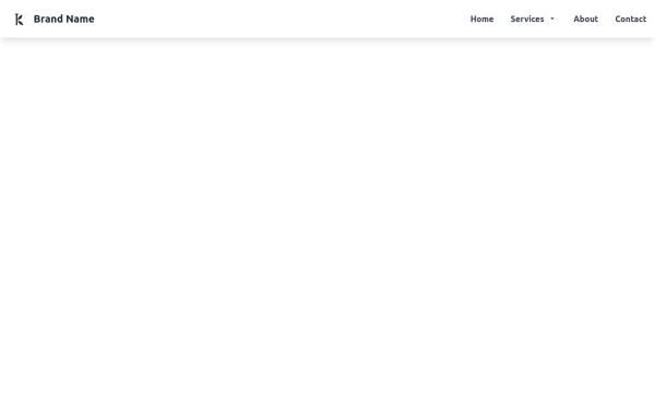 Tailwind CSS Navbar
Logo on the left. Main menu with a mega menu under "Services". Responsive design with a hamburger menu for mobile devices. Mega menu appears on hover for desktop and toggles on click for mobile.
8 months ago1.2k -
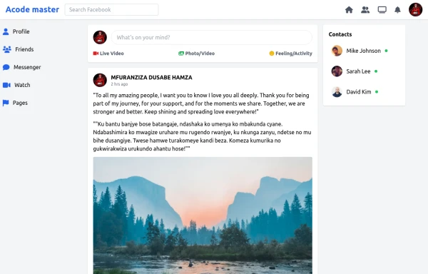 SocialSphere: A Full-Stack Social Media Platform
SocialSphere is a full-stack social media platform inspired by Facebook, built using HTML CSS
9 months ago866 -
 4 months ago271
 -
 8 months ago531


Explore components by Tags
Didn't find component you were looking for?
Search from 3000+ components