profil_eleve.html
This tailwind example is contributed by Anonymous, on 21-Oct-2025. Component is made with Tailwind v3.4. It is responsive.

Related Examples
-
 Soft-Modern Dark Pricing
A sophisticated, highly rounded pricing component inspired by modern fintech interfaces. It avoids harsh lines in favor of deep "zinc" tones and subtle borders (border-white/5). The center card pops using a high-contrast white button against the dark theme, guiding user focus naturally without using aggressive gradients.
742 -
 Floating "Go to Top" Button with Tailwind CSS
🚀 Boost your website’s user experience with a sleek floating "Go to Top" button! This easy-to-implement solution uses Tailwind CSS for styling. ✔️ Smooth scroll to top ✔️ Clean and modern design ✔️ Responsive and animated effects Perfect for any website or portfolio! Add it today and make navigation effortless! 🔝💻
1.6k -

-

-
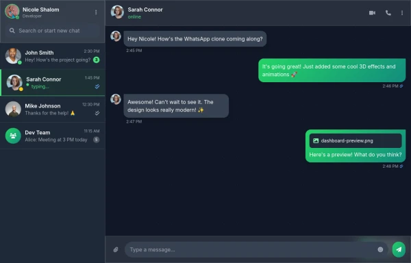 Best Chatting dashboard
create a modern WhatsApp-like chat dashboard with 3D effects, animations, and a sleek design. This will be a static view showcasing the interface with Nicole Shalom as the developer.
1.9k -
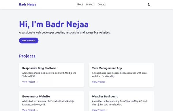 Portfolio
This responsive portfolio with dark mode support includes: 1. Fully responsive design that works on both desktop and mobile devices 2. Dark mode toggle with system preference detection and local storage persistence 3. Indigo-800 and Blue-900 color scheme for primary colors in light and dark modes 4. Beautiful animations and effects: 1. Fade-in and slide-up animations for sections using Intersection Observer 2. Hover effects on projects and buttons 3. Smooth scrolling for navigation 5. Mobile-friendly navigation with a toggle menu 6. Sections for About, Projects, and Contact 7. A contact form with styled inputs 8. Social media links in the footer 9. Accessibility considerations (proper heading structure, color contrast, focus styles, ARIA labels) Key features: - The color scheme uses Indigo-800 for light mode and orange-400 for dark mode as primary colors - Dark mode toggle in the header with a sun/moon icon - Sections fade in and slide up as they enter the viewport - Project cards have a hover effect with scaling and increased shadow - The contact form has animated focus states - Social media icons change color on hover - The layout is responsive, with a hamburger menu for mobile screens - Smooth scrolling behavior for navigation links - Dark mode preference is saved in local storage and syncs with system preference This implementation provides a visually appealing, accessible, and functional responsive portfolio with dark mode support, using HTML, Tailwind CSS, and vanilla JavaScript for the
4k -
 1.2k
1.2k -
-

-
 Why Choose Us - Our Core Strengths
Discover what sets us apart with this engaging "Why Choose Us" section. Highlighting three key pillars—passion, honesty, and continuous improvement—this component features a bold, centered headline with a striking blue accent
-
-
 Rwanda-Canada Transport Services | Safe & Reliable Shipping
Attractive color scheme inspired by Rwanda's landscapes









Browse by topic
Explore components by Tags
Jump straight to the UI pattern you need.
Can't find it?
Didn't find the component you were looking for?
Search across 3,000+ community-built components and grab the code in seconds.