Tailwind CSS Navbar
Logo on the left.
Main menu with a mega menu under "Services".
Responsive design with a hamburger menu for mobile devices.
Mega menu appears on hover for desktop and toggles on click for mobile.
This tailwind example is contributed by KULDEEP, on 20-Jun-2025. Component is made with Tailwind CSS v3. It is responsive.

Author KULDEEP
Related Examples
-
 Responsive navbar with alpinejs
A mix of Penguin navbar with PineUI Slide-Over
1 year ago3.5k -
 Sidebar
This is the sidebar that I use in my projects, I use grid to be able to manage the space issue a little better, it seems like a clean and modern design, it is more than anything for the dashboards that you want to create
1 year ago4k -
 1 year ago2.2k
 -
 Nav Bar
Animated Mobile Dropdown menu
1 year ago2.2k -
 chat ui advanced
Professional chat ui, connect me for jsx https://abhirajk.vercel.app/
1 year ago1.8k -
 1 year ago2.6k
 -
 11 months ago1.3k
 -
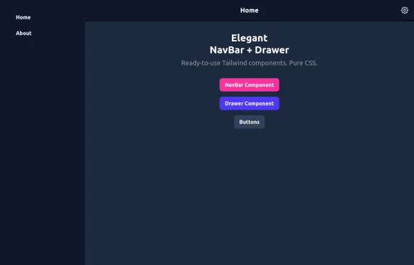 Elegant NavBar + Drawer
A NavBar, a responsive drawer/sidebar, and other useful Tailwind components to get started creating an app. Pure CSS, no JavaScript needed (although this example uses a bit of JS).
10 months ago1.4k -
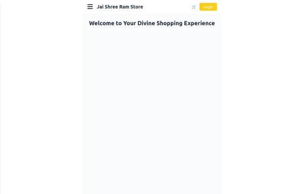 Responsive eCommerce Sidebar Layout with Hamburger Menu | Tailwind CSS UI for Online Stores
Build a clean and responsive eCommerce sidebar layout with a smooth hamburger menu using Tailwind CSS and Alpine.js. Ideal for devotional, spiritual, or modern online stores. Includes dark mode support, navigation links, cart, login, and a dynamic layout for beautiful product pages.
10 months ago1.1k -
 Life Tree
by salvator
10 months ago992 -
 joker
jokerjoker cyber punk
9 months ago1.3k -
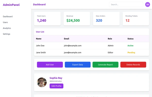 admin panel UI
Premium Admin Panel Pack including sidebar navigation, top navbar, dashboard cards, user tables, quick actions, profile section, and footer. Fully responsive with modern clean design using Tailwind CSS.
9 months ago1.9k


Explore components by Tags
Didn't find component you were looking for?
Search from 3000+ components