Tooltip - Right Aligned
This tailwind example is contributed by Prashant, on 12-Aug-2022. Component is made with Tailwind CSS v3.

Author Prashant
Related Examples
-
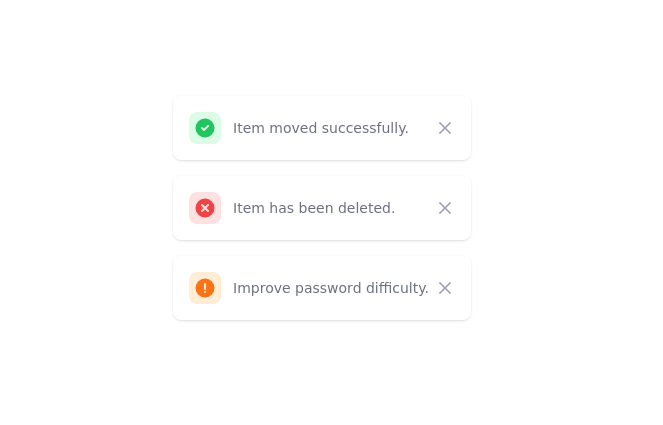 Toast
Toastmensajes de alerta a los visitantes de su sitio web.
2 years ago15.9k -
Popover
basic popover example
2 years ago13.1k -
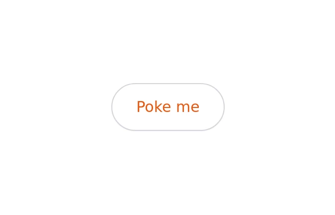
 Tooltip
A modern tooltip component with a gradient action button and smooth hover animation. Built using Tailwind CSS and custom styles, it provides clear, accessible hints with a polished UI and responsive behavior.
3 weeks ago19 -
 1 year ago3.1k
 -
 Native tooltip
tooltip
1 year ago3.1k -
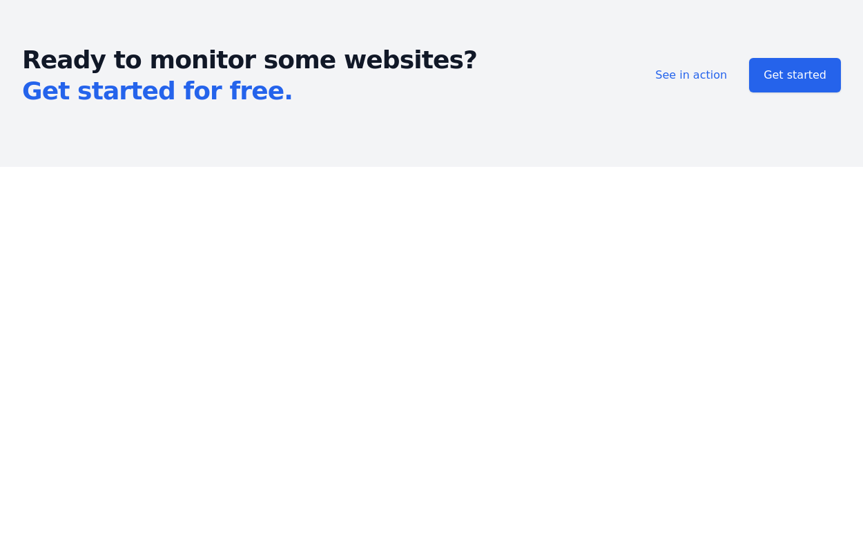
 3 years ago10.9k
 -
Group hover card
article card
3 years ago11.6k -
 3 years ago9.9k
 -
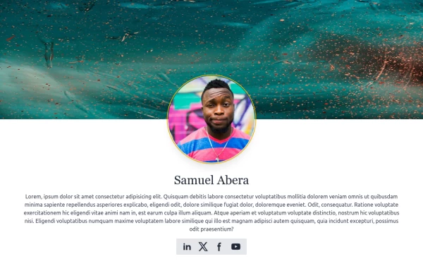 User Profile
User Profile
1 year ago5.7k -
Native tooltip
tooltip
1 year ago3.1k -
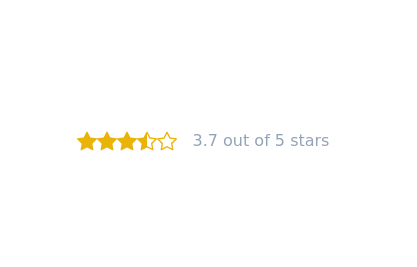 Star rating svg buttons
buttons consist of star,star-filled, and star half-filled
3 years ago11.3k -
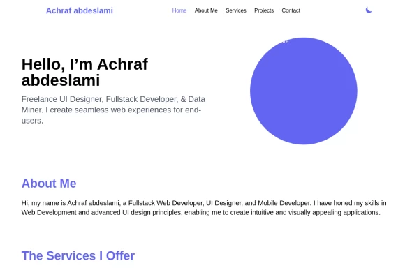 Responsive portfolio with dark mode
responsive and support dark mode .portfolio website
1 year ago3.7k


Explore components by Tags
Didn't find component you were looking for?
Search from 3000+ components