Live Chat Component using Tailwind Alpine JS
Live Chat Component using Tailwind Alpine JS
This tailwind example is contributed by Ahita Bisma Adlula, on 26-Feb-2025. Component is made with Tailwind CSS v3. It is responsive.

Author Ahita Bisma Adlula
Related Examples
-
 Tailwind CSS Navbar
Logo on the left. Main menu with a mega menu under "Services". Responsive design with a hamburger menu for mobile devices. Mega menu appears on hover for desktop and toggles on click for mobile.
8 months ago1.1k -
 Landi page template
con un cuerpo libre
1 month ago66 -
 Muhammad Umair Arshad - Frontend Developer Resume | React, TypeScript, Tailwind CSS
Professional resume of Muhammad Umair Arshad, a skilled Frontend Developer specializing in React, TypeScript, and Tailwind CSS. I build high-performance web applications with responsive UI design.
10 months ago1.2k -
 1 year ago2.1k
 -
 8 months ago1.5k
 -
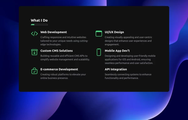
 Reusable Skill Showcase Section With Pure Tailwind CSS
A fully responsive and modular "Skills & Tools" section, perfect for any developer portfolio. Built with static HTML and Tailwind CSS, this component can be easily integrated into any project and made dynamic using any frontend framework (Vue, React, Svelte, Angular) or vanilla JavaScript. Customize it to highlight your unique tech stack and create engaging portfolio pages.
10 months ago1.9k -
 1 year ago2.4k
 -
 FLESH & BONE
Stranded in the heart of a cannibal-infested jungle, you must make unthinkable choices to survive. How far will you go to see another sunrise?
3 months ago281 -
 Linear infinite brand scrolling with hover effect
Beautiful lineat brand scrolling partner with hover effect
1 year ago2.5k -
 responsive home page
the best home page
8 months ago1.1k -
 1 year ago3k
 -
 1 year ago1.5k


Explore components by Tags
Didn't find component you were looking for?
Search from 3000+ components