Simple Payment Successfull Notification Page
This tailwind example is contributed by Anonymous, on 22-May-2025. Component is made with Tailwind v3.4. It is responsive.

Related Examples
-
 Notification Center with Filter Tabs
Notification center UI featuring unread indicators, activity filters, user avatars and interactive mark-as-read functionality.
-
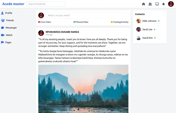 SocialSphere: A Full-Stack Social Media Platform
SocialSphere is a full-stack social media platform inspired by Facebook, built using HTML CSS
-
 Hero Section
Responsive Hero Section for you Project Background Image: A stunning, high-quality Unsplash photo that creates a unique visual impact. Overlay: Semi-transparent black overlay with blur effect for readability and a modern aesthetic. Content Area: Centered with a gradient background overlay for contrast, bold headline, engaging subtext. Buttons: Vibrant gradient and clean border with smooth hover animations to draw attention. Responsive Design: Looks great on all screen sizes with adaptable padding and font sizes.
2.5k -

-
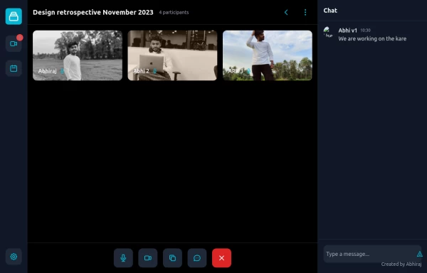 google meet clone
Meeting application with fully responsive connect my web for jsx https://abhirajk.vercel.app/
2k -
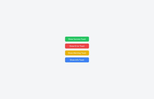 Notifications
Toast Notifications are lightweight and customizable components for displaying short messages or alerts. They are perfect for feedback on user actions, such as form submissions or system updates. Supports different types of notifications (success, error, warning, info). Automatically hides after a specified timeout. Option to include action buttons or close icons. Customizable styles, animation, and position on the screen.
2.2k -

-
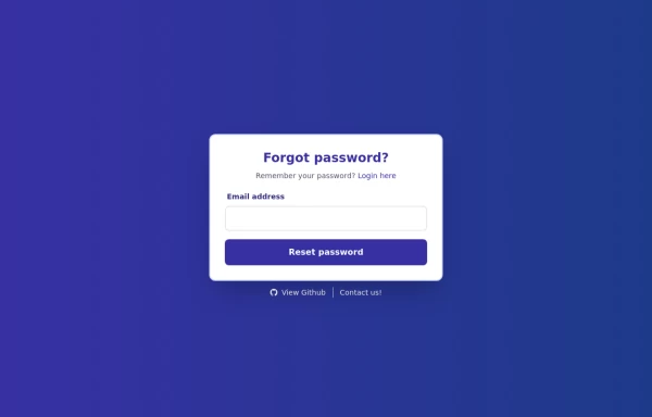 Forgot Password Form
1. Color Updates: 1. Changed background to gradient `from-indigo-800 to-blue-900` 2. Updated text colors to match the new theme 3. Changed button colors to `bg-indigo-800` with `hover:bg-blue-900` 4. Updated focus rings to use indigo colors 5. Made footer links white with indigo hover states 2. Enhanced Styling: 1. Added gradient background 2. Improved border radius to `rounded-xl` 3. Enhanced shadow with `shadow-2xl` 4. Added hover scale effects 5. Added fade-in animation 3. Dark Mode Improvements: 1. Enhanced dark mode colors 2. Added system preference detection 3. Improved dark mode contrast 4. Updated dark mode focus rings 4. Added Functionality: 1. Added form validation 2. Added success message 3. Added form reset after submission 4. Added smooth transitions 5. Accessibility Improvements: 1. Maintained ARIA attributes 2. Enhanced focus states 3. Improved color contrast 4. Added transition animations for better UX 6. Added Interactions: 1. Hover effects on all interactive elements 2. Scale animation on card and button hover 3. Smooth color transitions 4. Form validation feedback The form now matches the Indigo-800 and Blue-900 color scheme while maintaining dark mode support and adding enhanced animations and interactions.
2.4k -

-
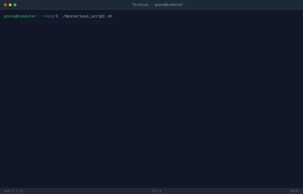 TASK FAILED SUCCESSFULLY
TradingGoose Ep2 MockUp
785 -
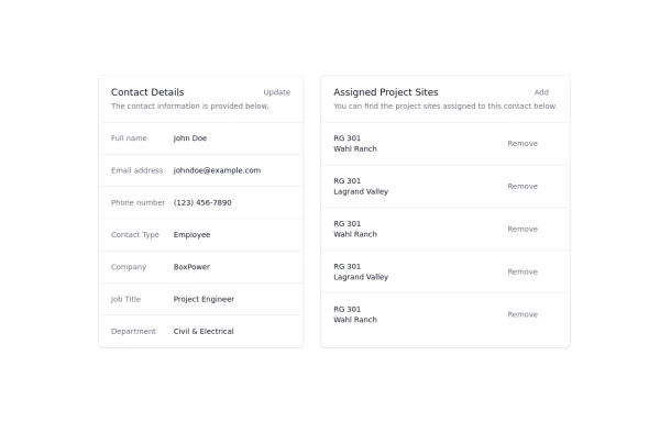 Updated customer details page
Customer details page
4.3k -



Browse by topic
Explore components by Tags
Jump straight to the UI pattern you need.
Can't find it?
Didn't find the component you were looking for?
Search across 3,000+ community-built components and grab the code in seconds.