walletp2p
This tailwind example is contributed by Anonymous, on 31-Dec-2024. Component is made with Tailwind CSS v3. It is responsive. It supports dark mode.

Author Anonymous
Related Examples
-
 portfolio
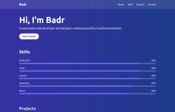
This portfolio page for Claire includes: 1. Responsive design that works on both desktop and mobile 2. Indigo-800 and Blue-900 color scheme for the background 3. Dark mode support (the design is already dark-themed) 4. Beautiful animations and effects: 1. Fade-in and slide-up animations for sections 2. Animated skill bars 3. Hover effects on projects and buttons 4. Smooth scrolling for navigation 5. Mobile-friendly navigation with a toggle menu 6. Sections for About, Skills, Projects, and Contact 7. A contact form with styled inputs 8. Social media links in the footer 9. Accessibility considerations (proper heading structure, color contrast, focus styles) Key features: - The background uses a gradient from Indigo-800 to Blue-900 - The header and footer have a frosted glass effect using backdrop filters - Text is white for high contrast against the dark background - Sections fade in and slide up as they enter the viewport - Skill bars animate when the skills section is in view - Project cards have a hover effect with scaling and increased opacity - The contact form has animated focus states - Social media icons change color on hover - The layout is responsive, with a hamburger menu for mobile screens This implementation provides a visually appealing and functional portfolio page for Claire, using HTML, Tailwind CSS, and vanilla JavaScript for the interactions and animations.
1 year ago2.8k -
 1 year ago3.9k
 -
-
 2 years ago9.1k
 -
 3 years ago25.6k
 -
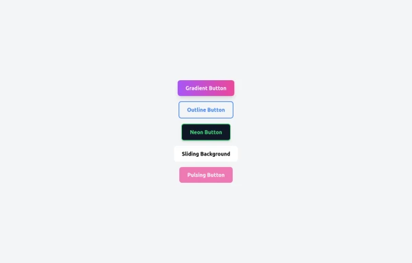 5 Different Style of Button
Gradient Button outline button neon button Sliding Background pulsing Button
8 months ago534 -
 machine
tell you how your MAC pc work
3 months ago335 -
 Invoice Generator
Invoice Generator
2 months ago112 -
 2 weeks ago43
 -
 chat ui advanced
Professional chat ui, connect me for jsx https://abhirajk.vercel.app/
1 year ago1.7k -
 Certificate of Completion
A clean and modern certificate template built with Tailwind CSS. Ideal for courses, training programs, and professional achievements.
4 months ago386 -
 3 years ago12.4k


Explore components by Tags
Didn't find component you were looking for?
Search from 3000+ components