magic card
by salvator
This tailwind example is contributed by Baraka Salvator, on 16-May-2025. Component is made with Tailwind v3.4. It is responsive.

Related Examples
-
-
 delivery
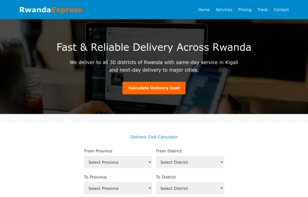
It will help us get our stuff delivered to your home in a way that your ordered items are delivered to your home.
1.3k -

-

-
 portfolio
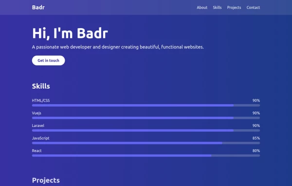
This portfolio page for Claire includes: 1. Responsive design that works on both desktop and mobile 2. Indigo-800 and Blue-900 color scheme for the background 3. Dark mode support (the design is already dark-themed) 4. Beautiful animations and effects: 1. Fade-in and slide-up animations for sections 2. Animated skill bars 3. Hover effects on projects and buttons 4. Smooth scrolling for navigation 5. Mobile-friendly navigation with a toggle menu 6. Sections for About, Skills, Projects, and Contact 7. A contact form with styled inputs 8. Social media links in the footer 9. Accessibility considerations (proper heading structure, color contrast, focus styles) Key features: - The background uses a gradient from Indigo-800 to Blue-900 - The header and footer have a frosted glass effect using backdrop filters - Text is white for high contrast against the dark background - Sections fade in and slide up as they enter the viewport - Skill bars animate when the skills section is in view - Project cards have a hover effect with scaling and increased opacity - The contact form has animated focus states - Social media icons change color on hover - The layout is responsive, with a hamburger menu for mobile screens This implementation provides a visually appealing and functional portfolio page for Claire, using HTML, Tailwind CSS, and vanilla JavaScript for the interactions and animations.
3.7k -

-
 1.3k
-
 Rwanda-Canada Transport Services | Safe & Reliable Shipping
Attractive color scheme inspired by Rwanda's landscapes
-
 Live Chat Component using Tailwind Alpine JS
1.3k -
 Lifetime Access (iOS 26 Style)
-
 trusted by
1. Color Scheme: 1. Updated the background to a gradient from Indigo-800 to Blue-900 2. Changed text colors to use Indigo-800 and Blue-900 shades 3. Updated ring colors on avatar images to match the new scheme 2. Enhanced Design: 1. Added a containing card with white background (dark gray in dark mode) 2. Increased the size of avatar images for better visibility 3. Added a shadow effect to the card that changes color on hover 3. Responsiveness: 1. Maintained the responsive layout, stacking vertically on smaller screens 4. Animations and Interactions: 1. Added a fade-in animation for the entire component 2. Enhanced hover effects on avatar images (scale and z-index change) 3. Added a ring effect on hover for each avatar 5. Accessibility: 1. Maintained alt text for images 2. Ensured proper color contrast for text readability 6. Dark Mode: 1. Implemented dark mode support 2. Adjusted colors and ring effects for dark mode 7. Additional Enhancements: 1. Increased font sizes for better readability 2. Added font weight variations to emphasize important text 3. Improved spacing and alignment This updated component maintains the original functionality while incorporating the Indigo-800 and Blue-900 color scheme and adding enhanced visual effects and interactions.
2.3k -
 Checkbox
2.8k










Browse by topic
Explore components by Tags
Jump straight to the UI pattern you need.
Can't find it?
Didn't find the component you were looking for?
Search across 3,000+ community-built components and grab the code in seconds.