Innovative Developer & Digital Creator
Innovative Developer
This tailwind example is contributed by gidy, on 28-May-2025. Component is made with Tailwind CSS v3. It is responsive.

Author gidy
Related Examples
-
 3 years ago11.7k
 -
 3 years ago12.3k
 -
 Track Your Order
Track Your Order
9 months ago401 -
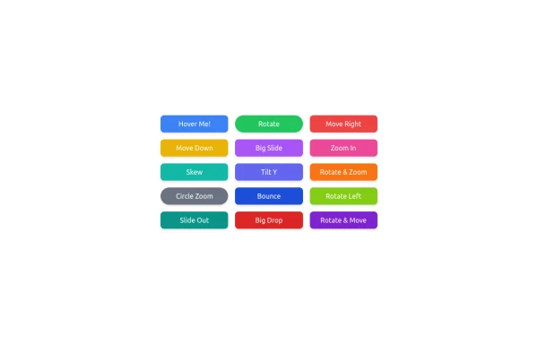 button animation
button animation big
8 months ago799 -
 Animated Ripple Avatar
Ripple Effect Avatar (Tailwind CSS Component) A visually striking animated component that displays a centered avatar or image surrounded by expanding ripple circles. Built with Tailwind CSS and custom animations, this effect simulates a pulsing or water ripple reaction, drawing attention to the central image. Ideal for user profile sections, hero banners, landing pages, or highlighted features in modern web interfaces. The ripples gradually fade and expand, creating a soft, calming motion that enhances interactivity and depth.
8 months ago1.1k -
 chatbot
is my chatbot
2 months ago294 -
 Sidebar
This is the sidebar that I use in my projects, I use grid to be able to manage the space issue a little better, it seems like a clean and modern design, it is more than anything for the dashboards that you want to create
1 year ago3.9k -
 3 years ago12.5k
 -
 A Code Master Academy
A Code Master Academy – Empowering the Next Generation of Tech Leaders in Rwanda 👨💻 I'm Acode Master, the founder of A Code Master Academy, a practical and inclusive coding school based in Rubavu, Rwanda. The academy is dedicated to transforming lives by equipping unemployed youth and passionate learners with job-ready skills in modern software development.
7 months ago1.1k -
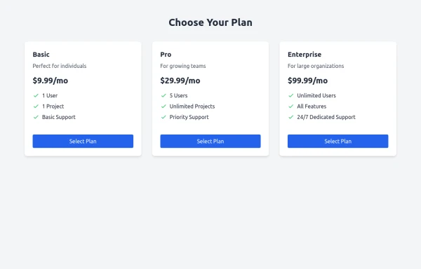 Subscription Plans
Subscription Plans
8 months ago783 -
 Invoice Generator
Invoice Generator
3 weeks ago94 -
 portfolio
Complete Portfolio UI Kit with hero, about, skills, projects, testimonials, contact form, and footer. Fully responsive and dark mode supported using Tailwind CSS.
7 months ago727


Explore components by Tags
Didn't find component you were looking for?
Search from 3000+ components