Responsive card grid
This tailwind example is contributed by TailwindFlex, on 03-Oct-2022. Component is made with Tailwind CSS v3. It is responsive. It supports dark mode.

Author TailwindFlex
Related Examples
-
 Responsive navbar with dark mode support
Sidebar on small screen devices
3 years ago19.7k -
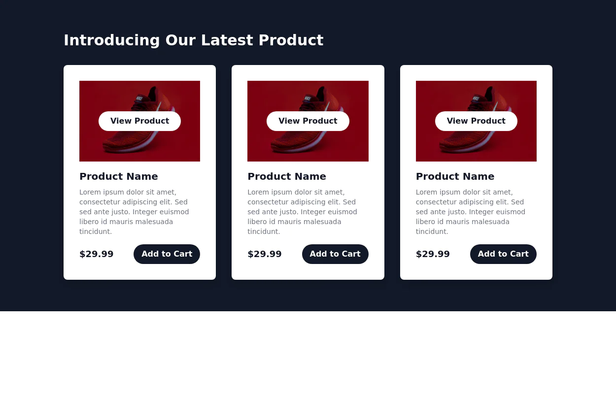
 Responsive products grid
Responsive product card grid using tailwind CSS.
3 years ago44.9k -
 2 years ago27.2k
 -
 3 years ago13.9k
 -
 3 years ago12.2k
 -
 Responsive Card Grid
Tailwind CSS responsive grid for feature listing. The cards have a teal background, rounded corners, and a concise display of feature titles, descriptions, and a "Learn More" link.
3 years ago52.3k -
 Tailwind image gallery
Responsive grid with evenly spaced image cards. Each card has a title label at the bottom, and there's a subtle hover effect for interactive engagement.
3 years ago61.1k -
 Posts / Articles card grid
Present a collection of articles or blog posts in a grid format with their respective featured images
2 years ago5.4k -
 2 years ago22k
 -
 404 Error Page
Minimal 404 for your project
3 years ago22.2k -
 3 years ago12.2k
 -
 3 years ago14k
 -
 Alert mono color
minimal alerts design
3 years ago10.9k


Explore components by Tags
Didn't find component you were looking for?
Search from 3000+ components