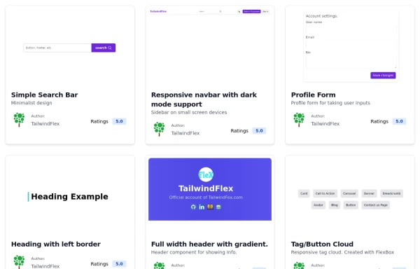
Responsive navbar with dark mode support
Sidebar on small screen devices
This tailwind example is contributed by TailwindFlex, on 16-Jul-2022. Component is made with Tailwind CSS v3. It is responsive. It supports dark mode. similar terms for this example is drawer

Author TailwindFlex
Related Examples
-
 Responsive navbar
navbar with the dropdown on mobile devices
3 years ago38.3k -
 Navbar with search
Use this example of a navbar element to also show a search input element that you can integrate for a site-wide search.
2 years ago16.1k -
 2 years ago27.4k
 -
 3 years ago61.8k
 -
Animated Drawer
Collapsible sidebar navigation that allows users to access additional menu options. It is designed for efficient space utilization and can be easily expanded and collapsed.
2 years ago27.9k -
 2 years ago16.8k
 -
 3 years ago16.1k
 -
 Minimalistic navbar
Responsive navbar
3 years ago21.1k -
 Navbar Section
Responsive Navbar
3 years ago23.4k -
 3 years ago16.7k
 -
 3 years ago10.6k
 -
 2 years ago12.8k
 -
 Navbar with social links
A header component with a logo, navigation links, and social media links.
2 years ago7.4k -
Responsive Navbar Example
A working example of the navbar
3 years ago17.2k -
 3 years ago14.3k
 -
 3 years ago15.3k
 -
 navigation
tailwind navigation pills
2 years ago9.2k -
 Simple navbar
semi transparent
3 years ago14.1k


Explore components by Tags
Didn't find component you were looking for?
Search from 3000+ components